dirr <- "D:/~"
fileis <- file.path(dirr,"avgpm25.csv", fsep="/")
pollution <- read.csv(fileis)EPA - EDA 2
Data
Let’s take a quick look and see what the data looks like, so we’ll read the first few lines of data (head)
head(pollution) pm25 fips region longitude latitude
1 9.771185 1003 east -87.74826 30.59278
2 9.993817 1027 east -85.84286 33.26581
3 10.688618 1033 east -87.72596 34.73148
4 11.337424 1049 east -85.79892 34.45913
5 12.119764 1055 east -86.03212 34.01860
6 10.827805 1069 east -85.35039 31.18973Size
Let’s see how large the dataset is by using dim(), it will give us the size of the data fram in rows(576) and columns(5)
dim(pollution)[1] 576 5Summary
Using summary() will give us a summary of statistical values regarding the data. If we want to target a specific variable in the data frame we need to tell R, and we get do that by using the $. So if we want to see the summary of the particle matter column (pm25), so we end up with
summary(pollution$pm25) Min. 1st Qu. Median Mean 3rd Qu. Max.
3.383 8.549 10.047 9.836 11.356 18.441 So now you see the min., max, median, average/mean, where the quarters separate.
Quantile
Let’s say we want to look at the quarters instead, we use quantile()
quantile(pollution$pm25) 0% 25% 50% 75% 100%
3.382626 8.548799 10.046697 11.356012 18.440731 Boxplot
Before we plot the data, let’s create a shortcut to pollution$pm25 so we don’t have to type it all the time, so now we just use ppm instead of pollution$pm25
ppm <- pollution$pm25Color
Maybe it’s easier for you to see the data by looking at a plot of what we just saw. Let’s use a variation of the plot(), but we want to look at a box plot, some might know this as candle stick (use in stock trading). We also want to use the blue color instead of the default, so we use (col=““)
boxplot(ppm, col="blue")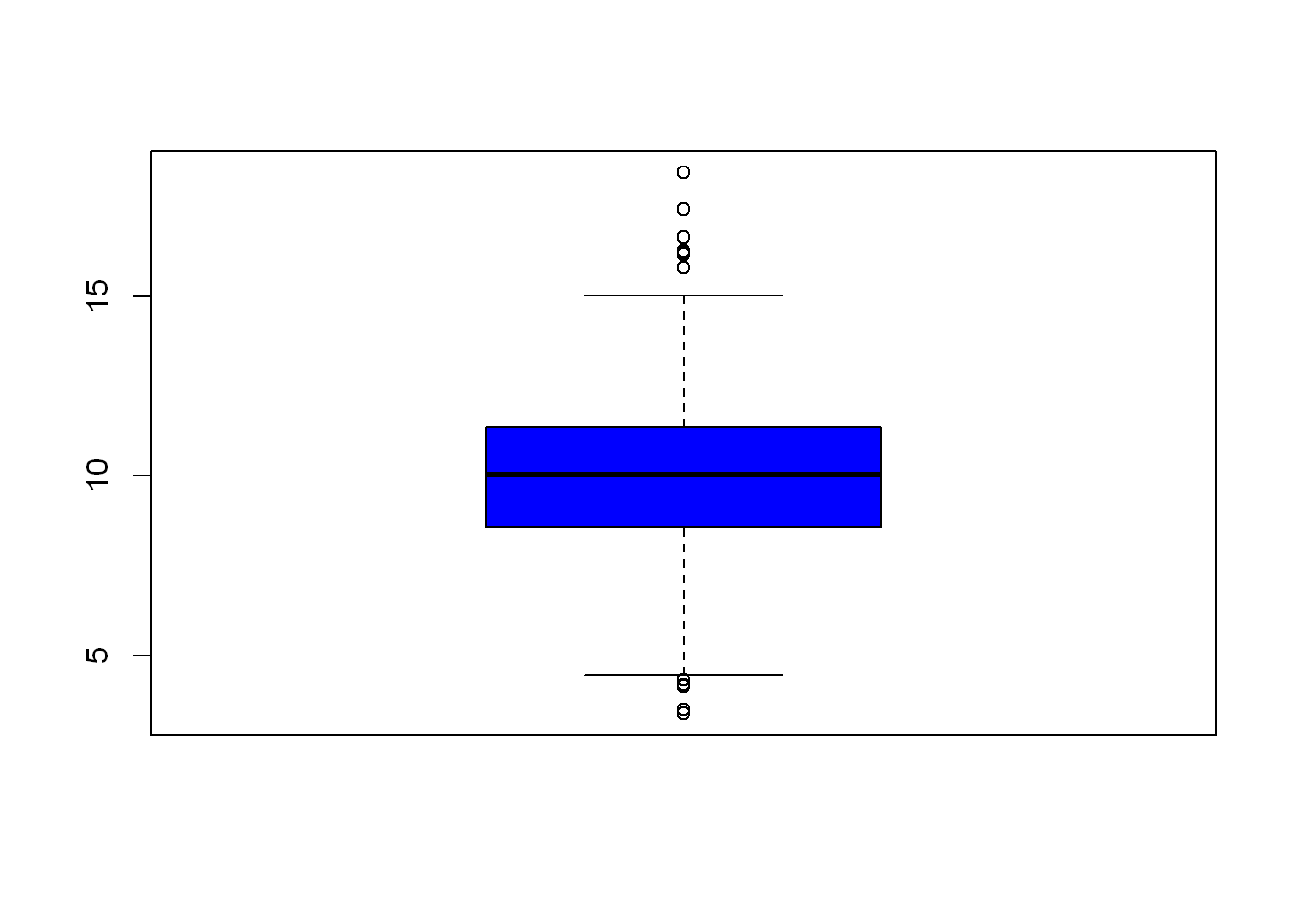
Compare the candle/box above to the results from quantile() and now you see how they appear in graph form.
Overlay Add line
Since we already know the EPA has a standard of pm=12 let’s draw a line at that value so we can easily see how the data relates to the EPA Maximum of 12 ppm. (h is for horizontal, v is for vertical)
boxplot(ppm, col="blue")
abline(h=12)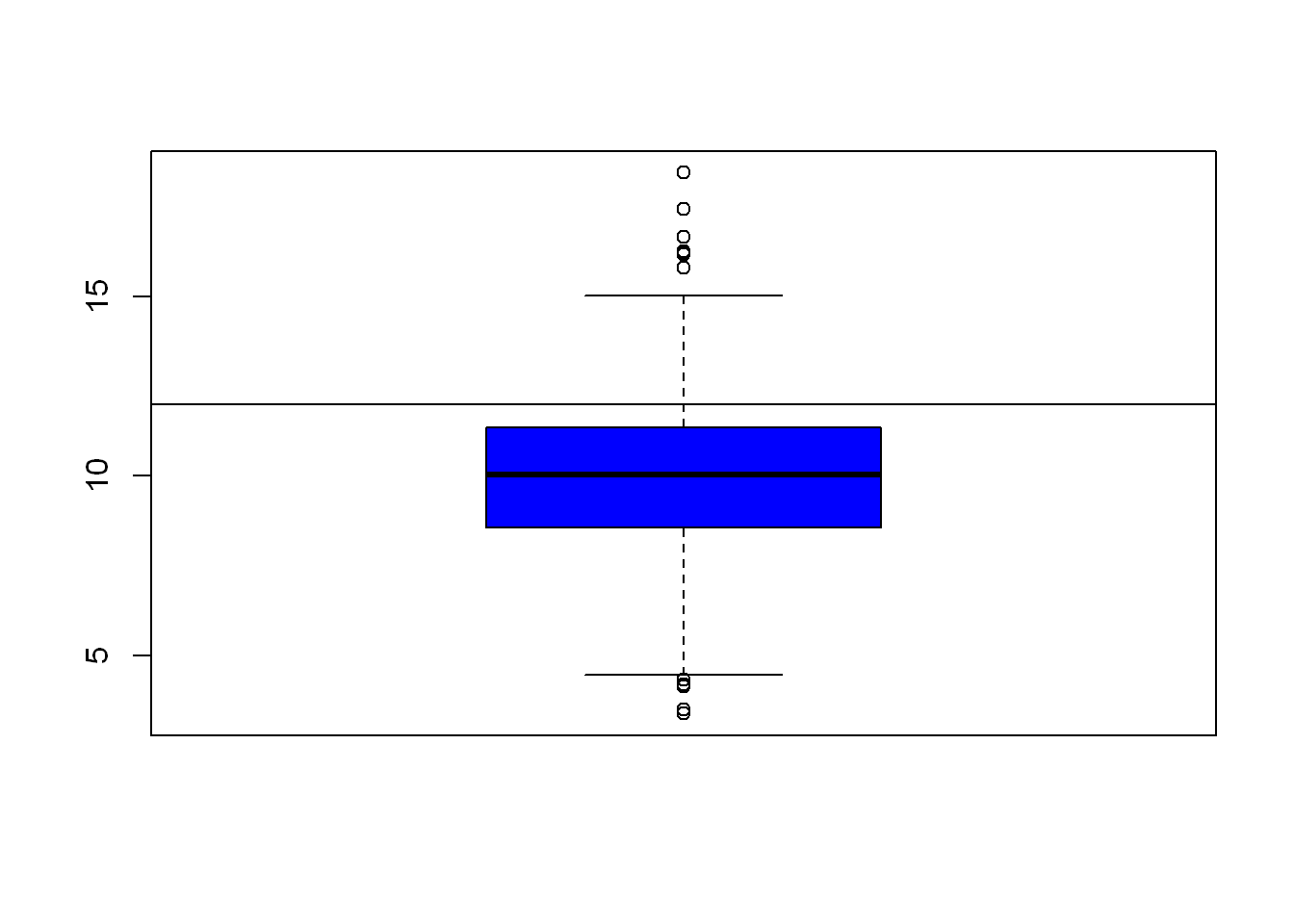
Histogram
Let’s see how the data is spread out over the very familiar histogram plot. Let’s color the bars green
hist(ppm, col="green")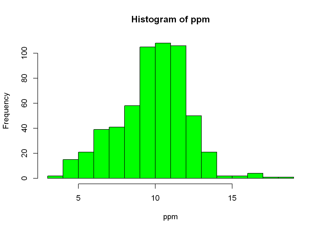
Breaks
As you can tell, R guesses on the variable it should assign to the axes, and it also guesses as the title of the plot. Let’s say we want to break it down further, zoom in so to speak, we want to use more buckets (bars) so let’s narrow the bar range/width. We can do that with (breaks=), the value you want to set it to will depend on what you see in the data and what you are needing to validate the point you’re going after.
hist(ppm, col="green", breaks = 100)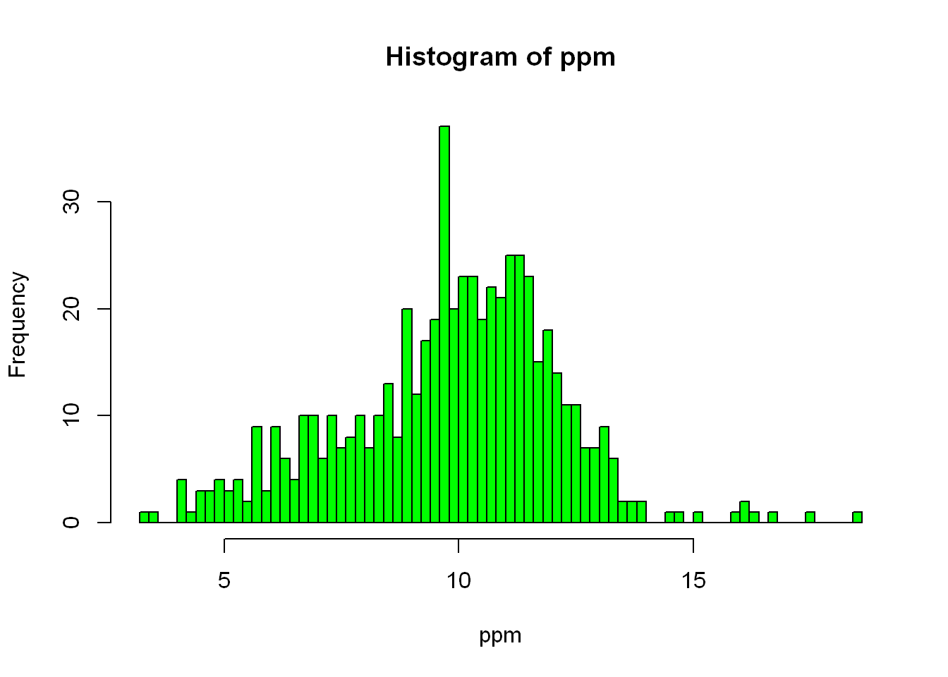
Rug
In stock/futures trading, density is extremely important, and we use many ways to graph it in that industry, but for here let’s use the built-in (rug) function to display the density distribution underneath the histogram shown above, we’ll also add a vertical line at 12 for the EPA standard value.
Line width
In addition to the above we’ll increase the vertical line width to (lwd=4) so it’s more visible
hist(ppm, col="green", breaks = 100)
rug(ppm, col="red")
abline(v=12, lwd=4, col="magenta")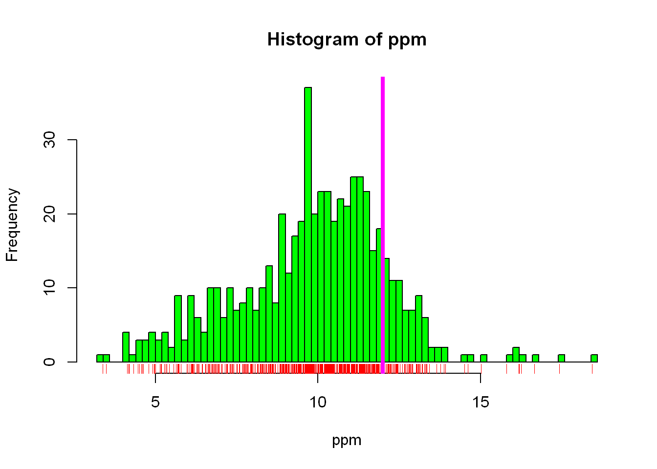
Line at function
As you see above we set the vertical line at a fixed value = 12. It’s more helpful to see how the average/mean value of our data compares to the EPA standard of 12, so let’s add another line at the mean of our data
hist(ppm, col="green", breaks = 100)
rug(ppm, col="red")
abline(v=12, lwd=4, col="magenta")
abline(v=median(ppm), lwd=4,col="red")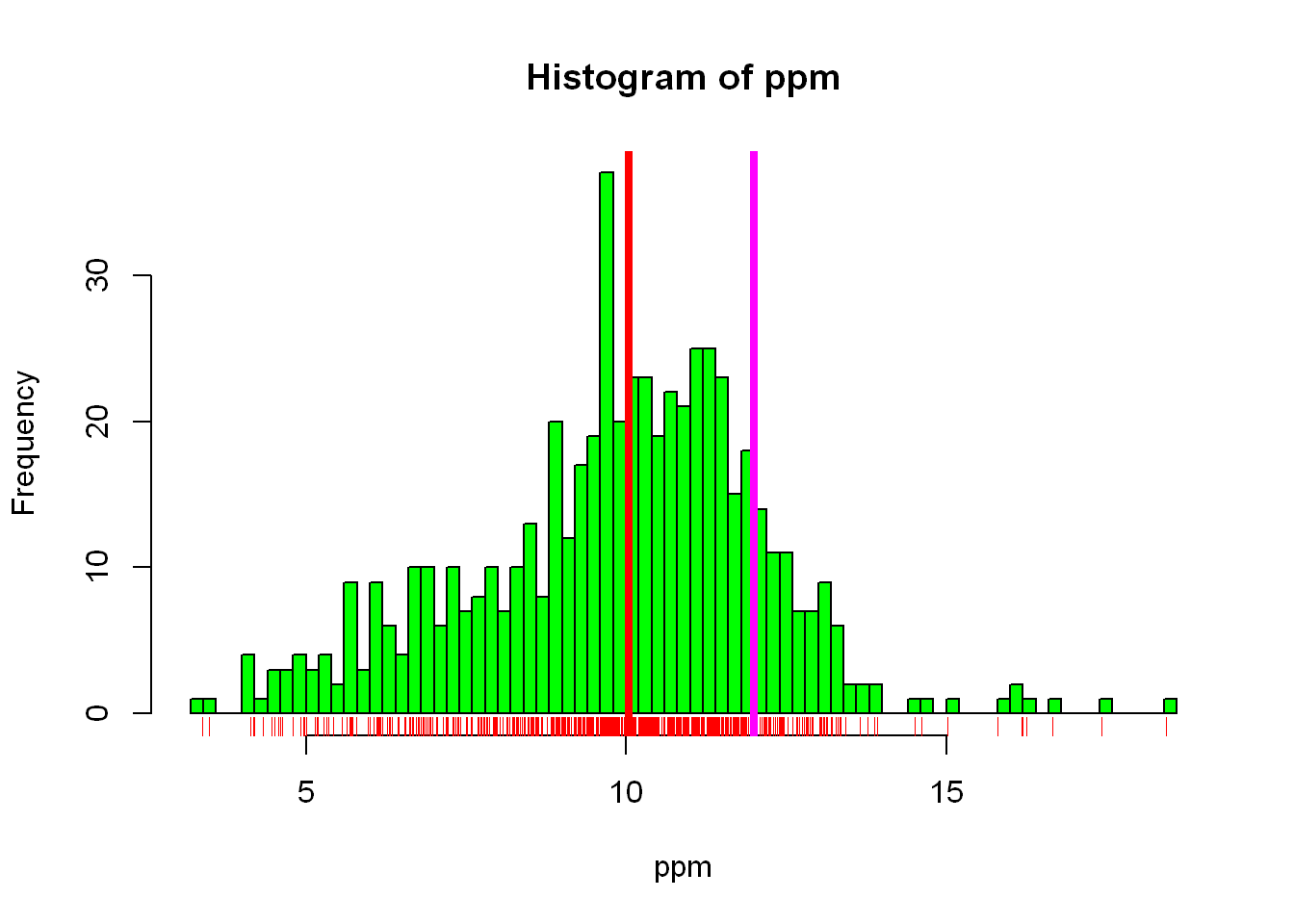
Now you can see in the graph how the data is spread, the relationship between the mean value and the standard EPA requirement, the spread/density of the data throughout the range of values. Let’s see what other data we have in the data frame we can explore.
Colnames
Let’s see how many other columns we have, we already know from dim() that we have 5 columns in total, we also saw in head() the names of those columns. In many instances you’ll have hundreds of columns if not more and you’d have to narrow your analysis to smaller pieces. So let’s see what the other variables are by using names()
names(pollution)[1] "pm25" "fips" "region" "longitude" "latitude" Table
Let’s let longitude and latitude sit for now, since we are not mapping the locations of the sensors yet, and let’s focus on “region”.
Let’s do what we did earlier, since we are focused on pollution$region let’s assign it a simpler variable: “regions” first and then let’s find out how many regions the dataset contains. There are many ways to find out how many regions the data contain, the simplest would be to assign it to reg and then view it
regions <- pollution$region
reg <- table(regions)
reg
regions
east west
442 134 Barplot
Let’s plot a point chart (empty circle chart) of the regions.
barplot(reg, col="grey")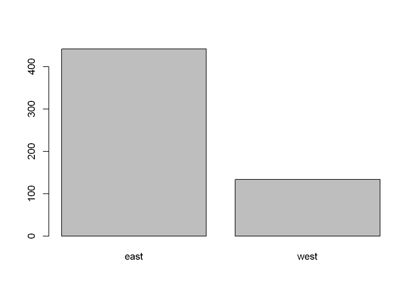
You might say it’s very familiar, it looks like a histogram, well let’s see if you’re right! The reason being is hist() plots count per numeric values, and East and West are not numeric. We can count using other packages but for now let’s stick to the base package, and so the use of table() and barplot()
hist(reg, col="grey")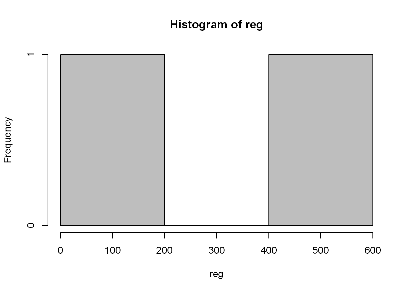
Title main
We’ll set the title of the chart using (main=“Number of Counties in Each Region”)
barplot(reg, col="grey", main="Number of Counties in Each Region")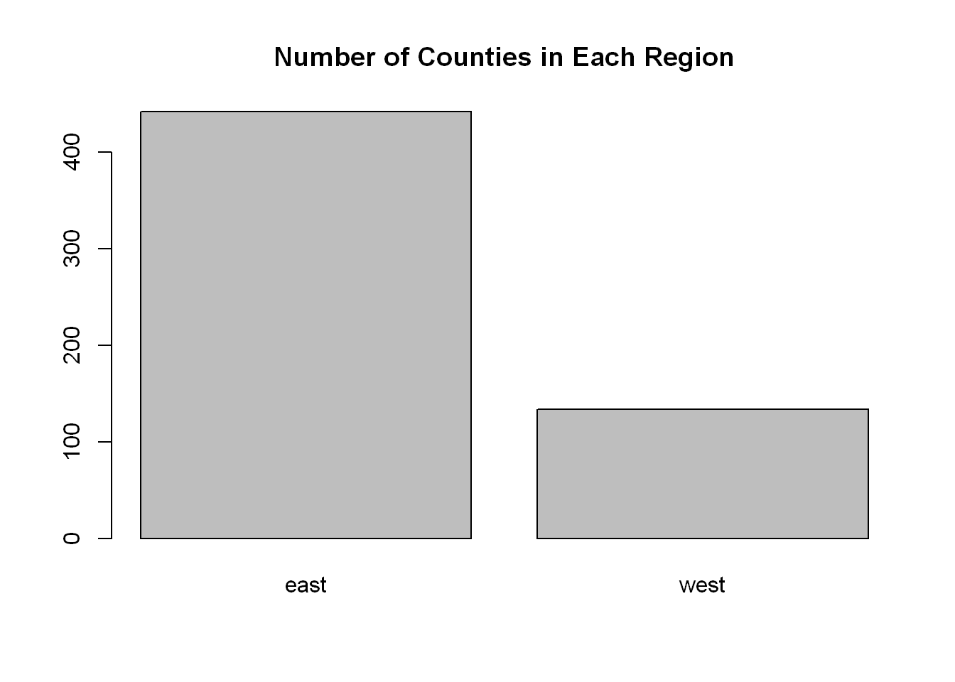
Depends
(~) Is a very useful expression in R, ( X ~ Y ) means X depends on Y. We’ll use it repeatedly in the next few sections. Since the code demands two plots to be drawn R puts them side by side. What if we want to control which plot goes where?
boxplot(pm25~region, data = pollution, col="red")
Margins
Let’s say we want to set the width of the margins around the plots. This is useful when we plot more than one plot at a time. The way R is setup mar = c(x,y,z,w), margins start at the x axis side (meaning bottom), and rotate clockwise, so y is the left side, z is top, w is the right side. So let’s try editing the above chart, you’ll notice very little change, wait and we’ll try it when we have multiple plots on the same display.
boxplot(pm25~region, data = pollution, col="red", mar= c(1,1,1,1))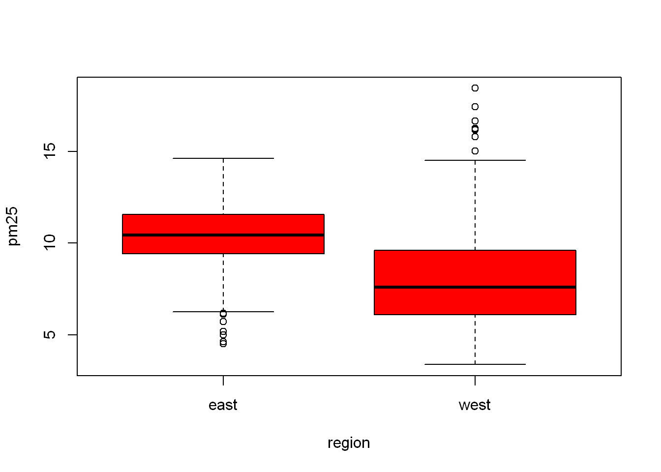
Subset
First let’s subset/filter out the EAST region from the data set, by setting it to “east”.
Do the same by subsetting the WEST region to “west”, so what we are doing is separating all the east counties from the west and assigning each region to its own dataframe “east” and “west”, and let’s look at the head of “east”
east <- subset(pollution, region =="east")
west <- subset(pollution, region =="west")
head(east)
pm25 fips region longitude latitude
1 9.771185 1003 east -87.74826 30.59278
2 9.993817 1027 east -85.84286 33.26581
3 10.688618 1033 east -87.72596 34.73148
4 11.337424 1049 east -85.79892 34.45913
5 12.119764 1055 east -86.03212 34.01860
6 10.827805 1069 east -85.35039 31.18973Histogram
Let’s plot the pm$25 of the east region only
hist(east$pm25, col="green")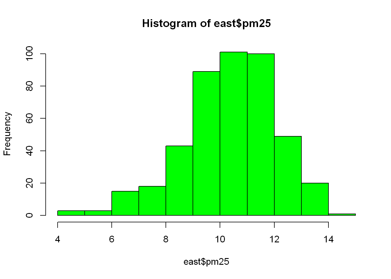
Function within Fun
As you saw above, we subset the east region into “east” then we plotted a histogram of east$pm25, so that’s two steps. Can we accomplish the same with just one line of code. Can we combine two functions inside one another?
We are going to take the first subset line of code, shorten it and use it as the first argument in hist(), So all we did was substitute “east” from above with the code that subset the dataframe into east, but in this case we were looking at subsetting for the west regions so replace east with west.
Funny thing is the title displayed by R reflects what we just did, just look at the difference in the title between this plot and the one above.
hist(subset(pollution, region == "west")$pm25, col = "green")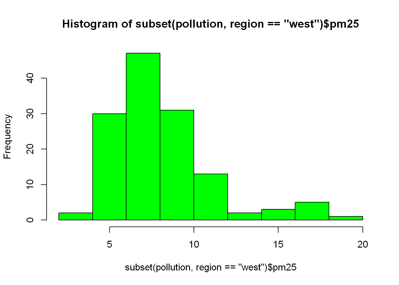
Scatterplot
With
With() saves us the use of having to refer to our variables by using pollution$. Here is an example, both lines of code gives us the same result
with(pollution, plot(latitude, pm25))Dashed line
Ad a horizontal line at 12, width = 2, and make it dashed lty=2
with(pollution, plot(latitude, pm25))
abline(h=12, lwd=2, lty=2)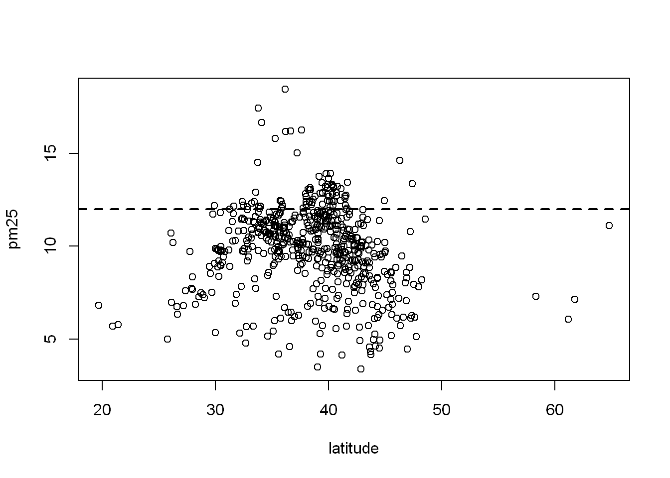
Color Variable
Let’s say we wanted to color the east region data differently from the west region, we set the col=region and let R plot in the appropriate colors based on the number of unique values in the region variable. What you should know is that the column “Species” is a factor. So in order to plot with a variable you need to know if it’s a factor. If you use “reg” which is the table, it only has two values.
plot(pollution$latitude, pollution$pm25, col = reg)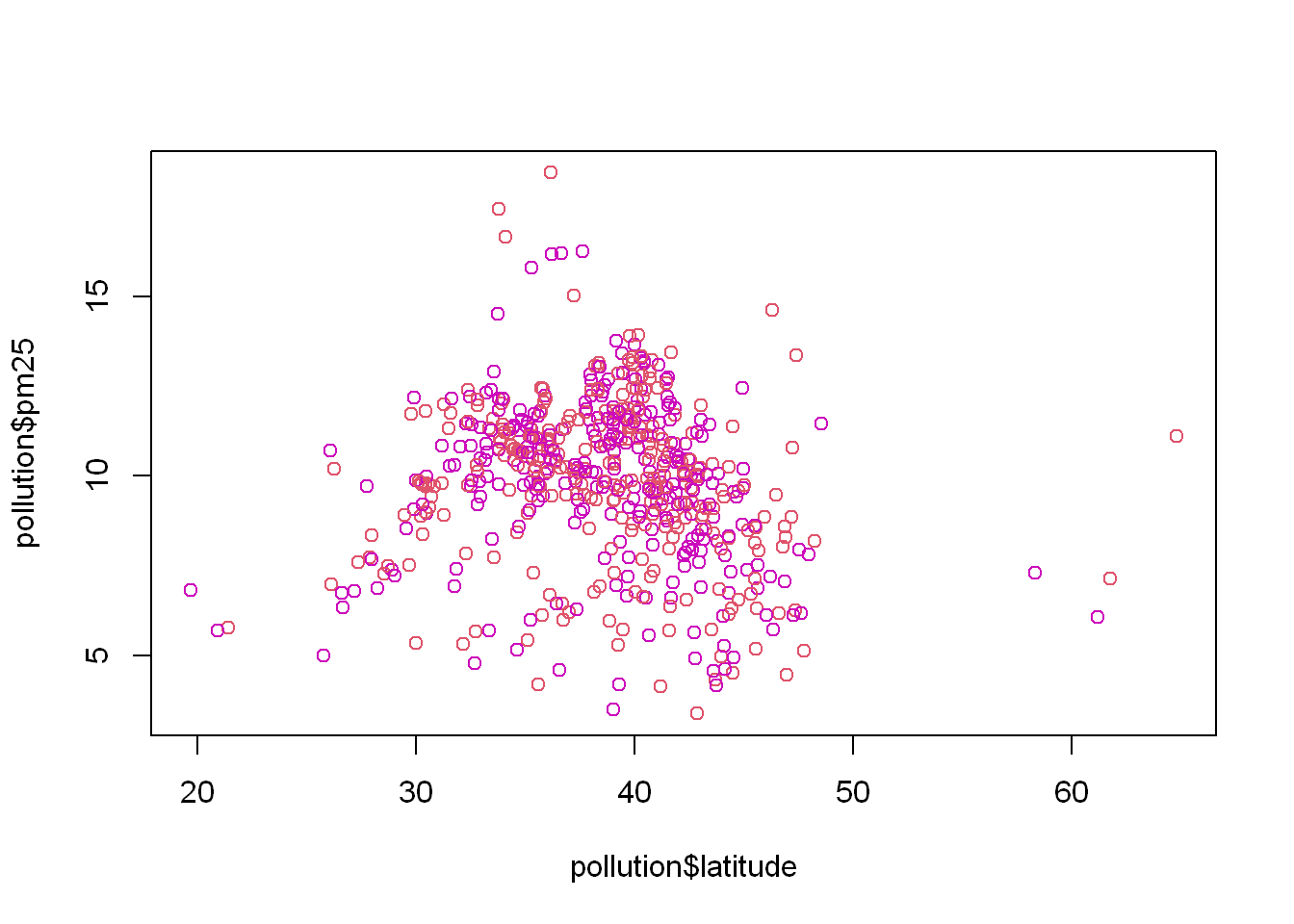
Another way
Another way to do it is to use the length(reg) = 2 so then R will cycle through the 2 colors when plotting
plot(pollution$latitude,pollution$pm25, col= 1:length(reg))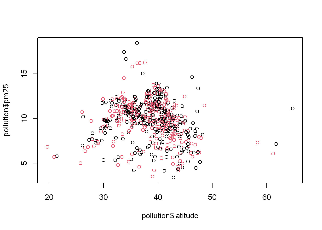
Here is how that would look like with the “iris” dataset
with(iris, plot(Sepal.Length, Petal.Length, col= Species))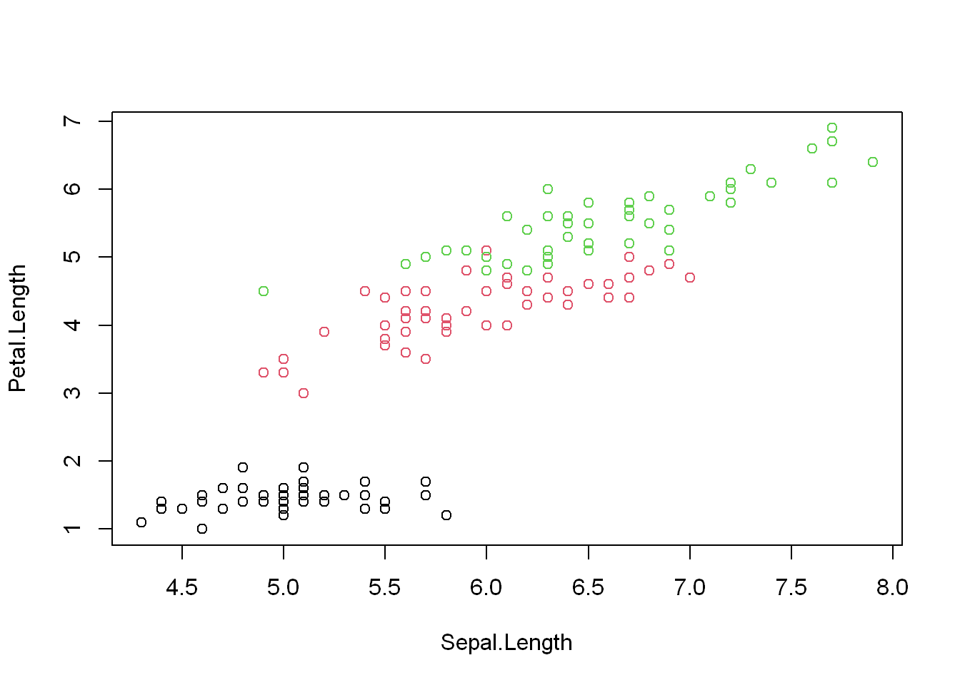
Multiple Plots
.sidebar .toc-actions>h1,.sidebar .toc-actions>.h2,.sidebar .quarto-code-links>h2,.sidebar .quarto-code-links>.h2,.sidebar .quarto-other-links>h2,.sidebar .quarto-other-links>.h2,.sidebar .quarto-alternate-notebooks>h2,.sidebar .quarto-alternate-notebooks>.h2,.sidebar .quarto-alternate-formats>h2,.sidebar .quarto-alternate-formats>.h2 { font-size: .8rem; font-weight: bold; }
Many times we want to compare plots side by side, what better way is there than to plot them side by side, we can either place them side by side using (mfrow)
Mfrow
(mfrow = c(2,1)) means we have 2 rows and 1 column, so that would place the first plot in the top row and the second plot in the second row.
(mfrow = c(1,2)) means we have 2 columns and 1 row, I’m sure you can figure out what R will do. Now let’s use them
Setup
Before you use the mfrow, you have to tell R what’s coming so we use the par() to do that, note par() does NOT plot anything it just informs R what’s coming. You still have to plot after you declare the par() command.
Remember we already subset the data into east and west, so we get to use them here, and we plot two charts vertically in one column
par(mfrow = c(2,1), mar = c(5,4,2,1))
with(west, plot(latitude,pm25, main = "West"))
with(east, plot(latitude, pm25, main = "East"))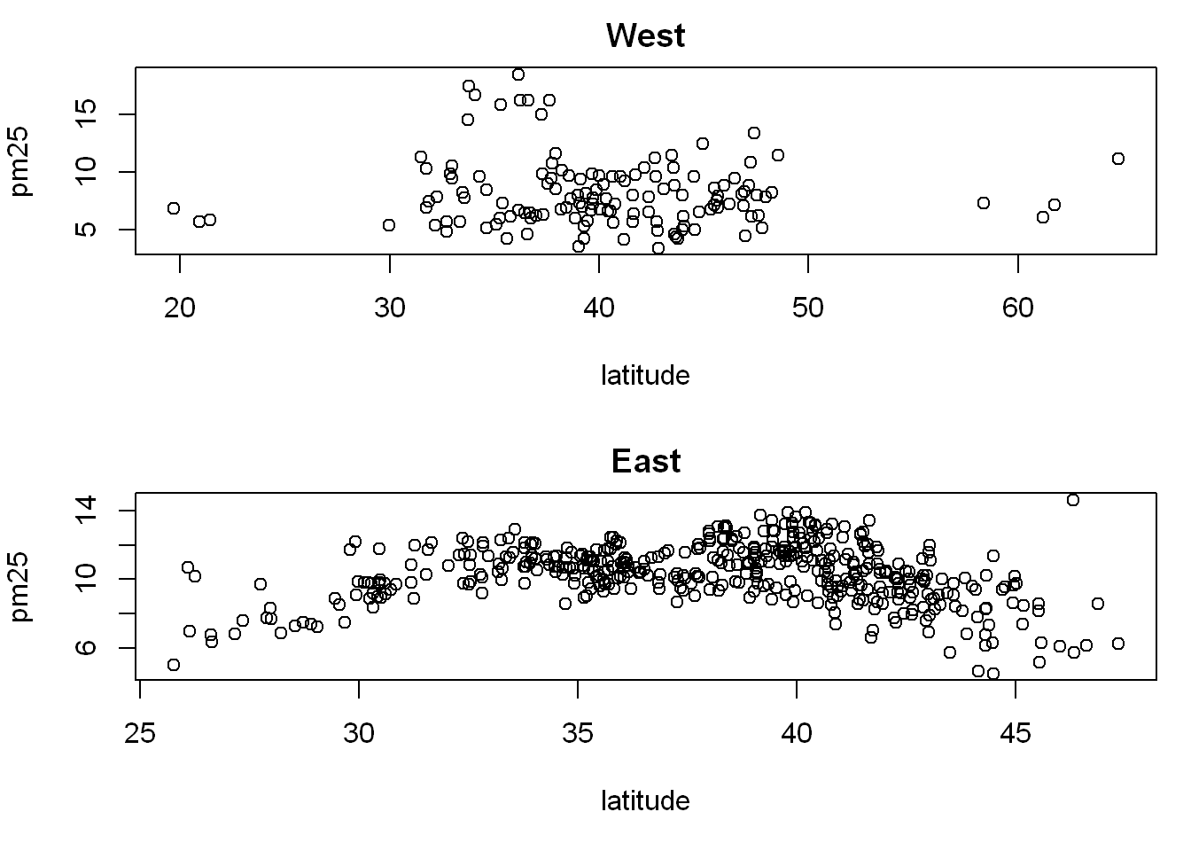
Now let’s do the same but with one row and 2 columns instead to see if it’s more appropriate, all we do is change the mfrow parameters
par(mfrow = c(1,2), mar = c(5,4,2,1))
with(west, plot(latitude,pm25, main = "West"))
with(east, plot(latitude, pm25, main = "East"))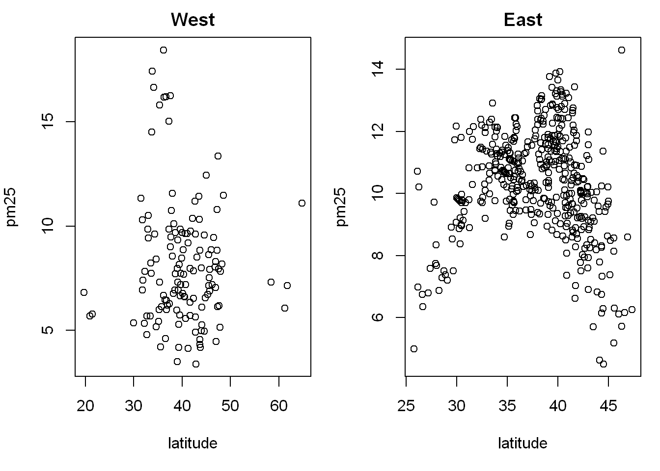
Inner Margin
Outer Margin
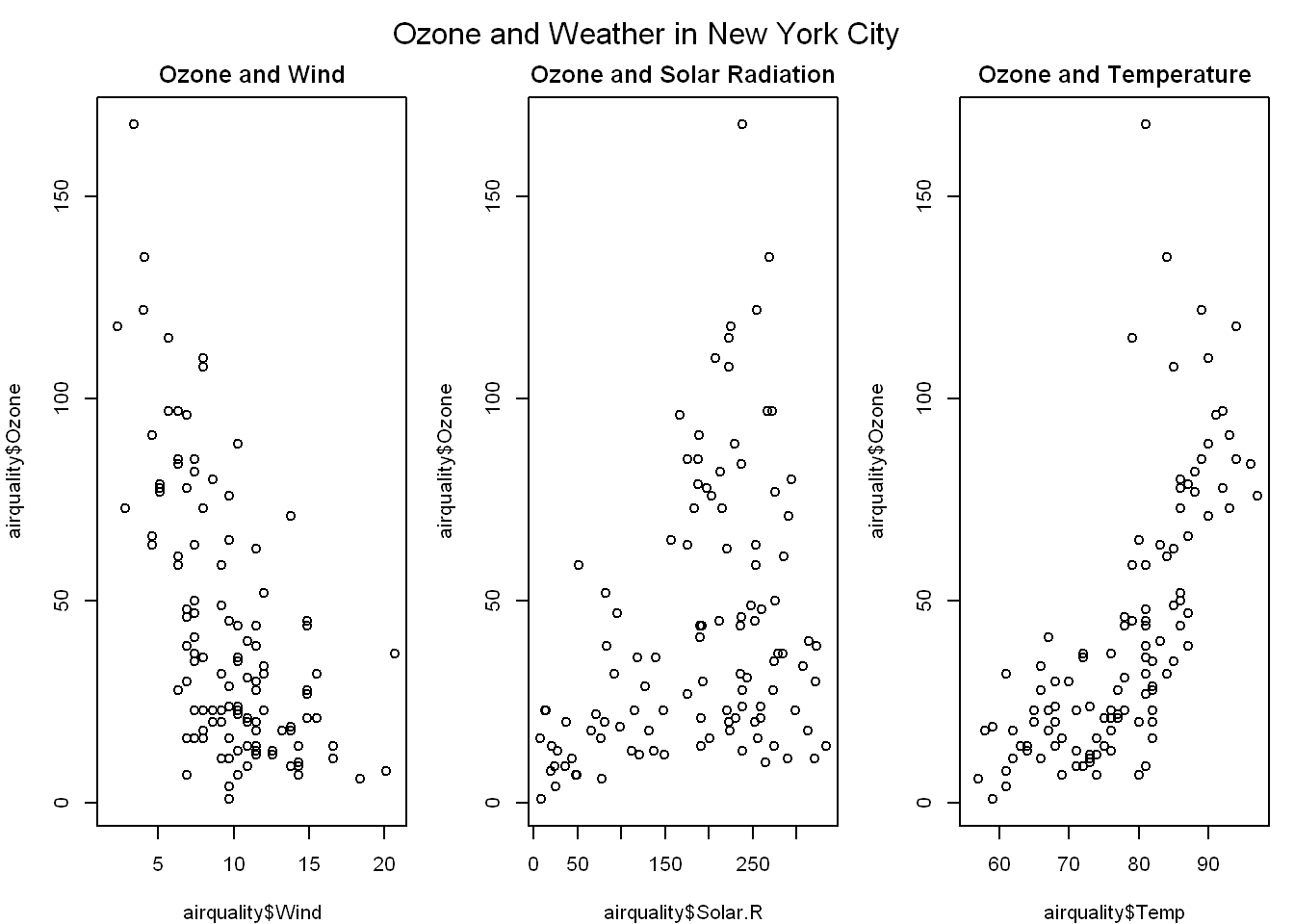
In this example we’ll learn about inner and outer margins used in a multi-graph plot, with 3 plots and inner and outer margin The default for the inner margin is c(5.1, 4.1, 4.1, 2.1) so you can see we reduced each of these so we’ll have room for some outer text.
Main title
This is relating the title above all three, we use mtext() and we put it all together to get:
par(mfrow=c(1,3), mar=c(4,4,2,1), oma=c(0,0,2,0))
plot(airquality$Wind, airquality$Ozone, main = "Ozone and Wind")
plot(airquality$Solar.R, airquality$Ozone, main = "Ozone and Solar Radiation")
plot(airquality$Temp, airquality$Ozone, main = "Ozone and Temperature")
mtext("Ozone and Weather in New York City", outer = TRUE)