length(par)
names(par())Base - Start
This is the first part of showing examples, code and sample chunks of code used for demonstrative exploratory analysis. We’ll be using the built-in default visualization package in R to perform our analysis.
We’ll step up to other packages after this section.
It’s always a good reason to use graphics in data science to:
Find patterns in the data
Understand data properties
Suggest modeling strategies
Help debug analyses
It’s not a good idea to use EDA graphics to communicate results. EDA is just that Exploratory, you’ll take the time to clean up the graphics, fix typos, rename axis or correct titles…. at another stage. This stage is for finding patterns, clarifying your theories.
The next two sample pages will show the use of the base package with real case studies.
Parameters
The parameters of the base package are well documented in help, we can see the names of all the parameters and the count by using the following commands
Foreground color
fg is the foreground parameter
Background color
bg is the background parameter
head(airquality) Ozone Solar.R Wind Temp Month Day
1 41 190 7.4 67 5 1
2 36 118 8.0 72 5 2
3 12 149 12.6 74 5 3
4 18 313 11.5 62 5 4
5 NA NA 14.3 56 5 5
6 28 NA 14.9 66 5 6Histogram
Using the airquality dataset, let’s look at some examples.
First let’s look at the range of the Ozone variable to see what we have to work with.
Then let’s plot a histogram to see how the values are distributed
Range
range(airquality$Ozone, na.rm = TRUE)[1] 1 168hist(airquality$Ozone)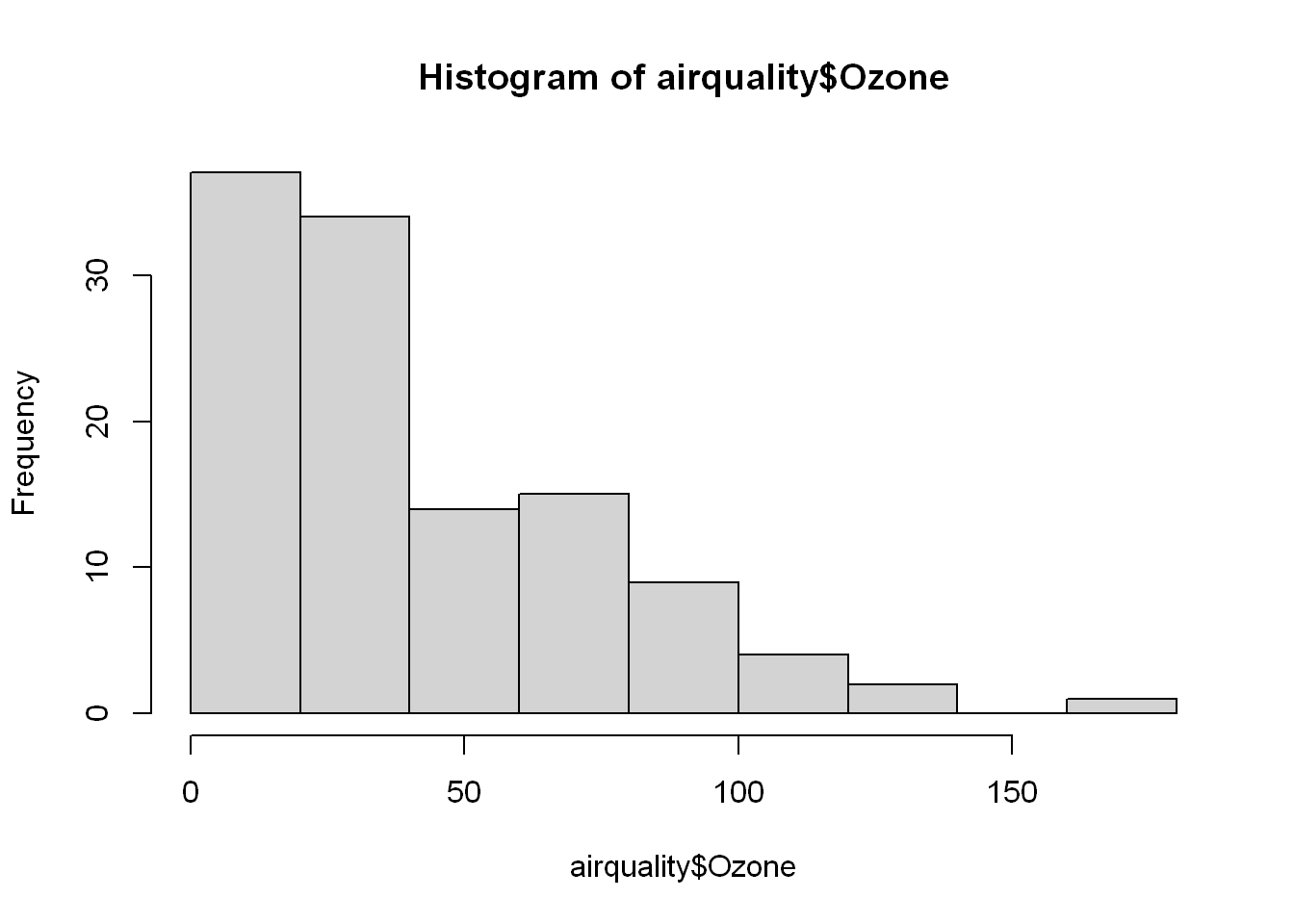
Boxplot
Now let’s look at the Ozone values divided per month to see if we can find a pattern.
We’ll want a boxplot of ozone as a function of the month in which the measurements were taken so we’ll use the R formula Ozone~Month
Let’s the labels of both axes
boxplot(airquality$Ozone, xlab = "Ozone", ylab="Ozone (ppb)",
        col.axis="blue", col.lab="red")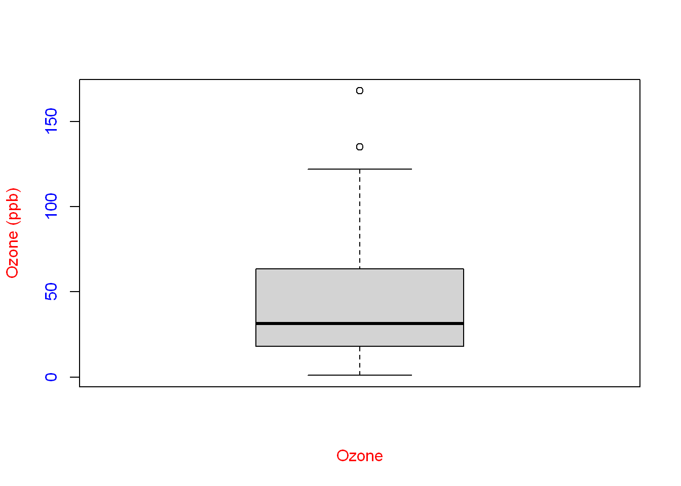
Summary
Since we used a boxplot already, let’s compare the values to summary()
summary(airquality$Ozone) Min. 1st Qu. Median Mean 3rd Qu. Max. NA's
1.00 18.00 31.50 42.13 63.25 168.00 37 Quantile
Let’s look at quantile() of the Ozone variable and see what it gives us.
So as you see
quantile(airquality$Ozone, na.rm = TRUE) 0% 25% 50% 75% 100%
1.00 18.00 31.50 63.25 168.00 Look at the values of Summary and Quantile, then look at the box plot:
The boxplot doesn’t make it obvious but the smallest reading is 1 as shown in quantile and summary
Similarly the 100%/Max reading is 168
The bottom part of the box is at 25% or 1st quarter
The top part of the box is at 75% or 3rd quater
So what’s in the box is 50% of the range (from quarter 1 to q3, and from 25-75%)
Within that box you’ll see a line that represents the 50% mark of the range (the Median)
Axis label color
We’ll want a boxplot of ozone as a function of the month in which the measurements were taken so we’ll use the R formula Ozone~Month, we color the labels of both axes
boxplot(Ozone ~ Month, airquality,xlab = "Month", ylab = "Ozone (ppb)",
        col.axis="blue", col.lab="red")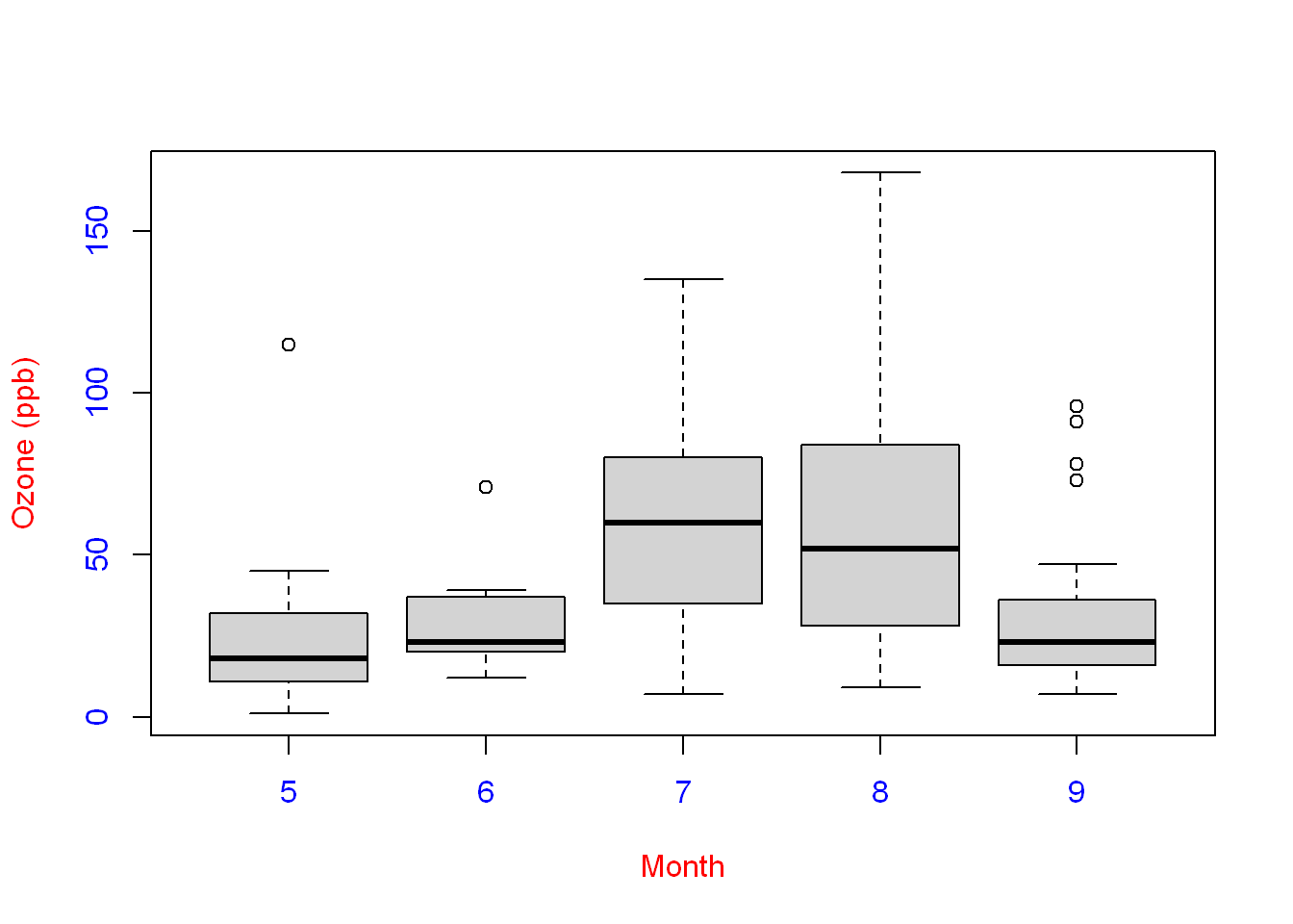
Title
Add a title to a single plot with title() as a layer, or main=“” could be added as an argument as we see later in the chapter.
boxplot(Ozone ~ Month, airquality,xlab = "Month", ylab = "Ozone (ppb)",
        col.axis="blue", col.lab="red")
title(main = "Ozone and Wind in New York City")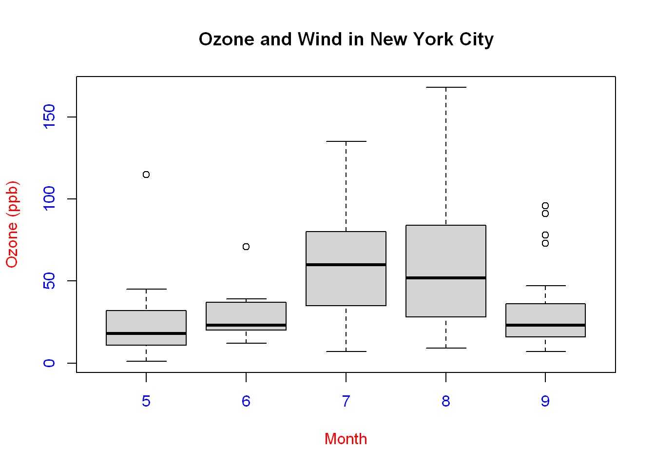
With
Instead of typing the data source over and over again let’s use with()
with(airquality, plot(Wind, Ozone, main="Ozone and Wind in New York City"))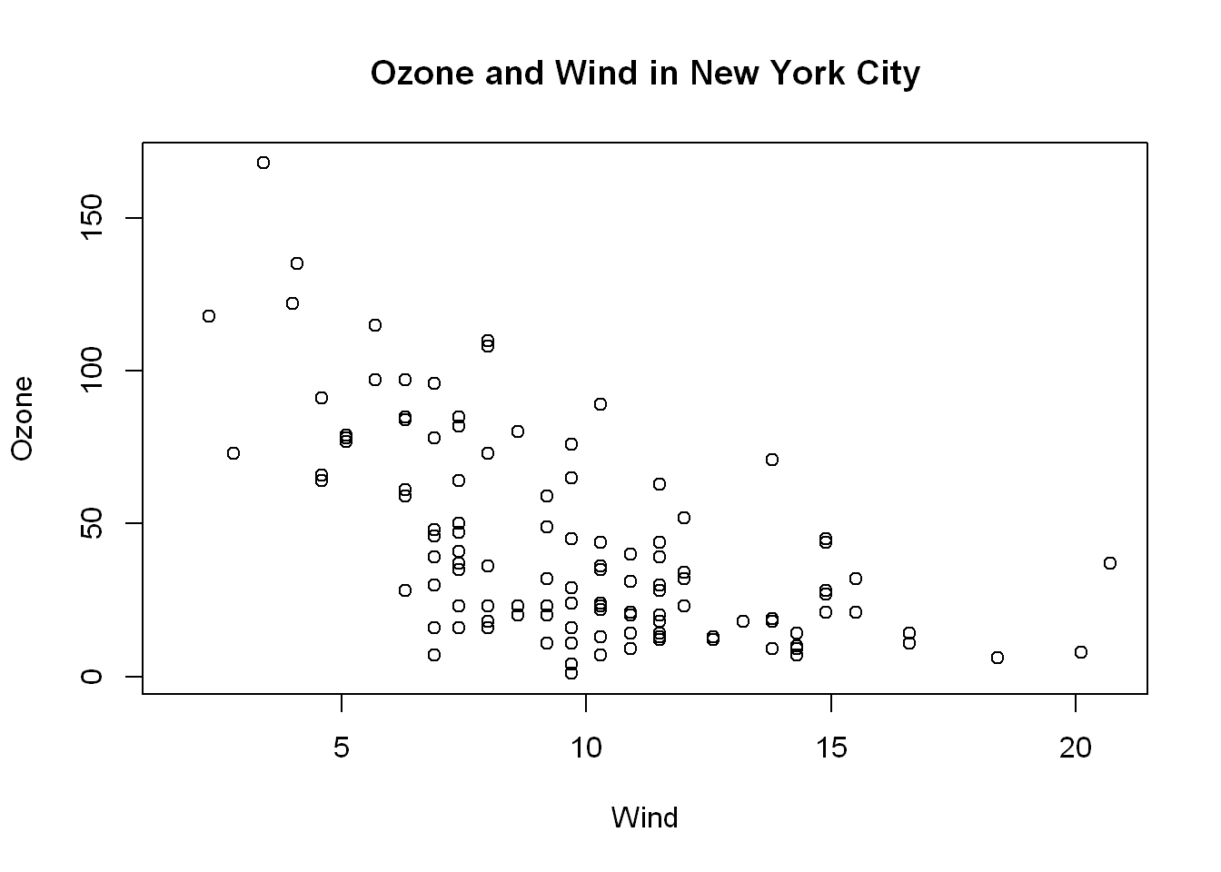
# or can have a separate layer
#title(main = ""Ozone and Wind in New York City")
Type n
type=“n” tells R not to plot any data, just to setup the plot
plot(airquality$Wind, airquality$Ozone, type="n")
plot(airquality$Wind, airquality$Ozone, type="n")
title(main="Wind and Ozone in NYC")
PCH
When creating plots in base R, you can use different shapes by specifying the pch = 0:18 argument.
“.” is handled specially, and is a rectangle
Note that unlike S (which uses octagons), symbols
1,10,13and16use circles. The filled shapes15:18do not include a border.0 = square.
1 = circle.
2 = triangle point up.
3 = plus.
4 = cross.
5 = diamond.
6 = triangle point down.
7 = square cross.
8 = star.
9 = diamond plus.
10 = circle plus.
11 = triangles up and down.
12 = square plus.
13 = circle cros.
14 = square and triangle down.
15 = filled square.
16 = filled circle.
17 = filled triangle point-up.
18 = filled diamond.
The following R plotting symbols are can be obtained with
pch = 19:25: those with21:25can be colored and filled with different colors:colgives the border color andbgthe background colorpch = 19: solid circle,pch = 20: bullet (smaller solid circle, 2/3 the size of19),pch = 21: filled circle,pch = 22: filled square,pch = 23: filled diamond,pch = 24: filled triangle point-up,pch = 25: filled triangle point down.
may <- subset(airquality, Month ==5)First we’ll subset the data to extract data related to the month of May, then we’ll use pch= controls the symbol character used in the plot. pch = 17 is the filled triangle, pch = 8 is the snow flake and we layer on top of the plot() we setup earlier with type=“n”
plot(airquality$Wind, airquality$Ozone, type="n")
title(main="Wind and Ozone in NYC")
may <- subset(airquality, Month ==5)
notmay <- subset(airquality, Month!=5)
points(notmay$Wind, notmay$Ozone, col="red",pch= 8 )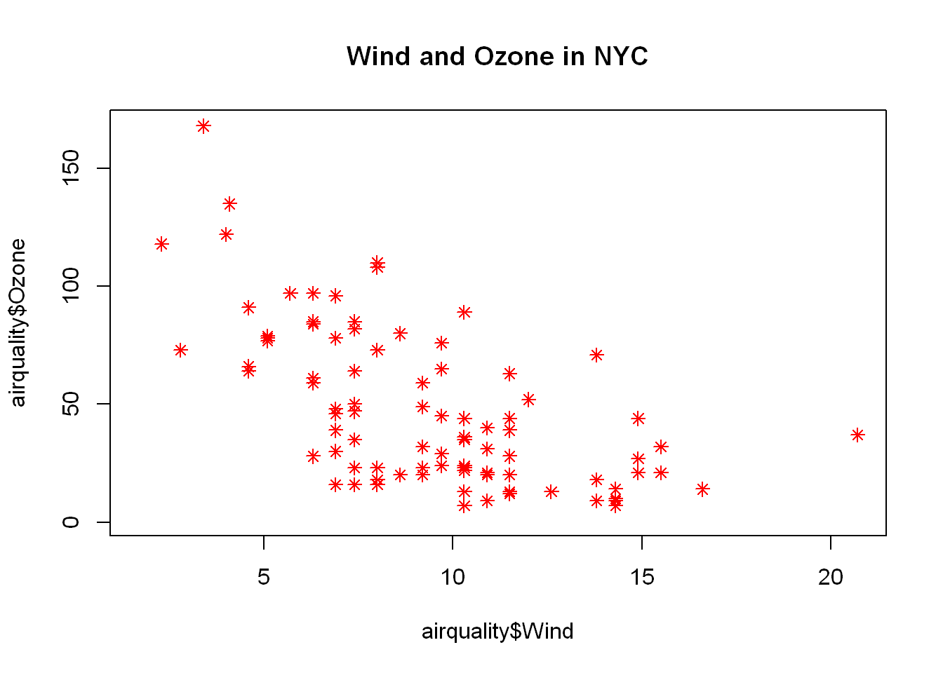
Legend
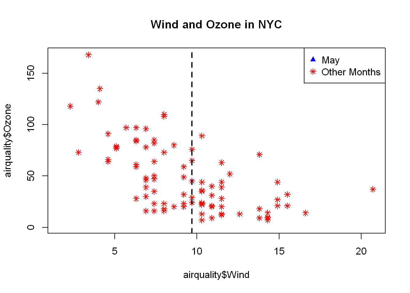
Let’s add a legend to the upper right corner.
plot(airquality$Wind, airquality$Ozone, type="n")
title(main="Wind and Ozone in NYC")
may <- subset(airquality, Month ==5)
notmay <- subset(airquality, Month!=5)
points(notmay$Wind, notmay$Ozone, col="red",pch= 8 )
legend("topright",pch=c(17,8),col=c("blue","red"),legend =c("May","Other Months") )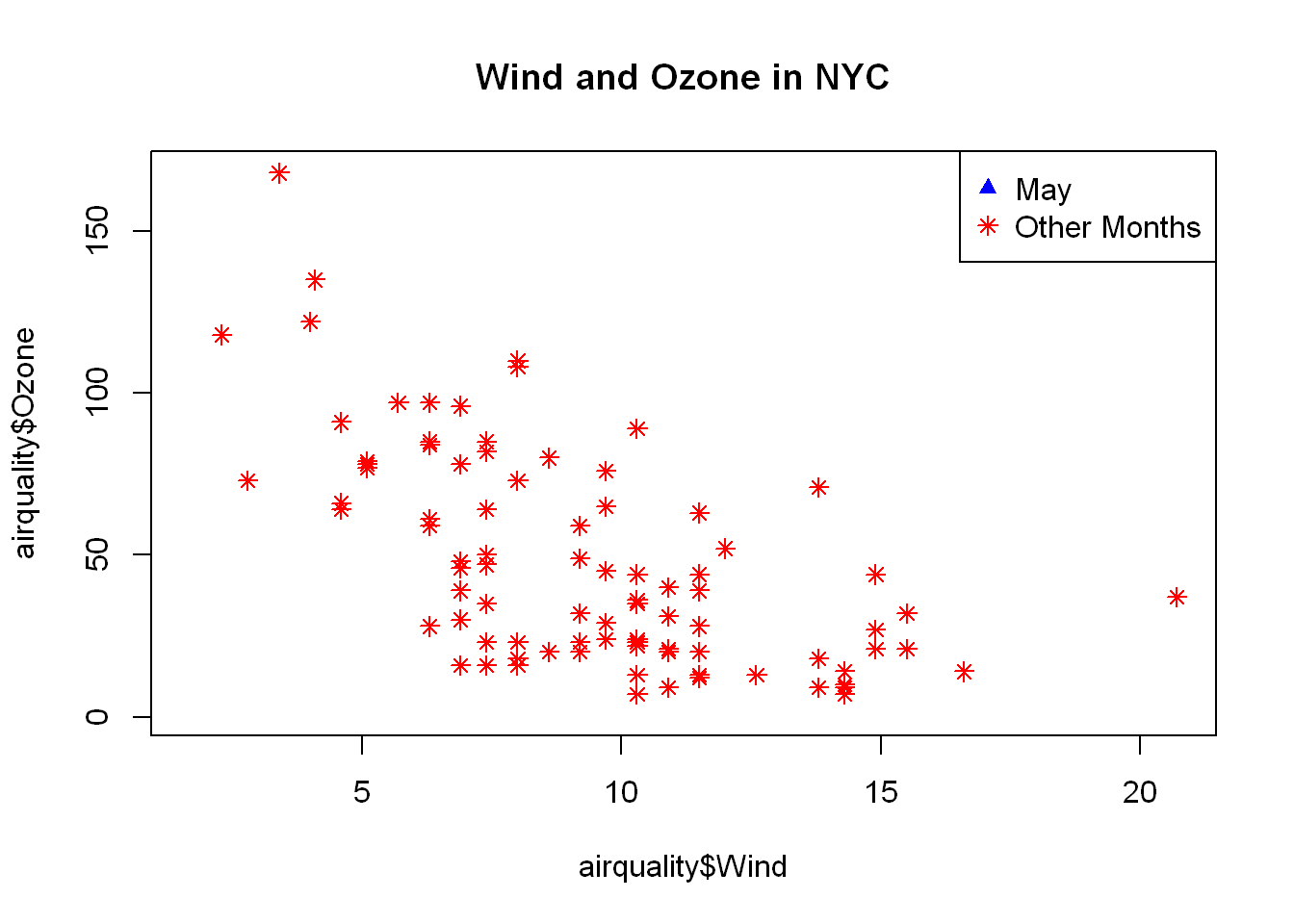
Add line
v=
h=
Add a vertical or horizontal line with v= or h=, in this case we add the vertical at a location specified by the median of the wind variable
Line type
The type of line is set using lty=, for dashed it’s = 2 solid line is default lty=1
- lty = 1 solid (default)
- 2 is dashed
- 3 is dotted
- 4 is dotdash
- 5 is longdash
- 6 is twodash
Line width
That’s set with ldw= 2 in this case, put it all together now and we get
plot(airquality$Wind, airquality$Ozone, type="n")
title(main="Wind and Ozone in NYC")
may <- subset(airquality, Month ==5)
notmay <- subset(airquality, Month!=5)
points(notmay$Wind, notmay$Ozone, col="red",pch= 8 )
legend("topright",pch=c(17,8),col=c("blue","red"),legend =c("May","Other Months") )
abline(v=median(airquality$Wind), lty=2, lwd=2)