library(tidyverse)
library(palmerpenguins)
library(ggthemes)
library(cowplot)
library(ggridges)ggplot - Variation
Data
We’ll be using the built-in diamonds and penguins and mpg datasets
Packages
Questions
Let’s start by asking questions we covered earlier: 1. What type of variation occurs within my variables? 2. What type of covariation occurs between my variables?
The rest of this page will look at these two questions. We’ll explain what variation and covariation are, and we’ll show you several ways to answer each question.
Variation
Every variable has its own pattern of variation, which can reveal interesting information about how that it varies between measurements on the same observation as well as across observations. The best way to understand that pattern is to visualize the distribution of the variable’s values.
Histogram
Binwidth
We’ll start our exploration by visualizing the distribution of weights (carat) of ~54,000 diamonds from the diamonds dataset. Since carat is a numerical variable, we can use a histogram:
ggplot(diamonds, aes(x = carat)) +
  geom_histogram(binwidth = 0.5)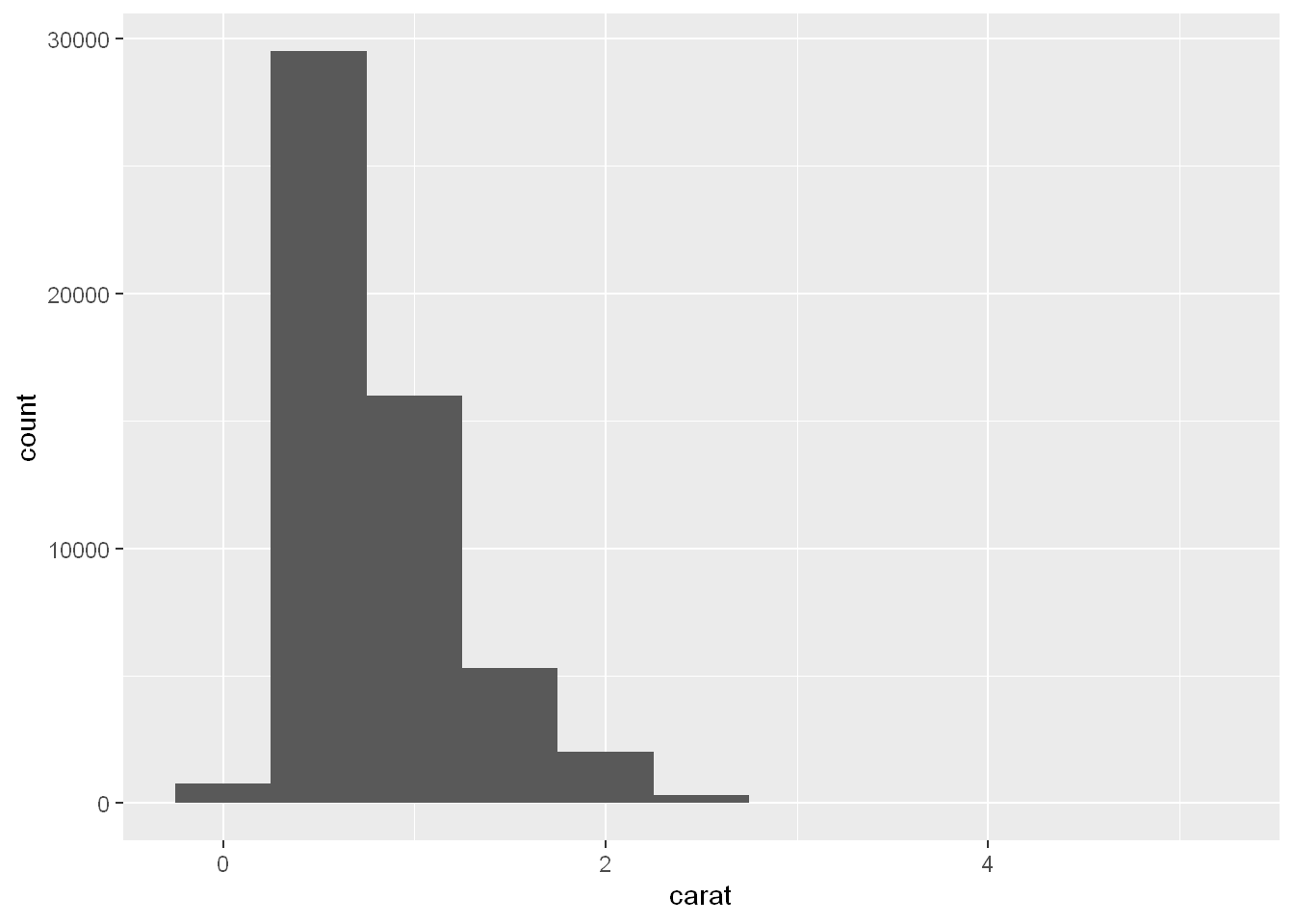
Now that you can visualize variation, what should you look for in your plots? And what type of follow-up questions should you ask? We’ve put together a list below of the most useful types of information that you will find in your graphs, along with some follow-up questions for each type of information. The key to asking good follow-up questions will be to rely on your curiosity (What do you want to learn more about?) as well as your skepticism (How could this be misleading?).
- The y-axis ranging from 0 to 30000.
- The distribution is right skewed with very few diamonds in the bin centered at 0,
- Almost 30000 diamonds in the bin centered at 0.5
- Approximately 15000 diamonds in the bin centered at 1
- Much fewer, approximately 5000 diamonds in the bin centered at 1.5
- Beyond this, there’s a trailing tail.
Typical values
In both bar charts and histograms, tall bars show the common values of a variable, and shorter bars show less-common values. Places that do not have bars reveal values that were not seen in your data. To turn this information into useful questions, look for anything unexpected: - Which values are the most common? Why? - Which values are rare? Why? Does that match your expectations? - Can you see any unusual patterns? What might explain them?
Let’s take a look at the distribution of carat for smaller diamonds.
smaller <- diamonds |>
  filter(carat < 3)

ggplot(smaller, aes(x = carat)) +
  geom_histogram(binwidth = 0.01)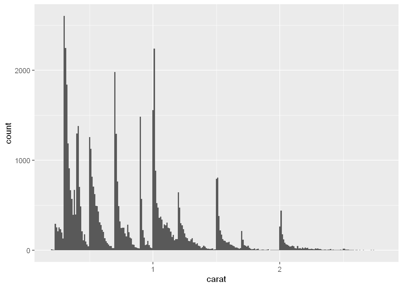
This histogram suggests several interesting questions:
- Why are there more diamonds at whole carats and common fractions of carats? - Why are there more diamonds slightly to the right of each peak than there are slightly to the left of each peak?
- Visualizations can also reveal clusters, which suggest that subgroups exist in your data. To understand the subgroups, ask:
- A histogram of carats of diamonds, with the x-axis ranging from 0 to 3 and the y-axis ranging from 0 to roughly 2500.
- The binwidth is quite narrow (0.01), resulting in a very large number of skinny bars.
- The distribution is right skewed, with many peaks followed by bars in decreasing heights, until a sharp increase at the next peak.
- How are the observations within each subgroup similar to each other?
- How are the observations in separate clusters different from each other?
- How can you explain or describe the clusters?
- Why might the appearance of clusters be misleading?
Some of these questions can be answered with the data while some will require domain expertise about the data. Many of them will prompt you to explore a relationship between variables, for example, to see if the values of one variable can explain the behavior of another variable. We’ll get to that shortly.
Unusual values
When you have a lot of data, outliers are sometimes difficult to see in a histogram. For example, take the distribution of the y variable from the diamonds dataset. The only evidence of outliers is the unusually wide limits on the x-axis.
ggplot(diamonds, aes(x = y)) +
  geom_histogram(binwidth = 0.5)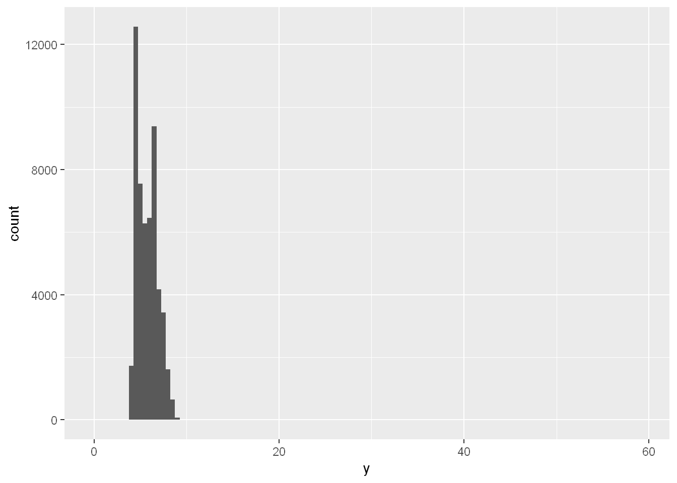
Coord_cartesian
Ylim
There are so many observations in the common bins that the rare bins are very short, making it very difficult to see them (although maybe if you stare intently at 0 you’ll spot something). To make it easy to see the unusual values, we need to zoom to small values of the y-axis with coord_cartesian():
ggplot(diamonds, aes(x = y)) +
  geom_histogram(binwidth = 0.5) +
  coord_cartesian(ylim = c(0, 50))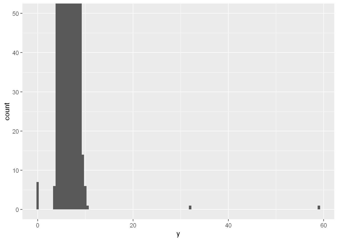
coord_cartesian() also has an xlim() argument for when you need to zoom into the x-axis. ggplot2 also has xlim() and ylim() functions that work slightly differently: they throw away the data outside the limits.
This allows us to see that there are three unusual values: 0, ~30, and ~60. We pluck them out with dplyr:
old <- options(tibble.print_max = 10, tibble.print_min = 10)unusual <- diamonds |>
filter(y < 3 | y > 20) |>
select(price, x, y, z) |>
arrange(y)
unusual# A tibble: 9 × 4
price x y z
<int> <dbl> <dbl> <dbl>
1 5139 0 0 0
2 6381 0 0 0
3 12800 0 0 0
4 15686 0 0 0
5 18034 0 0 0
6 2130 0 0 0
7 2130 0 0 0
8 2075 5.15 31.8 5.12
9 12210 8.09 58.9 8.06The y variable measures one of the three dimensions of these diamonds, in mm. We know that diamonds can’t have a width of 0mm, so these values must be incorrect. By doing EDA, we have discovered missing data that was coded as 0, which we never would have found by simply searching for NAs. Going forward we might choose to re-code these values as NAs in order to prevent misleading calculations. We might also suspect that measurements of 32mm and 59mm are implausible: those diamonds are over an inch long, but don’t cost hundreds of thousands of dollars!
It’s good practice to repeat your analysis with and without the outliers. If they have minimal effect on the results, and you can’t figure out why they’re there, it’s reasonable to omit them, and move on. However, if they have a substantial effect on your results, you shouldn’t drop them without justification. You’ll need to figure out what caused them (e.g., a data entry error) and disclose that you removed them in your write-up.
Observations
- Explore the distribution of each of the
x,y, andzvariables indiamonds. What do you learn? Think about a diamond and how you might decide which dimension is the length, width, and depth. - Explore the distribution of
price. Do you discover anything unusual or surprising? (Hint: Carefully think about thebinwidthand make sure you try a wide range of values.) - How many diamonds are 0.99 carat? How many are 1 carat? What do you think is the cause of the difference?
- Compare and contrast
coord_cartesian()vs.xlim()orylim()when zooming in on a histogram. What happens if you leavebinwidthunset? What happens if you try and zoom so only half a bar shows?
Unusual values - continued
If you’ve encountered unusual values in your dataset, and simply want to move on to the rest of your analysis, you have two options.
- Drop the entire row with the strange values:
diamonds2 <- diamonds |>
  filter(between(y, 3, 20))
We don’t recommend this option because one invalid value doesn’t imply that all the other values for that observation are also invalid. Additionally, if you have low quality data, by the time that you’ve applied this approach to every variable you might find that you don’t have any data left!
Mutate
Instead, we recommend replacing the unusual values with missing values. The easiest way to do this is to use
mutate()to replace the variable with a modified copy. You can use theif_else()function to replace unusual values withNA:diamonds2 <- diamonds |> mutate(y = if_else(y < 3 | y > 20, NA, y))
geom_point
It’s not obvious where you should plot missing values, so ggplot2 doesn’t include them in the plot, but it does warn that they’ve been removed:
#| dev: "png"
#| fig-alt: |
#|   A scatterplot of widths vs. lengths of diamonds. There is a strong,
#|   linear association between the two variables. All but one of the diamonds
#|   has length greater than 3. The one outlier has a length of 0 and a width
#|   of about 6.5.

ggplot(diamonds2, aes(x = x, y = y)) +
  geom_point()
Warning: Removed 9 rows containing missing values or values outside the scale range
(`geom_point()`).
na.rm = TRUE
To suppress that warning, set na.rm = TRUE:
ggplot(diamonds2, aes(x = x, y = y)) +
  geom_point(na.rm = TRUE)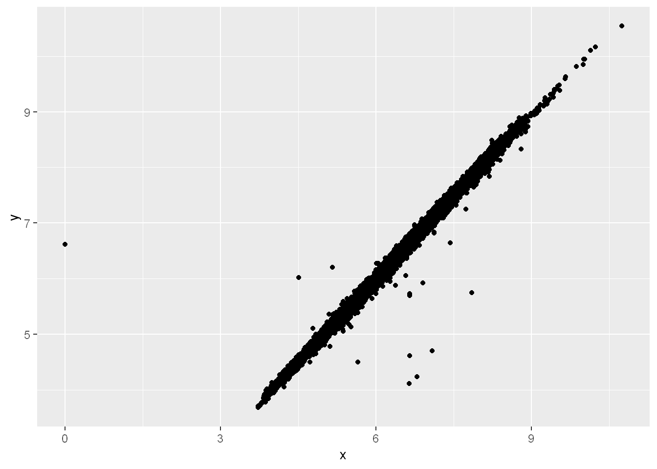
geom_freqpoly
Visualise the distribution of a single continuous variable by dividing the x axis into bins and counting the number of observations in each bin.
Histograms (
geom_histogram()) display the counts with bars; frequency polygons (geom_freqpoly()) display the counts with lines. Frequency polygons are more suitable when you want to compare the distribution across the levels of a categorical variable.
geom_freqpoly
Other times you want to understand what makes observations with missing values different to observations with recorded values. For example, in nycflights13::flights, missing values in the dep_time variable indicate that the flight was cancelled. So you might want to compare the scheduled departure times for cancelled and non-cancelled times. You can do this by making a new variable, using is.na() to check if dep_time is missing.
nycflights13::flights |>
  mutate(
    cancelled = is.na(dep_time),
    sched_hour = sched_dep_time %/% 100,
    sched_min = sched_dep_time %% 100,
    sched_dep_time = sched_hour + (sched_min / 60)
  ) |>
  ggplot(aes(x = sched_dep_time)) +
  geom_freqpoly(aes(color = cancelled), binwidth = 1/4)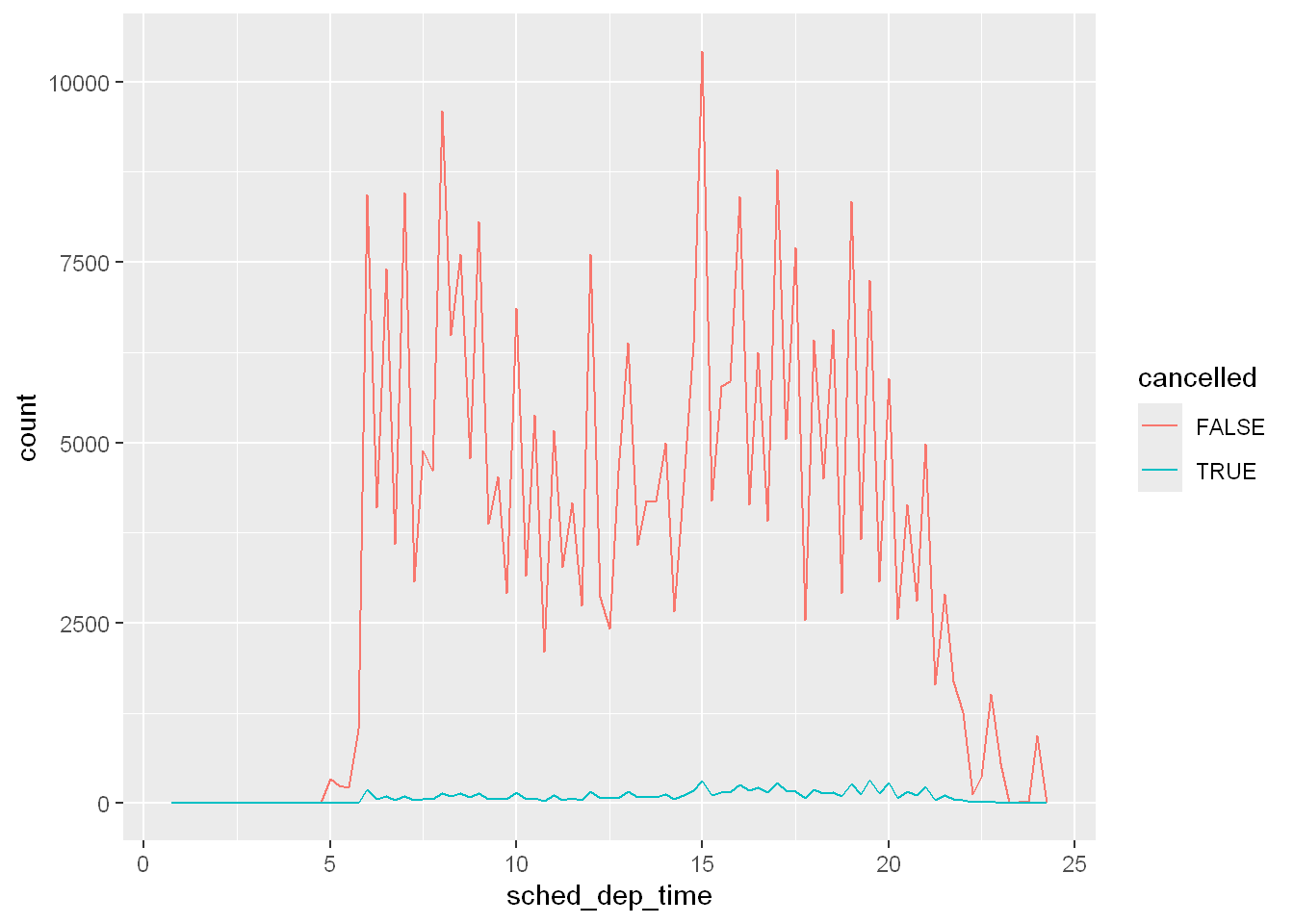
However this plot isn’t great because there are many more non-cancelled flights than cancelled flights. In the next section we’ll explore some techniques for improving this comparison.
Observations
- What happens to missing values in a histogram? What happens to missing values in a bar chart? Why is there a difference in how missing values are handled in histograms and bar charts?
- What does
na.rm = TRUEdo inmean()andsum()? - Recreate the frequency plot of
scheduled_dep_timecolored by whether the flight was cancelled or not. Also facet by thecancelledvariable. Experiment with different values of thescalesvariable in the faceting function to mitigate the effect of more non-cancelled flights than cancelled flights.
Categorical Variable
Bar chart
A variable is categorical if it can only take one of a small set of values. To examine the distribution of a categorical variable, you can use a bar chart. The height of the bars displays how many observations occurred with each x value.
ggplot(penguins, aes(x = species)) + geom_bar()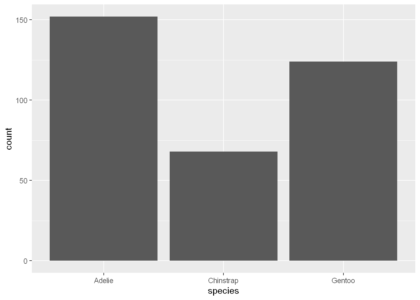
Reorder Bar chart
fct_infreq
In bar plots of categorical variables with non-ordered levels, like the penguin species above, it’s often preferable to reorder the bars based on their frequencies. Doing so requires transforming the variable to a factor (how R handles categorical data) and then reordering the levels of that factor. Now you see how the bars are arranged in descending order
ggplot(penguins, aes(x = fct_infreq(species))) + geom_bar()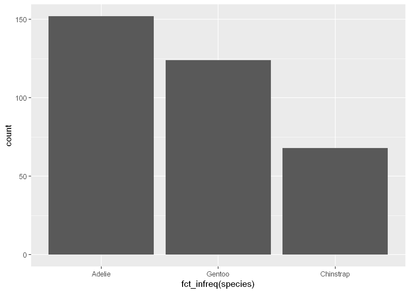
Numerical Variable
Histogram
A variable is numerical (or quantitative) if it can take on a wide range of numerical values, and it is sensible to add, subtract, or take averages with those values. Numerical variables can be continuous or discrete.
A histogram divides the x-axis into equally spaced bins then displays the number of observations for each bin in a bar.
Binwidth
You can set the bin width with binwidth=.
ggplot(penguins, aes(x = body_mass_g)) + geom_histogram(binwidth = 200)Warning: Removed 2 rows containing non-finite outside the scale range
(`stat_bin()`).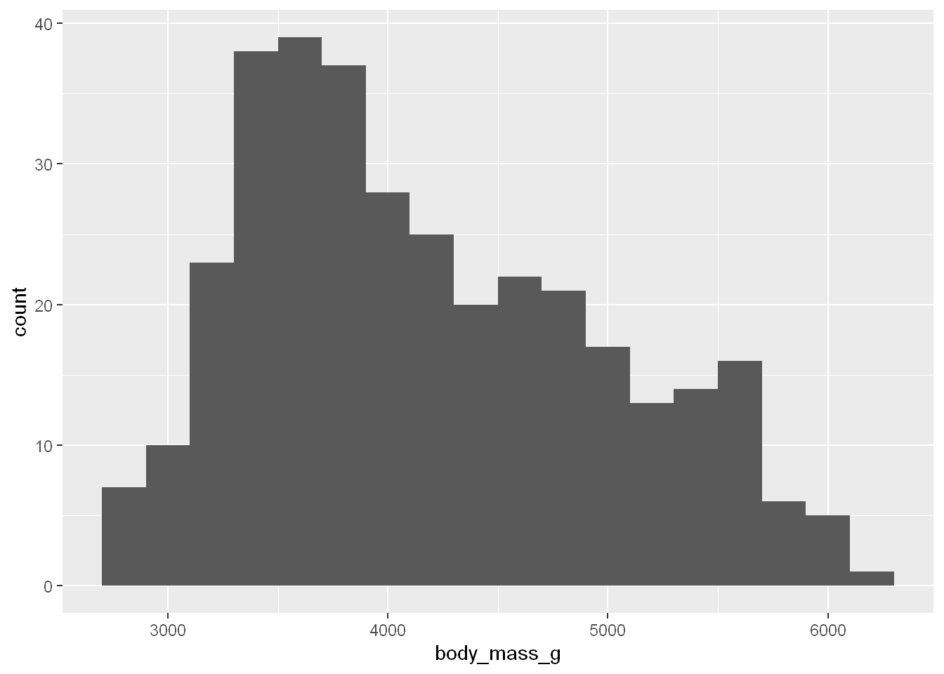
Density
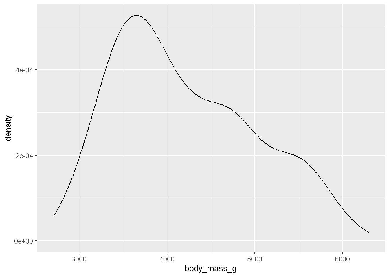
An alternative for distributions of numerical values is a density plot. It’s a smoothed out version of a histogram particularly for continuous data that comes from an underlying smooth distribution.
geom_density
ggplot(penguins, aes(x = body_mass_g)) + geom_density()Warning: Removed 2 rows containing non-finite outside the scale range
(`stat_density()`).