library(tidyverse)ggplot - qplot
As we’ve already learned about ggplot2, qplot is part of the package, it is used for Quick Plots (qplot), I will cover it briefly since it was deprecated.
Scenario 1
Data
We’ll be working with mpg a built-in dataset.
Packages
Scatterplot
Let’s start with the default dataset within ggplot2, the mpg dataframe.
str(mpg)tibble [234 × 11] (S3: tbl_df/tbl/data.frame)
$ manufacturer: chr [1:234] "audi" "audi" "audi" "audi" ...
$ model : chr [1:234] "a4" "a4" "a4" "a4" ...
$ displ : num [1:234] 1.8 1.8 2 2 2.8 2.8 3.1 1.8 1.8 2 ...
$ year : int [1:234] 1999 1999 2008 2008 1999 1999 2008 1999 1999 2008 ...
$ cyl : int [1:234] 4 4 4 4 6 6 6 4 4 4 ...
$ trans : chr [1:234] "auto(l5)" "manual(m5)" "manual(m6)" "auto(av)" ...
$ drv : chr [1:234] "f" "f" "f" "f" ...
$ cty : int [1:234] 18 21 20 21 16 18 18 18 16 20 ...
$ hwy : int [1:234] 29 29 31 30 26 26 27 26 25 28 ...
$ fl : chr [1:234] "p" "p" "p" "p" ...
$ class : chr [1:234] "compact" "compact" "compact" "compact" ...We see that there are 234 points in the dataset concerning 11 different characteristics of the cars. Suppose we want to see
If there’s a correlation between engine displacement (displ) and
highway miles per gallon (hwy).
As we did with the plot function of the base system we could simply call qplot with 3 arguments, the first two are the variables we want to examine and the third argument data is set equal to the name of the dataset which contains them (in this case, mpg).
You’ll see all the labels are provided
First argument is shown on the x-axis, second on the y
qplot(displ, hwy, data=mpg)Warning: `qplot()` was deprecated in ggplot2 3.4.0.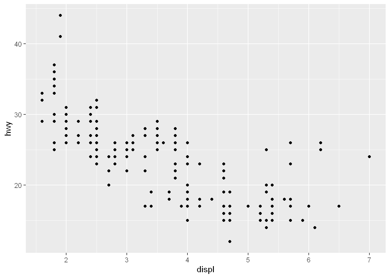
Color
Let’s say we want to know which points belong to which (drv) type. So basically we want to color by group, here we’ll use the aesthetic for color. We could’ve used a different aes instead of color, we could use shape=
qplot(displ, hwy, data= mpg, color= drv)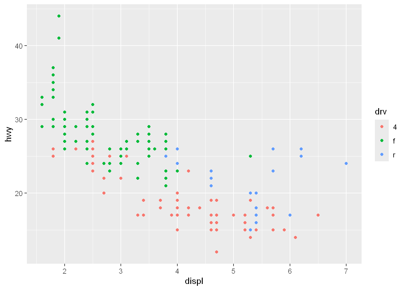
Smoothing trend line
Let’s add geom to the plot.
First let’s add points using the geom
Also add a smoothing line as well,
We can concatenate the two together in the 4th argument geom=
The results will show a wide smoothing area (a 95% confidence interval) for each color/drv line.
It also tells us which method it used as the default for smoothing the data y~x (y in relation to x)
qplot(displ, hwy, data= mpg, color= drv, geom = c("point", "smooth"))`geom_smooth()` using method = 'loess' and formula = 'y ~ x'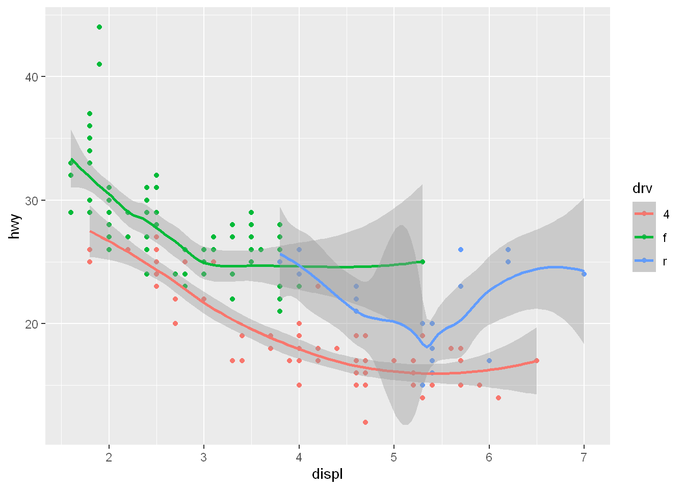
geom_smooth
This is a ggplot function that can be used with qplot() as well. If we want to show a smooth linear line we can do the following to the diamonds dataset. The full example is shown in ggplot - Sample 2
qplot(carat, price, data= diamonds, color=cut) +
        geom_smooth(method = "lm")
`geom_smooth()` using formula = 'y ~ x'
No x value
Let’s say we want to know
How were the data points of hwy mpg spread out
For each drv type, in other words
We plot the hwy values against nothing in the x axis and qplot will automatically use the range of the dataframe (234 total rows) to plot the hwy (y=hwy) in the colors indicated by the color= argument (per drv)
So, specifying the y parameter only, without an x argument, plots the values of the y argument in the order in which they occur in the data.
qplot(y=hwy, data=mpg, color=drv)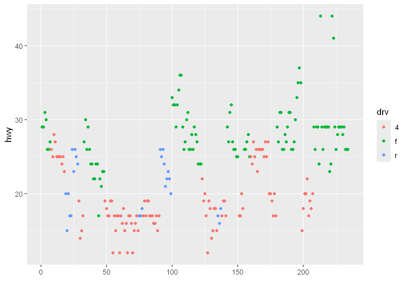
Boxplot
geom
We want to look at the range of hwy values per drv using geom= boxplot. So we end up with
- 3 regions/boxes one for each drv (it is called a factor/group)
qplot(drv, hwy, data=mpg, geom="boxplot")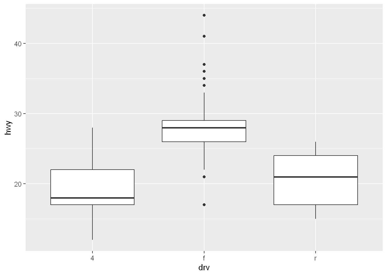
Let’s color by manufacturer
qplot(drv, hwy, data=mpg, geom="boxplot", color=manufacturer)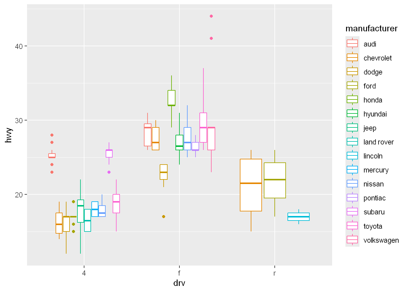
Histogram
Histograms display frequency counts for a single variable.
Let’s plot bins/buckets/bars for the occurrence of each hwy value and let’s color/fill them by drv type.
One thing is obvious the 4 wheel drive doesn’t have a single bin exceeding 30 mpg.
qplot(hwy, data=mpg, fill=drv)`stat_bin()` using `bins = 30`. Pick better value with `binwidth`.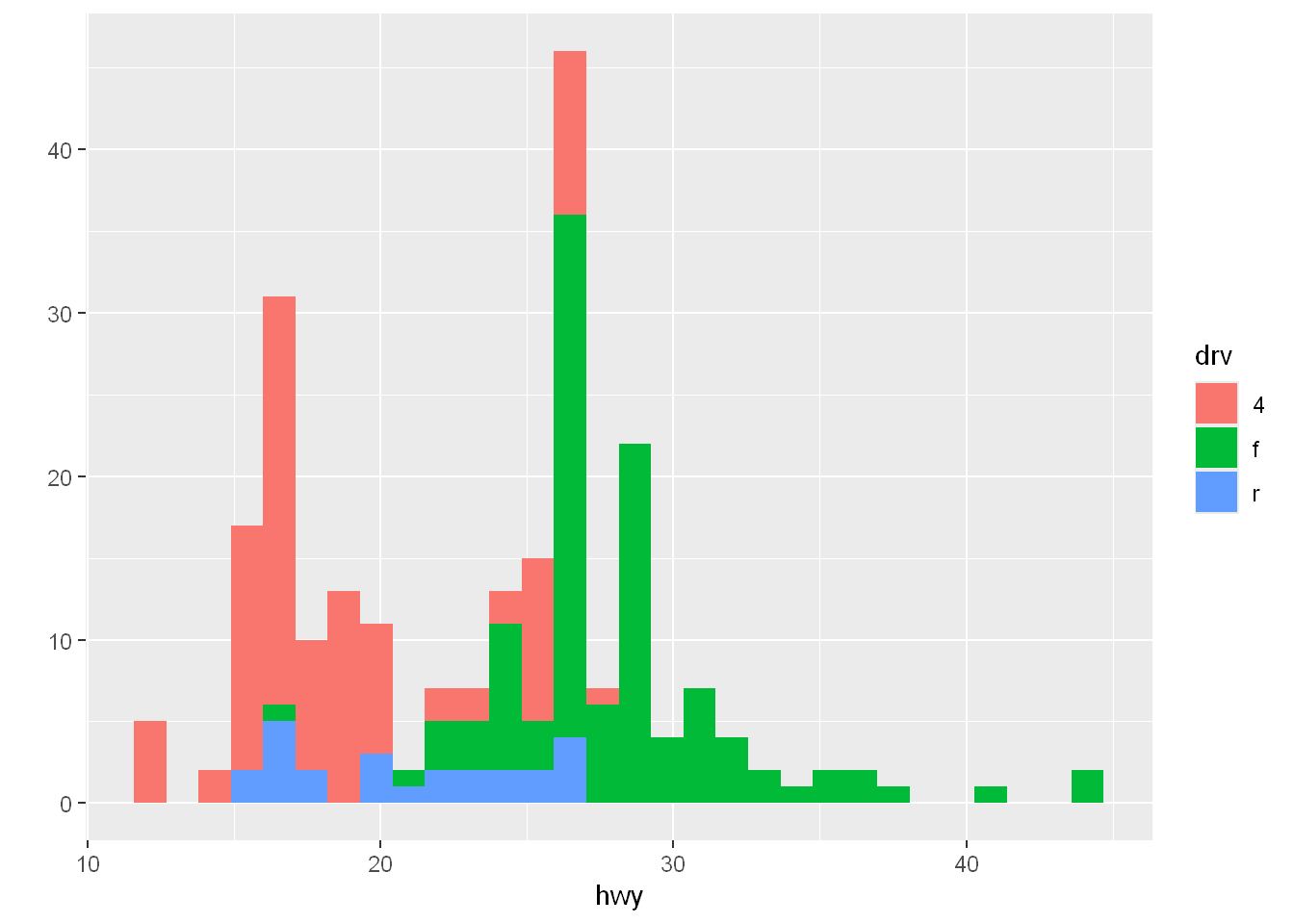
Facets
For some of us it’s hard to read histograms, so let’s split this plot into panels. So since we have 3 groups of drives, we’ll split the plot into 3 smaller individual plots for each subset.
Scatterplot
Let’s start with scatterplot panels.
.~drv means: what’s left of the ~ are the number of rows, what’s to the right are the columns
So since . is to the left of the ~ that means we only have the base 1
drv is on the right of the ~ which means we have as many columns as there are factors/groups in drv
The panels show a more detailed relationship than the histogram. The relationship of each drv type is broken down by panel
qplot(displ, hwy, data=mpg, facets = .~drv)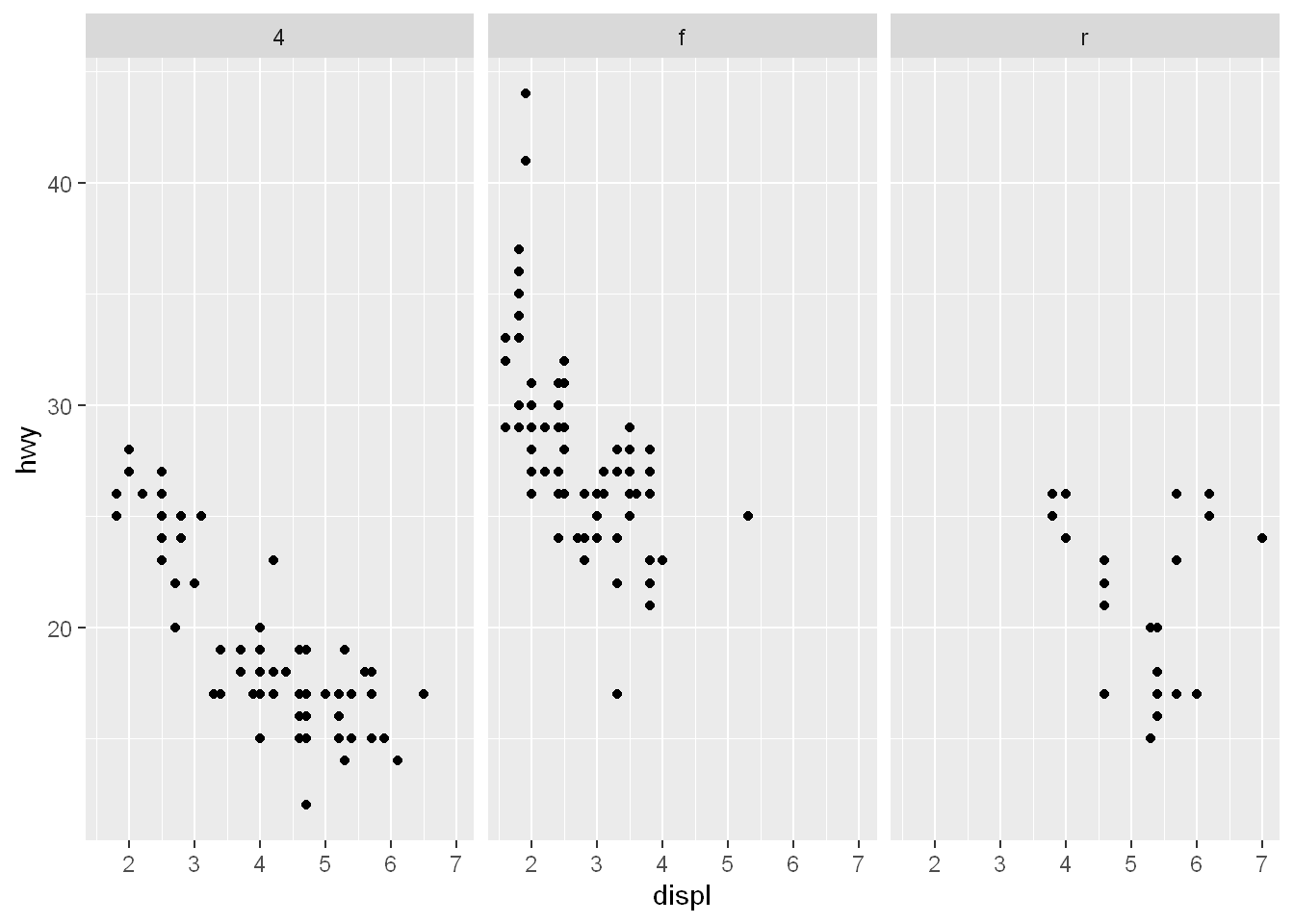
Histogram
Binwidth
Let’s lay the panels into rows this time, so all we do is move drv to the left of the ~
Set the binwidth of the histogram to 2 to make it wider
qplot(hwy, data=mpg, facets = drv ~ ., binwidth=2)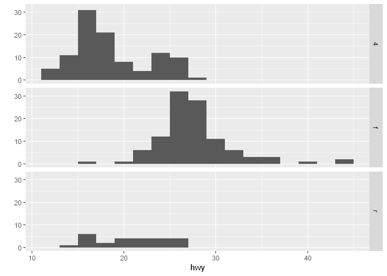
Scenario 2
Data
We’ll be working with the diamonds default data with ggplot2.
str(diamonds)tibble [53,940 × 10] (S3: tbl_df/tbl/data.frame)
$ carat : num [1:53940] 0.23 0.21 0.23 0.29 0.31 0.24 0.24 0.26 0.22 0.23 ...
$ cut : Ord.factor w/ 5 levels "Fair"<"Good"<..: 5 4 2 4 2 3 3 3 1 3 ...
$ color : Ord.factor w/ 7 levels "D"<"E"<"F"<"G"<..: 2 2 2 6 7 7 6 5 2 5 ...
$ clarity: Ord.factor w/ 8 levels "I1"<"SI2"<"SI1"<..: 2 3 5 4 2 6 7 3 4 5 ...
$ depth : num [1:53940] 61.5 59.8 56.9 62.4 63.3 62.8 62.3 61.9 65.1 59.4 ...
$ table : num [1:53940] 55 61 65 58 58 57 57 55 61 61 ...
$ price : int [1:53940] 326 326 327 334 335 336 336 337 337 338 ...
$ x : num [1:53940] 3.95 3.89 4.05 4.2 4.34 3.94 3.95 4.07 3.87 4 ...
$ y : num [1:53940] 3.98 3.84 4.07 4.23 4.35 3.96 3.98 4.11 3.78 4.05 ...
$ z : num [1:53940] 2.43 2.31 2.31 2.63 2.75 2.48 2.47 2.53 2.49 2.39 ...Histogram
Let’s plot the price
Not only you get a histogram but you get a message that bins=30 and asking to pick a better value. The default is calculated from range/30.
qplot(price, data=diamonds)`stat_bin()` using `bins = 30`. Pick better value with `binwidth`.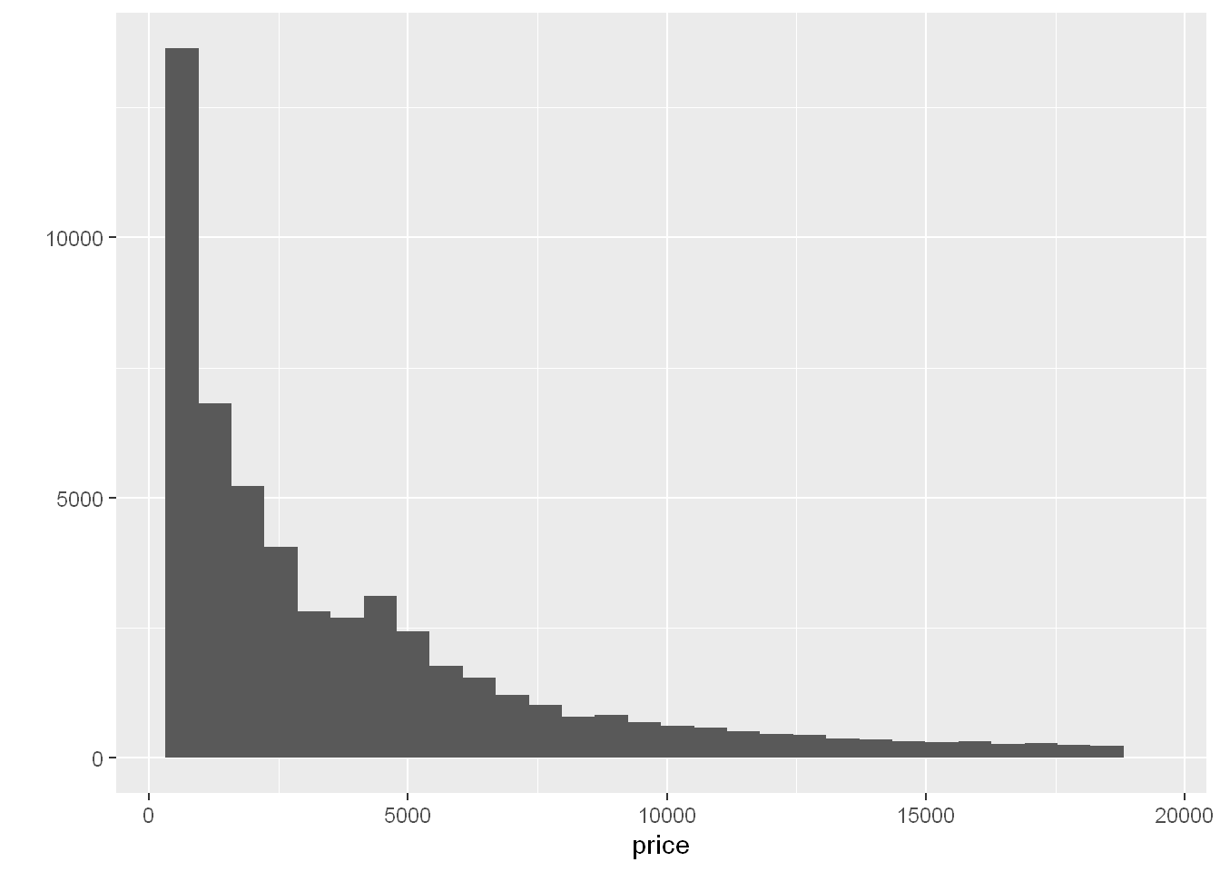
If you run range() you’ll see how they came up with bins=30. From the range calculate the difference and use it to size the bins
range(diamonds$price)[1] 326 18823bins
Size the bins from the diff in the range, so now the bins are 616.5667 wide. So each bin is a price increment of $616.5667
qplot(price, data=diamonds, binwidth = 18497/30)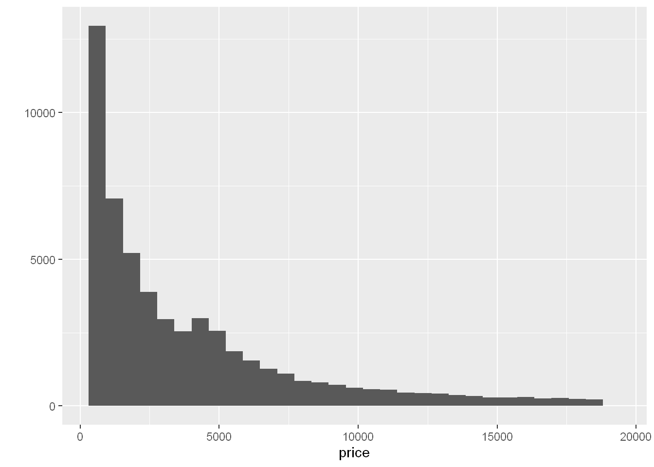
brk: If you create a vector of length (range) and of sequence with each sequence 617 from the previous one you’ll know the tick marks of the x-axis. Let’s call that vector: brk with first count is for prices from $0 to $617, second from $617 and $1234…
counts: is the number of diamonds in each bin, so the first object is 4611 which is the height of the first bar
Of course you can view these vectors by typing their names in the command line
fill
Let’s fill the bar with the colors corresponding to the cut size, so each bar shows the count for each cut in that price range
qplot(price, data=diamonds, binwidth = 18497/30, fill=cut)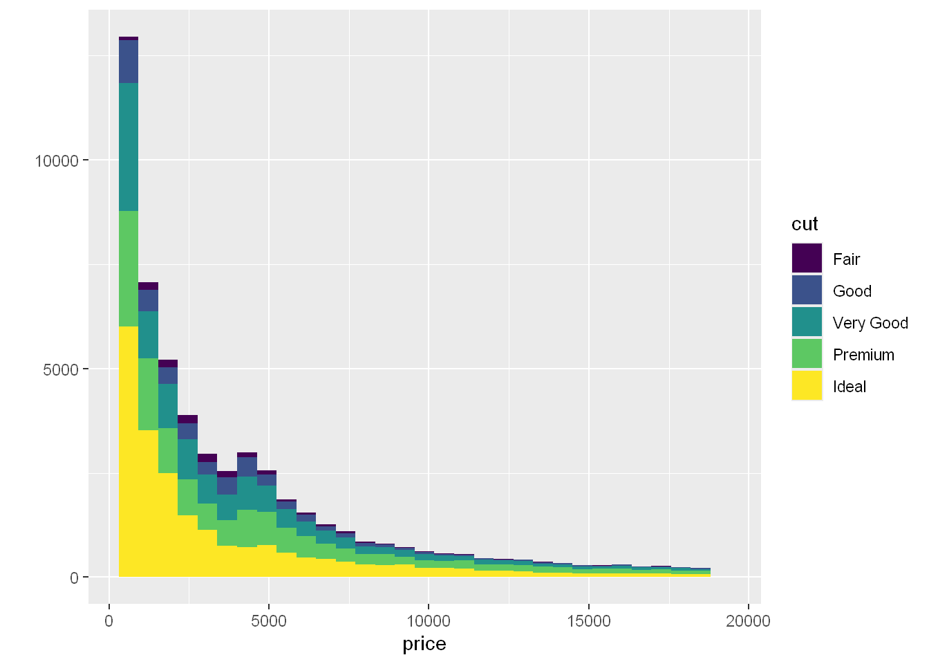
geom
Let’s replot price again but as a density function.
This will show the proportion of diamonds in each bin as opposed to the count in each bin. The shape will be similar but the scale is different, and the area under the curve is equal to one.
So let’s add a third geom = “density”. The highest peak is around 0 and goes down except around $4000 where there is a slight increase.
qplot(price, data=diamonds, geom = "density")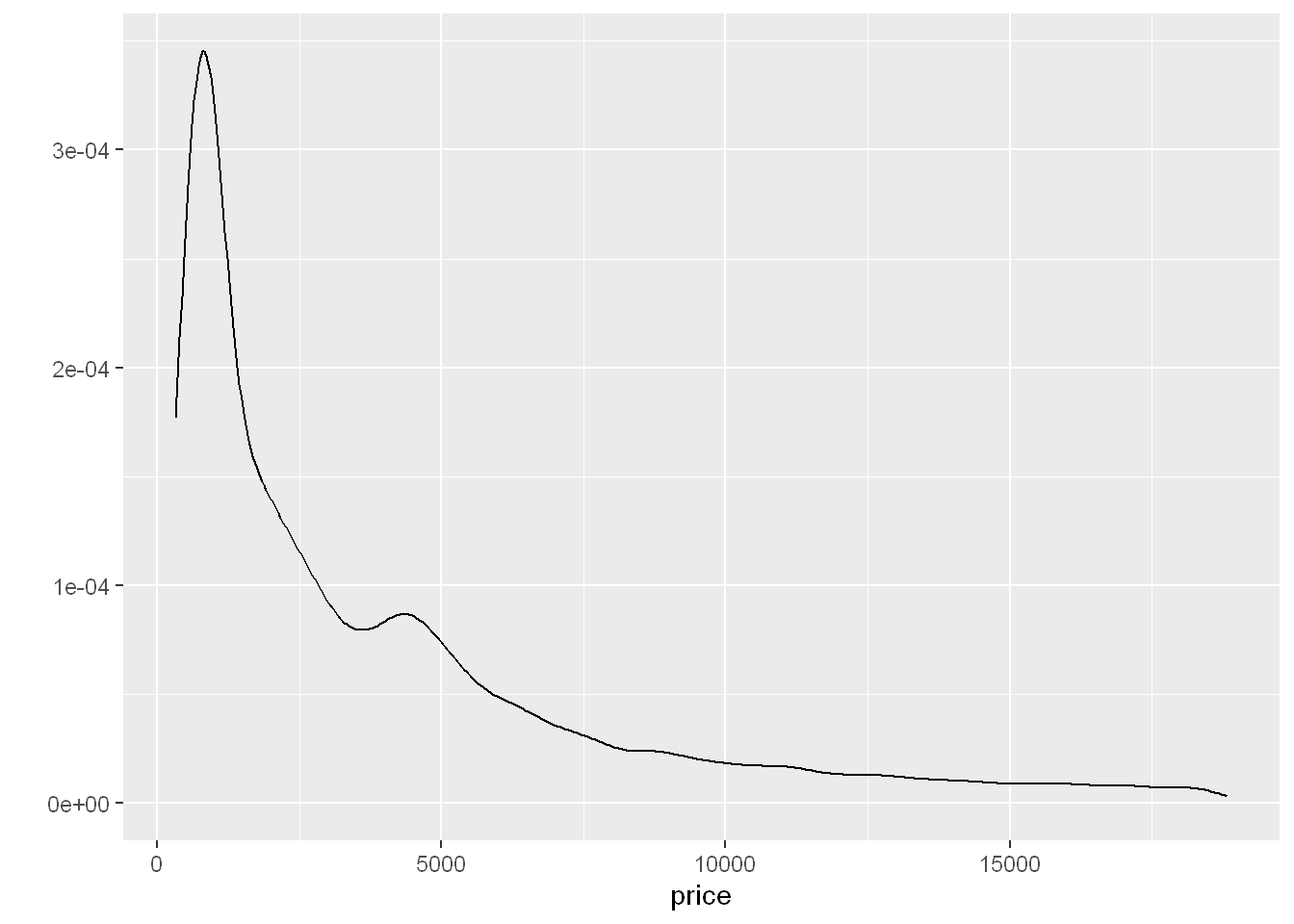
Let’s see what’s responsible for this increase? Let’s add color =cut and see if that shows us something.
qplot(price, data=diamonds, geom = "density", color=cut)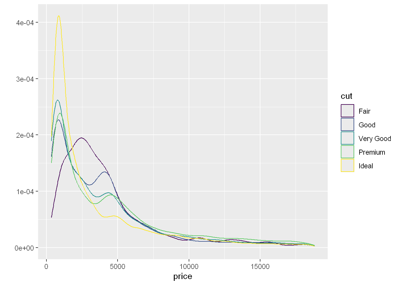
Well the lines and color is pretty sad, I can’t see a darn thing, except I see an increase in the good, very good, and premium lines. So we do see a reason for the peak around $4000 which is caused by the type of cut and how they are priced
Scatterplot
Let’s plot the price per carat size, as the size of diamonds goes up so does the price DUH!
qplot(carat, price, data= diamonds)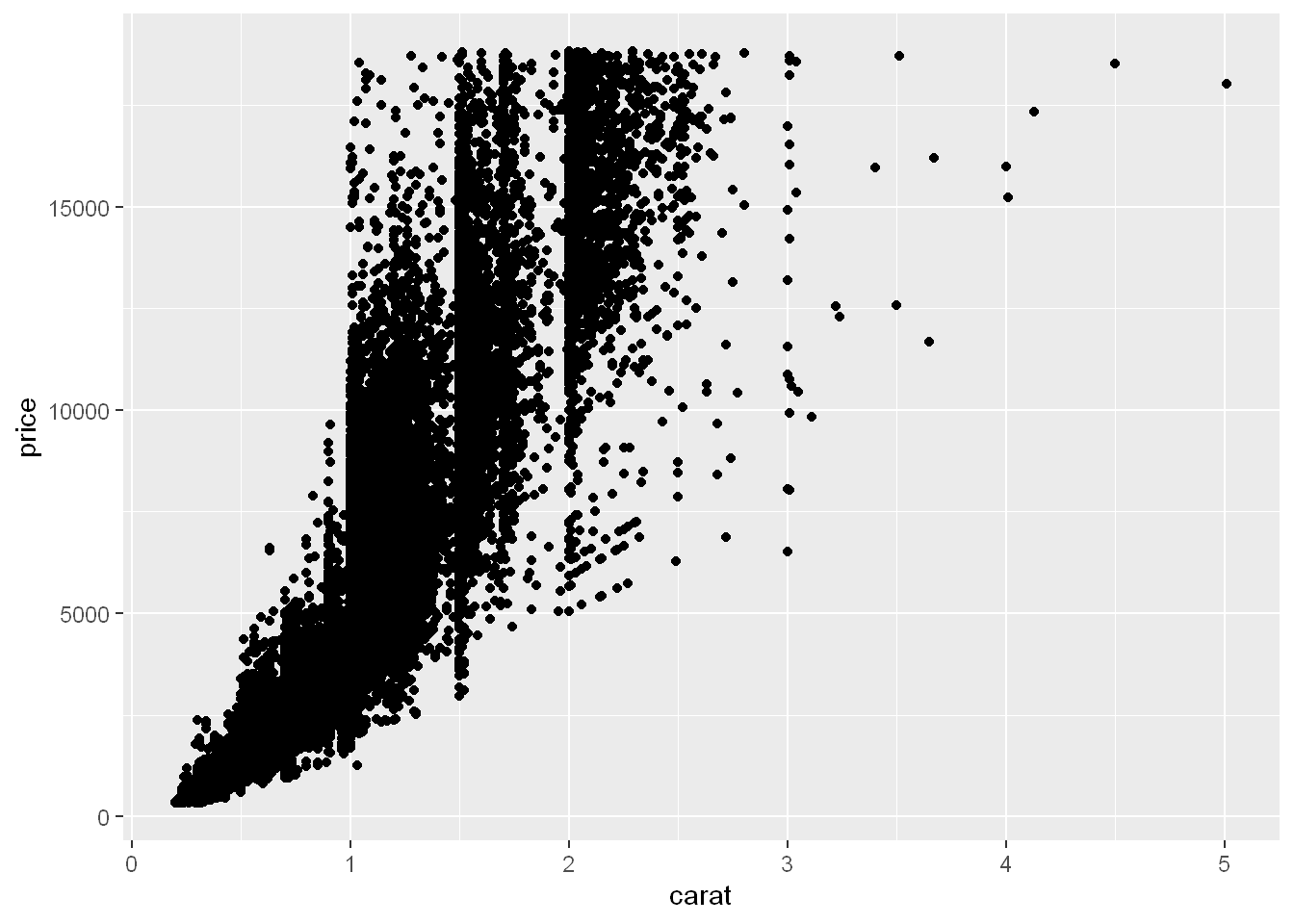
shape
We can set the geom shape to be based on a variable. In this case let’s set it to the type of cut. Now each cut is shown as a different geom/symbol.
qplot(carat, price, data= diamonds, shape=cut)Warning: Using shapes for an ordinal variable is not advised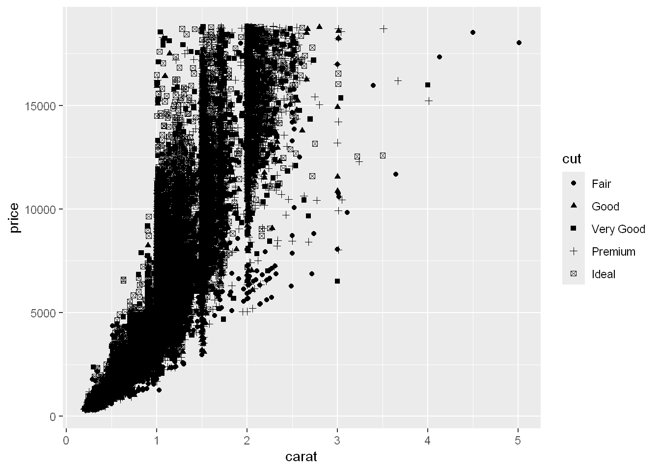
color
It’s hard to see so let’s try color instead
qplot(carat, price, data= diamonds, shape=cut)Warning: Using shapes for an ordinal variable is not advised
geom_smooth
method = lm
Even though this is a ggplot function, it can be used here with qplot to display a smooth linear line with the shadow around each line showing the 95% confidence interval. We can see the better the cut (yellow) the steeper the price point line is.
qplot(carat, price, data= diamonds, color=cut) + geom_smooth(method = "lm")`geom_smooth()` using formula = 'y ~ x'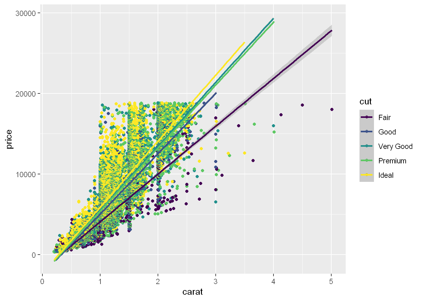
Facets
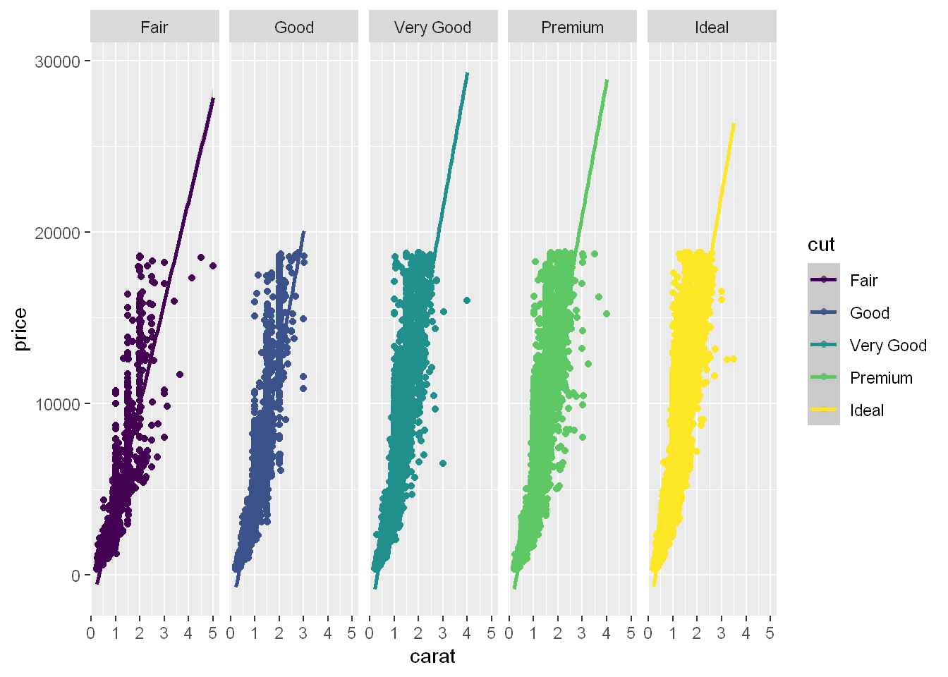
Of course we knew it was coming to this, since it’s hard to tell from the scatter plot, let’s break them down into subplots/panels/facets and see if we have something. So let’s divide the plot by cut, so we have one row and 5 columns for the cuts.
qplot(carat, price, data= diamonds, color=cut, facets = .~cut) +
        geom_smooth(method = "lm")
`geom_smooth()` using formula = 'y ~ x'