library(lattice)
library(ggplot2)
library(jpeg)
library(RColorBrewer)
library(datasets)Lattice - Background
The lattice plotting system is completely separate and independent of the base plotting system. It’s an add-on package so it has to be explicitly loaded with a call to the R function library.
Lattice is an implementation of the Trellis graphics for R with an emphasis on multivariate data.
Lattice is implemented using two packages:
- The first is called, not surprisingly, lattice, and it contains code for producing Trellis graphics. Some of the functions in this package are the higher level functions which you would call. These include xyplot( scatterplots ), bwplot for ( box and whiskers), boxplot (box plots), histogram (histograms), and several others like: stipplot, dotplot, splom and levelplot.
- The second package in the lattice system is grid which contains the low-level functions upon which the lattice package is built. You’ll seldom call functions from the grid package directly.
Packages
Unlike base plotting, the lattice system does not have a “two-phase” aspect with separate plotting and annotation. Instead all plotting and annotation is done at once with a single function call.
Lattice returns an object of class trellis, then the print method plots the graphic on the device. It returns “plot objects” that can be stored. If you don’t save the plot into an object it will automatically print onto your device.
xyplot
We’ve used the airquality dataset before, let’s use it again:
head(airquality) Ozone Solar.R Wind Temp Month Day
1 41 190 7.4 67 5 1
2 36 118 8.0 72 5 2
3 12 149 12.6 74 5 3
4 18 313 11.5 62 5 4
5 NA NA 14.3 56 5 5
6 28 NA 14.9 66 5 6Let’s plot the dataset, you’ll see Lattice
- Uses open circles as default
- Labeled the axes
xyplot(Ozone~Wind, data = airquality)
For example look at this example:
- The first line doesn’t print anything but if you look in the Environment panel you’ll see the object “p”
- With a list of 45 parameters and their values
p <- xyplot(Ozone ~ Wind, data=airquality)But if we use print(p) or just p the graphic is displayed
p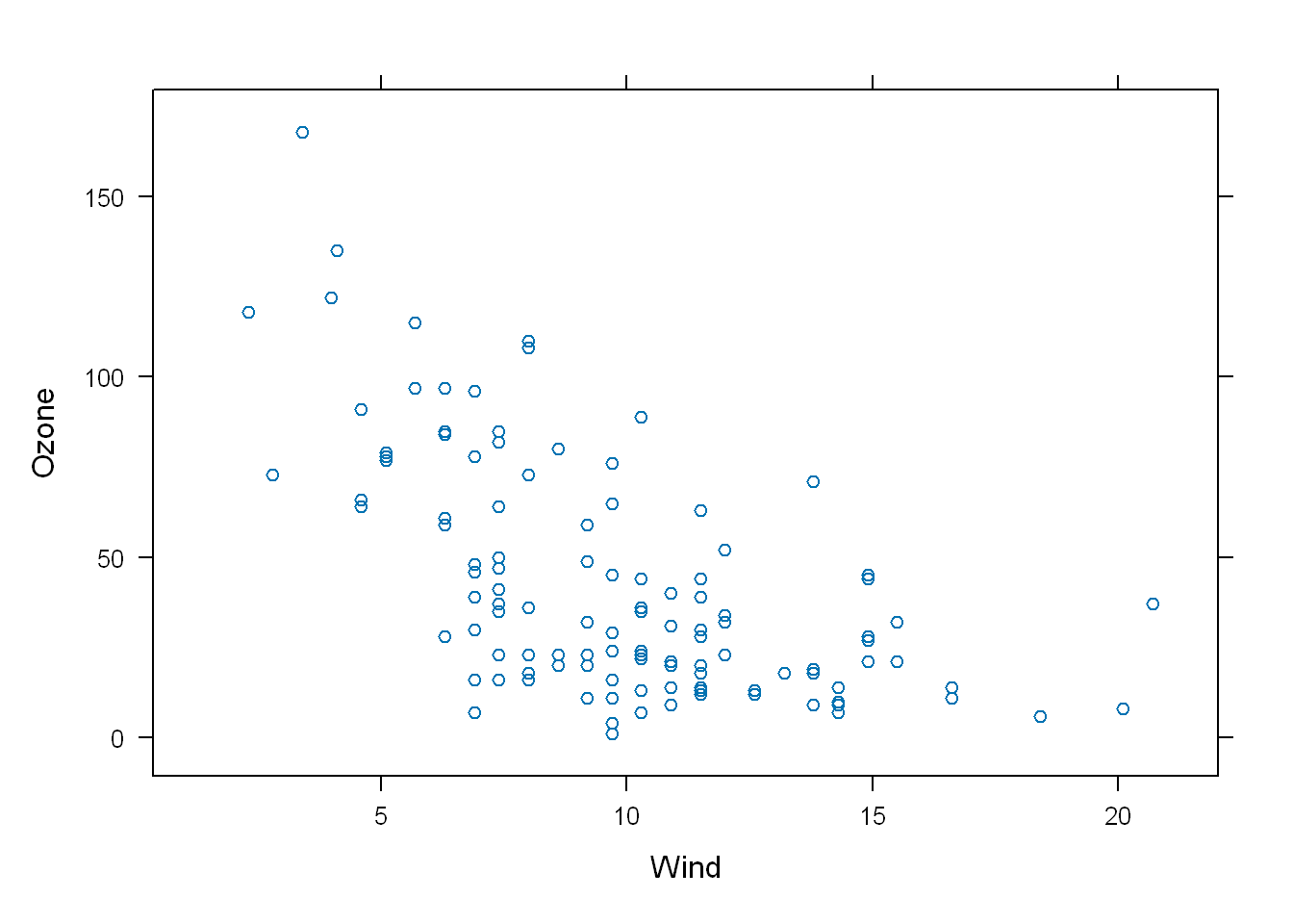
Properties
In order to see the list that the object “p” contains, run:
names(p) [1] "formula" "as.table" "aspect.fill"
[4] "legend" "panel" "page"
[7] "layout" "skip" "strip"
[10] "strip.left" "xscale.components" "yscale.components"
[13] "axis" "xlab" "ylab"
[16] "xlab.default" "ylab.default" "xlab.top"
[19] "ylab.right" "main" "sub"
[22] "x.between" "y.between" "par.settings"
[25] "plot.args" "lattice.options" "par.strip.text"
[28] "index.cond" "perm.cond" "condlevels"
[31] "call" "x.scales" "y.scales"
[34] "panel.args.common" "panel.args" "packet.sizes"
[37] "x.limits" "y.limits" "x.used.at"
[40] "y.used.at" "x.num.limit" "y.num.limit"
[43] "aspect.ratio" "prepanel.default" "prepanel" #there you have your list of 45 propertiesLet’s look at some of the values of these properties.
p[["formula"]]Ozone ~ Windp[["x.limits"]];[1] 0.37 22.03# These are the limits of the x valuesArguments
Lattice functions usually take a formula for their first argument, usually in the form of y ~ x, so in a scatterplot y would be plotted on the y-axis and x on the x-axis. The code below would plot
- Y on y-axis
- X on x-axis
- f and g represent the optional conditioning variables. The * represent the interaction between them
- The second argument is the dataframe data. If no df or list is passed then the parent df is used.
- If no other arguments are passed, as you know the default ones are used
xyplot(y~x | f * g, data)Color
PCH
Main
Let’s change the color of the points. We can use some of the same graphical parameters we use in Base plot R.
xyplot(Ozone~Wind, data = airquality, pch=8, col="red", main = "Big Apple Data")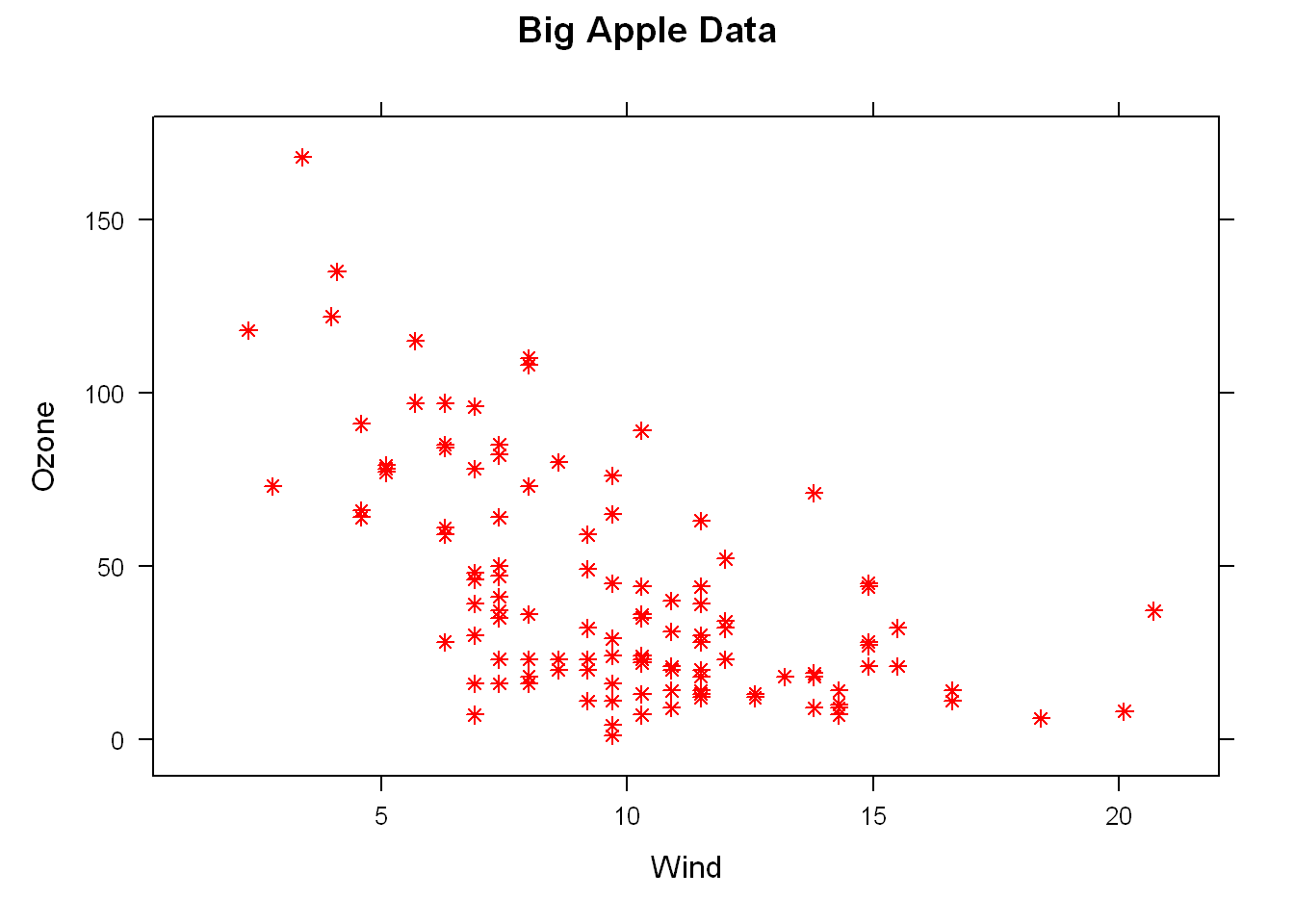
Factor
Most data will contain at least one factor (a group), many times several factors, at this time let’s use Month as a factor. So let’s adjust the formula from above and add a new argument with the factor. We don’t see in the head output above, but Month has a value of 5:9 which gives us 5, and we want to divide the plot into 5 subplots so
- We edit the first argument to include the factor(Month)
- We add an argument layout = c(5,1)
xyplot(Ozone~Wind | as.factor(Month), data = airquality, layout = c(5,1))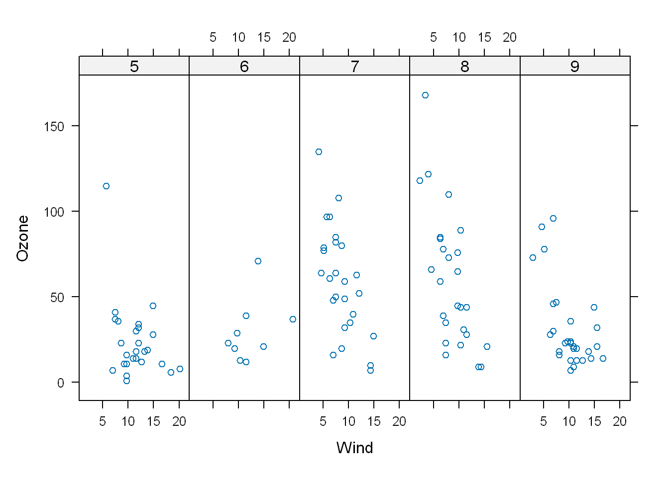
If we had used Month as part of the first argument and not used it as a factor like the code below, we divide the plots by month but we have no idea as to which month is which
xyplot(Ozone~Wind | Month, data = airquality, layout = c(5,1))
Panel
- The panel() has 3 arguments; x, y, …
- There are 2 lines in the panel function, each invokes a panel method
- The first to plot the data in each panel (panel.xyplot)
- The second to draw a horizontal line in each panel
p <- xyplot(y ~ x | f, panel = function(x, y, ...) {
  panel.xyplot(x, y, ...)  ## First call the default panel function for 'xyplot'
  panel.abline(h = median(y), lty = 2)  ## Add a horizontal line at the median
})


# Here is another example but using a linear regressiong line instead
p2 <- xyplot(y ~ x | f, panel = function(x, y, ...) {
  panel.xyplot(x, y, ...)  ## First call default panel function
  panel.lmline(x, y, col = 2)  ## Overlay a simple linear regression line
})
Using the diamond data loaded with ggplot2 package, we’ll use it to show off lattice’s panel plotting ability. Let’s first look at the df
str(diamonds)tibble [53,940 × 10] (S3: tbl_df/tbl/data.frame)
$ carat : num [1:53940] 0.23 0.21 0.23 0.29 0.31 0.24 0.24 0.26 0.22 0.23 ...
$ cut : Ord.factor w/ 5 levels "Fair"<"Good"<..: 5 4 2 4 2 3 3 3 1 3 ...
$ color : Ord.factor w/ 7 levels "D"<"E"<"F"<"G"<..: 2 2 2 6 7 7 6 5 2 5 ...
$ clarity: Ord.factor w/ 8 levels "I1"<"SI2"<"SI1"<..: 2 3 5 4 2 6 7 3 4 5 ...
$ depth : num [1:53940] 61.5 59.8 56.9 62.4 63.3 62.8 62.3 61.9 65.1 59.4 ...
$ table : num [1:53940] 55 61 65 58 58 57 57 55 61 61 ...
$ price : int [1:53940] 326 326 327 334 335 336 336 337 337 338 ...
$ x : num [1:53940] 3.95 3.89 4.05 4.2 4.34 3.94 3.95 4.07 3.87 4 ...
$ y : num [1:53940] 3.98 3.84 4.07 4.23 4.35 3.96 3.98 4.11 3.78 4.05 ...
$ z : num [1:53940] 2.43 2.31 2.31 2.63 2.75 2.48 2.47 2.53 2.49 2.39 ...Table
So as you see we have 10 rows of information relating to 53940 diamonds. Let’s look at it in a table, we see 7 colors each represented by a letter.
table(diamonds$color)
    D     E     F     G     H     I     J
 6775  9797  9542 11292  8304  5422  2808
Let’s run it with two variables, and we get a 7x5 array with counts showing how many diamonds in the df have a particular color with that specific cut.
table(diamonds$color, diamonds$cut)
    Fair Good Very Good Premium Ideal
  D  163  662      1513    1603  2834
  E  224  933      2400    2337  3903
  F  312  909      2164    2331  3826
  G  314  871      2299    2924  4884
  H  303  702      1824    2360  3115
  I  175  522      1204    1428  2093
  J  119  307       678     808   896
Label axis
Main title
Strip
Let’s create labels for the x and y-axes and a main title, if you want to save the labels in a file locally and refer to it in the plot function follow these steps:
- Save the labels to a file
- Name the file “myLabels.R”
- Run source(pathtofile(“myLabels.R”), local = TRUE)
myxlab <- "Carat"
myylab <- "Price"
mymain <- "Diamonds are Sparkly!"
xyplot(price~carat | color*cut, data=diamonds,
       strip=FALSE, pch=20, xlab=myxlab, ylab=myylab, main=mymain)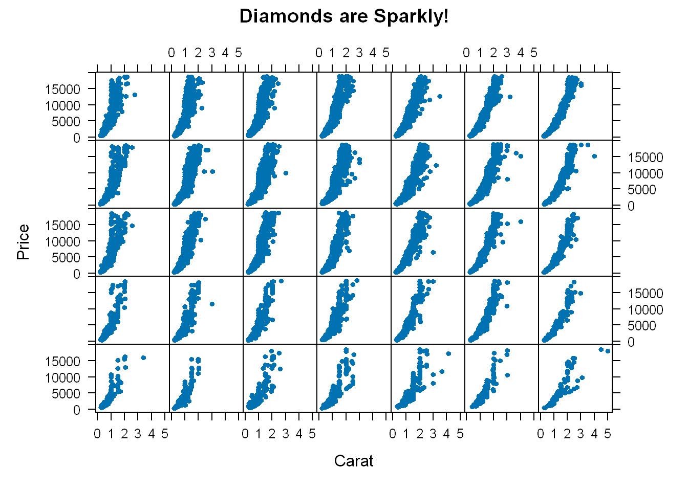
- So we get 35 panels, one for each combination of color and cut.
- pch=20 are the dots
- Each plot shows how the prices vary for each cut and color
- If we had taken strip out and left it at its default value of TRUE it would’ve shown the label for each panel and would’ve made the graphic too busy and less legible
Color
This section supplements the lessons on plotting with the base which contain functions that are able to take the argument col.
Packages
library(jpeg)
library(RColorBrewer)
library(datasets)
Default
The default colors in R are 1- grey, 2- red, 3 - green, so if you use col=c(1:3) that’s what you’ll get. To look at the first 10 colors of colors(). The colors() function has 600+ colors
sample(colors(),10) [1] "grey70" "burlywood2" "thistle1" "turquoise4" "maroon4"
[6] "violetred2" "burlywood3" "grey80" "grey88" "lightblue1"colorRamp
Let’s see what colorRamp() does for us: it takes a palette of colors (arguments) and returns a function pal that takes between 0 and 1 as arguments. 0 and 1 are the extremes of the color palette.
pal <- colorRamp(c("red","blue"))So now let’s call the function pal() with a single argument between the extremes of 0 and 1
pal(0) [,1] [,2] [,3]
[1,] 255 0 0That gives us a 1x3 array with 255 as the first entry and 0 in the other 2. This is the RGB (red, green, blue) color encoding. 24 bits are used so we have 3 sets of 8 bits, each represent the intensity of the Red, Green, and the Blue. Remember the extremes were 0 and 1, and so when we used 0 we get one extreme with Red being at its max, and no Green nor Blue as they are 0. So this means that the other extreme would be all Blue and nothing else, let’s try it
pal(1) [,1] [,2] [,3]
[1,] 0 0 255You can use a sequence if you wish, let’s call pal with a seq(0,1, len=6), so we are going from one extreme 0 to another 1, and we want to do it in 6 steps. None of which contain Green since the pattern we specified was 0,1 both extremes and neither contain Green. So it will step from Red to Blue one extreme to another skipping Green
pal(seq(0,1,len=6)) [,1] [,2] [,3]
[1,] 255 0 0
[2,] 204 0 51
[3,] 153 0 102
[4,] 102 0 153
[5,] 51 0 204
[6,] 0 0 255colorRampPalette
Similar to colorRamp. It also takes a palette of colors and returns a function. This function, however, takes integer arguments (instead of numbers between 0 and 1) and returns a vector of colors each of which is a blend of colors of the original palette.
Let’s compare it to colorRamp() above
p1 <- colorRampPalette(c("red","blue"))Now let’s call p1 with the argument 2
p1(2)[1] "#FF0000" "#0000FF"We see a 2-long vector is returned.
- The first entry FF0000 represents red. The FF is hexadecimal for 255, the same value returned by our call pal(0).
- The second entry 0000FF represents blue, also with intensity 255.
p1(6)[1] "#FF0000" "#CC0033" "#990066" "#650099" "#3200CC" "#0000FF"Now we get the 6-long vector (FF0000, CC0033, 990066, 650099, 3200CC, 0000FF).
- We see the two ends (FF0000 and 0000FF) are consistent with the colors red and blue.
- How about CC0033? Type 0xcc or 0xCC at the command line to see the decimal equivalent of this hex number. You must include the 0 before the x to specify that you’re entering a hexadecimal number.
0xcc[1] 204So 0xCC equals 204 and we can easily convert hex 33 to decimal, as in 0x33=3*16+3=51.
- These were exactly the numbers we got in the second row returned from our call to
pal(seq(0,1,len=6)). - We see that 4 of the 6 numbers agree with our earlier call to pal.
- Two of the 6 differ slightly.
We can form palettes using colors other than red, green and blue. Let’s form a palette p2 by calling the function with red and yellow
p2 <- colorRampPalette(c("red","yellow"))Let’s call the new function with the argument 2
p2(2)[1] "#FF0000" "#FFFF00"Not surprisingly the first color we see is FF0000, which we know represents red. The second color returned, FFFF00, must represent yellow, a combination of full intensity red and full intensity green. This makes sense, since yellow falls between red and green.
Now let’s call it with 10 to get a larger pallet
p2(10) [1] "#FF0000" "#FF1C00" "#FF3800" "#FF5500" "#FF7100" "#FF8D00" "#FFAA00"
[8] "#FFC600" "#FFE200" "#FFFF00"So we see the 10-long vector. For each element, the red component is fixed at FF, and the green component grows from 00 (at the first element) to FF (at the last).
Alpha
We can of course add an alpha value as an argument, let’s create a function p3
p3 <- colorRampPalette(c("blue","green"), alpha=.5)
p3(5)
[1] "#0000FFFF" "#003FBFFF" "#007F7FFF" "#00BF3FFF" "#00FF00FF"We see that in the 5-long vector that the call returned, each element has 32 bits,
4 groups of 8 bits each.
The last 8 bits represent the value of alpha. Since it was NOT ZERO in the call to colorRampPalette, it gets the maximum FF value. (The same result would happen if alpha had been set to TRUE.)
When it was 0 or FALSE (as in previous calls to colorRampPalette) it was given the value 00 and wasn’t shown.
The leftmost 24 bits of each element are the same RGB encoding we previously saw.
RColorBrewer
RColorBrewer Package, available on CRAN, that contains interesting and useful color palettes, of which there are 3 types, sequential, divergent, and qualitative. Which one you would choose to use depends on your data.
- Sequential: colors are ordered from light to dark
- Divergent: neutral color in the middle and as you move from the middle to the two ends, the color increases in intensity
- Qualitative: is a collection of random colors, could be used to distinguish factors in your data
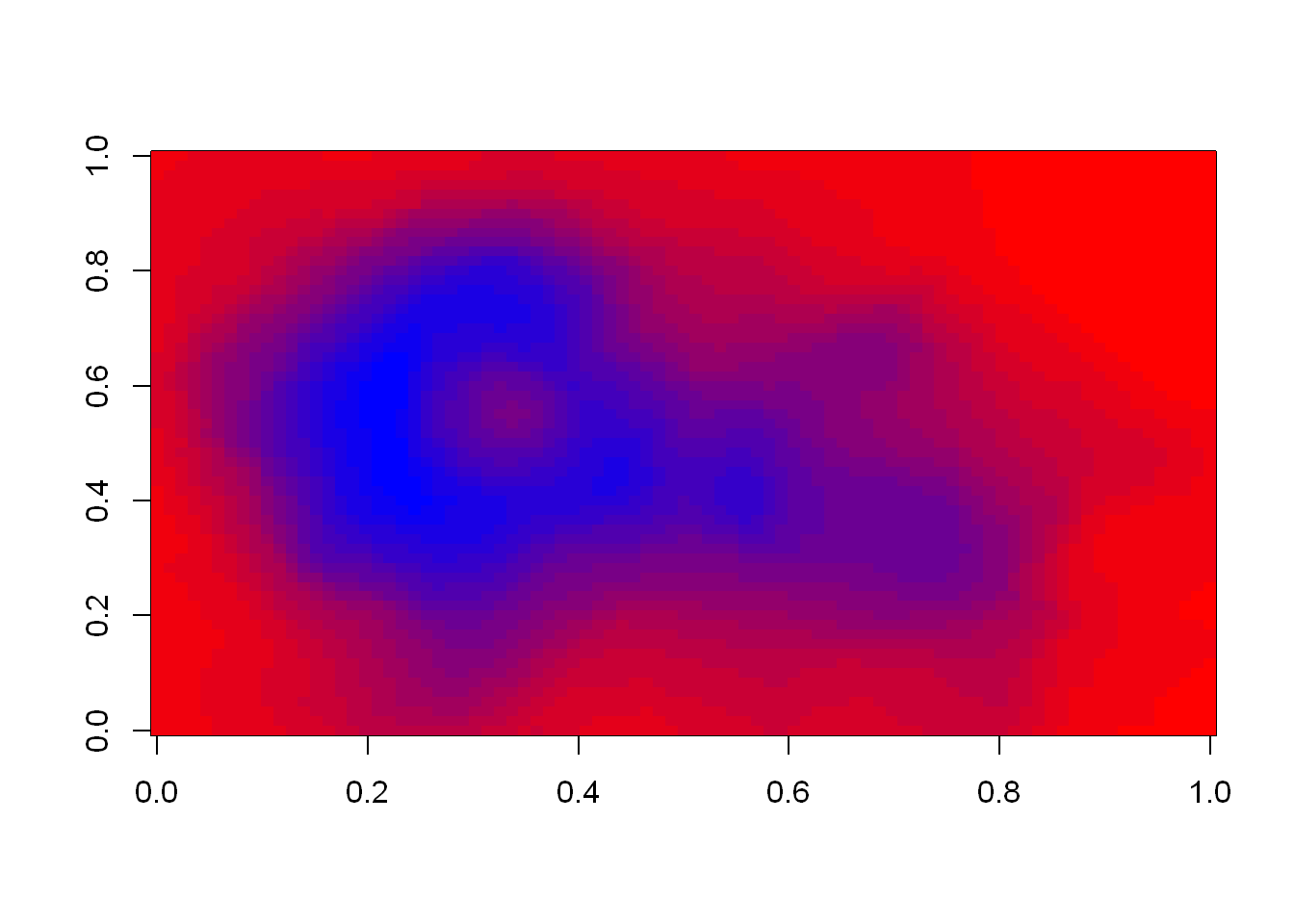
cols <- brewer.pal(3, "BuGn")
pal <-  colorRampPalette(cols)
image(volcano, col=pal(20))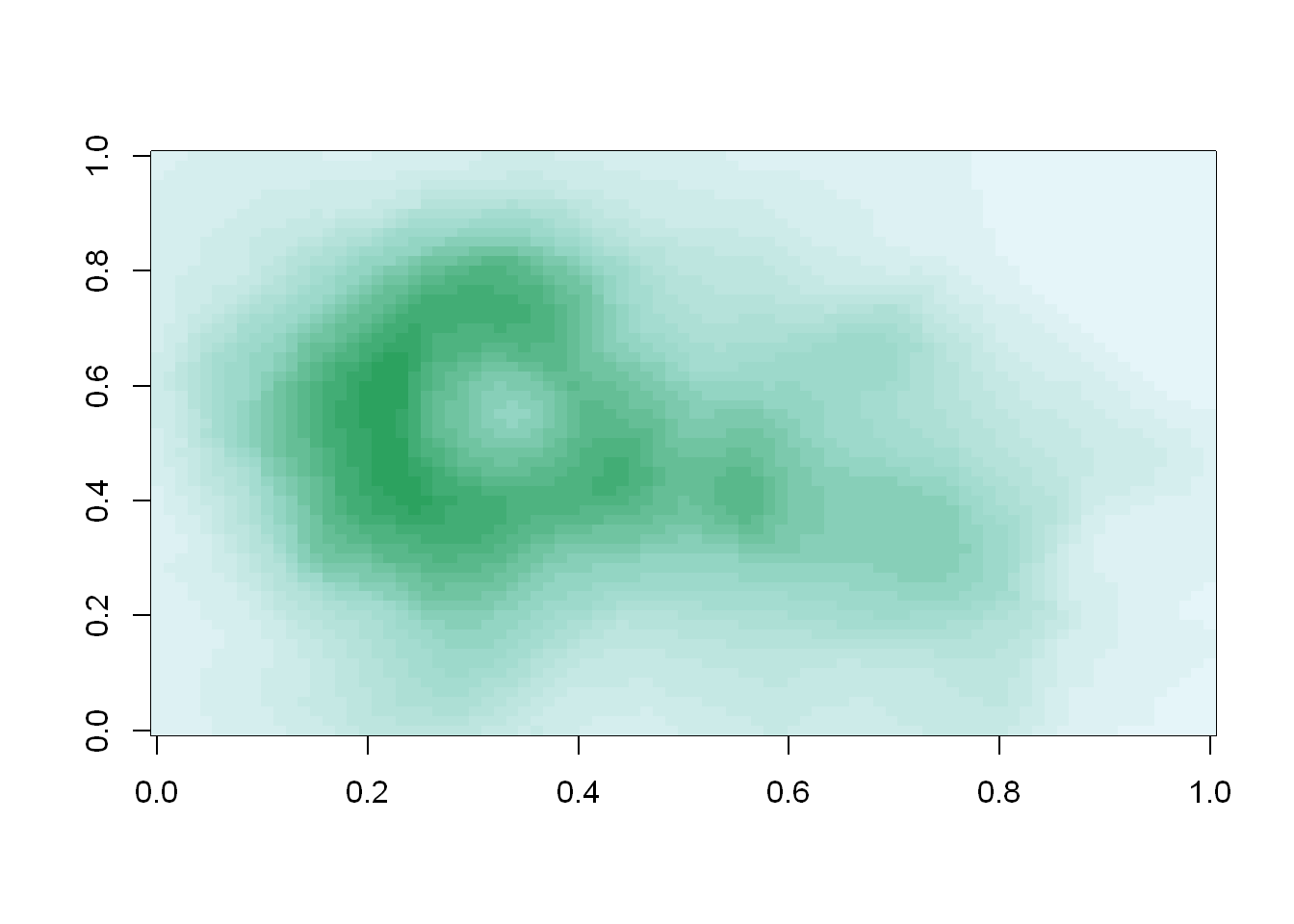
We see that the colors here of the sequential palette clue us in on the topography. The darker colors are more concentrated than the lighter ones. Just for fun, recall your last command calling image and instead of pal(20), use p1(20) as the second argument.
image(volcano, col=p1(20))