library(fields)Clustering
Hierarchical Clustering
Is a simple way of quickly examining and displaying multi-dimensional data. This technique is usually most useful in the early stages of analysis when you’re trying to get an understanding of the data, e.g., finding some pattern or relationship between different factors or variables. As the name suggests hierarchical clustering creates a hierarchy of clusters.
Clustering organizes data points that are close into groups. The obvious questions are:
- How do we define close? Distance or similarity.
- How do we group data points?
- How do we interpret the groupings?
H. clustering is a bottom-up approach (agglomerative). This means that we’ll find the closest two points and put them together in one cluster, then find the next closest pair in the updated picture, and so forth. We’ll repeat this process until we reach a reasonable stopping place.
Close
How do we define close:
- Euclidean distance - as the crow flies distance. Many applications can’t follow this theory and have to use
- Manhattan distance - roads, as in zig and zag till you get there like in city blocks.
dist(dataFrame)You see that the output is a lower triangular matrix with rows numbered from 2 to 12 and columns numbered from 1 to 11. Entry (i,j) indicates the distance between points i and j. Clearly you need only a lower triangular matrix since the distance between points i and j equals that between j and i.
hclust
We can keep with the process till we have all the points clustered. But R provides a simple function which createds a dendrogram for you. It’s called hclust() and takes as an argument the pairwise distance matrix which we looked at before. We’ve stored this matrix for you in a variable called distxy. Run hclust now with distxy as its argument and put the result in the variable hc.
hc <- hclust(distxy)Dendrogram
Let’s look at hc
plot(hc)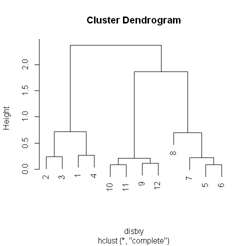
R’s plot conveniently labeled everything for you. The points we saw are the leaves at the bottom of the graph, 5 and 6 are connected, as are 10 and 11. Moreover, we see that the original 3 groupings of points are closest together as leaves on the picture.
Now call plot again, this time with the argument as.dendrogram(hc)
plot(as.dendrogram(hc))The essentials are the same, but the labels are missing and the leaves (original points) are all printed at the same level. Notice that the vertical heights of the lines and labeling of the scale on the left edge give some indication of distance.
Line
If you remember from base plot() we can use abline to draw a horizontal line, let’ say at 1.5 and see how many clusters we have.
abline( h=1.5, col="blue")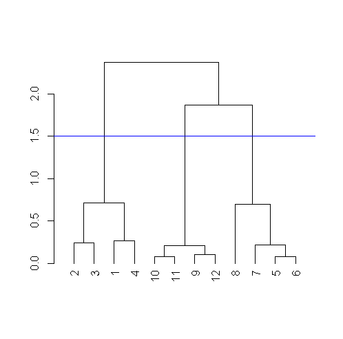
Clusters distance
So after we have our clusters, how do we measure the distances between them?
Complete linkage
If you’re trying to measure a distance between two clusters, take the greatest distance between the pairs of points in those two clusters
Average linkage
First you compute an “average” point in each cluster (think of it as the cluster’s center of gravity). You do this by computing the mean (average) x and y coordinates of the points in the cluster. Then you compute the distances between each cluster average to compute the intercluster distance.
In small datasets the difference between complete and average linkages aren’t that different, but in more complicated datasets, the type of linkage used could affect how your data clusters. So try to experiment with different methods of linkage to see how your data is grouped.
Heat Maps
It is a graphical representation of data where the individual values contained in a matrix are represented as colors. A tutorial on the subject can be found here: http://sebastianraschka.com/Articles/heatmaps_in_r.html#clustering
K Means Clustering
Here is another simple way of examining and organizing multi-dimentional data. Once again this is a very useful technique in the early stages of analysis while you’re trying to get an understanding of the data, find patterns or relationship between factors or variables.
k-means method aims to partition the points into k groups such that the sum of the squares from points to the assigned cluster centers is minimized.
- Let’s decide on a measure of distance: Euclidean
- Guess how many clusters you have (or want).
- Once you’ve made the first two choices, you randomly create a centroid ( a phantom point) for each cluster and assign each point in your dataset to the centroid to which it is closest.
- Once each point is assigned to a centroid, you readjust the centroid’s position by making it the average of the points assigned to it
- Now that you’ve repositioned the centroids, you recalculate the distance of the observations to the centroids and reassign any, if neccessary, to the centroid closest to them.
- Keep repeating the process till you reach a point where no adjustments are made, or when you’ve reached your predetermined maximum number of iterations.
which.min
apply(distTmp, 2, which.min)which.min is a function we can apply to all the columns at once. It finds the minimum value in each column and spits back the row that minimum value was in.
kmeans
For the 3 clusters we guessed, and the data the points coordinates are stored in
kmeans(dataFrame,centers=3)Cluster means:
x y
1 0.8904553 1.0068707
2 2.8534966 0.9831222
3 1.9906904 2.0078229
Clustering vector:
[1] 1 1 1 1 3 3 3 3 2 2 2 2
Within cluster sum of squares by cluster:
[1] 0.34188313 0.03298027 0.34732441
(between_SS / total_SS = 93.6 %)
Available components:
[1] "cluster" "centers" "totss" "withinss" "tot.withinss"
"betweenss" "size" "iter"
[9] "ifault"The program returns the information that the data clustered into 3 clusters each of size 4.
It also returns the coordinates of the 3 cluster means, a vector named cluster indicating how the 12 points were partitioned into the clusters, and
the sum of squares within each cluster.
It also shows all the available components returned by the function.
Dimension Reduction
PCA and SVD are used in both the exploratory phase and the more formal modelling stage of analysis. We’ll focus on the | exploratory phase and briefly touch on some of the underlying theory.
As data scientists, we’d like to find a smaller set of multivariate variables that are uncorrelated AND explain as much variance (or| variability) of the data as possible. This is a statistical approach. In other words, we’d like to find the best matrix created with fewer variables (that’s a lower rank matrix) that explains the original data. That’s related to data compression.
Two related solutions to these problems are PCA and SVD.
Singular Value Decomposition SVD
We express a matrix X of observations (rows) and variables (columns) as the product of 3 other matrices, i.e., X=UDV^t. This last term (V^t) represents the transpose of the matrix V.
Here U and V each have orthogonal (uncorrelated) columns. U’s columns are the left singular vectors of X and V’s columns are the right singular vectors of X. D is a diagonal matrix, by which we mean that all of its entries not on the diagonal are 0. The diagonal entries of D are the singular values of X.v
svd
A function to perform singular value decomposition. The data matrix is its only argument, let’s see the data matrix mat
mat [,1] [,2] [,3]
[1,] 1 2 3
[2,] 2 5 7svd(mat)$d
[1] 9.5899624 0.1806108
$u
[,1] [,2]
[1,] -0.3897782 -0.9209087
[2,] -0.9209087 0.3897782
$v
[,1] [,2]
[1,] -0.2327012 -0.7826345
[2,] -0.5614308 0.5928424
[3,] -0.7941320 -0.1897921We see that the function returns 3 components, d which holds 2 diagonal elements, u, a 2 by 2 matrix, and v, a 3 by 2 matrix.
Let’s see if we can recompose it again and get the original data matrix mat (to multiply a matrix we need to use %*% instead of * to multiply. And the results appears to be mat where we started
matu %*% diag %*% t(matv) [,1] [,2] [,3]
[1,] 1 2 3
[2,] 2 5 7Principal Component Analysis PCA
A simple, non-parametric method for extracting relevant information | from confusing data sets.
Basically, it’s a method to reduce a high-dimensional data set to its essential elements and explain the variability in the data.
Scale
We have to scale mat from above, This means we subtract the column mean from every element and divide the result by the column standard deviation. R has a command for it scale(data matrix)
svd(scale(mat))$d
[1] 1.732051 0.000000
$u
[,1] [,2]
[1,] -0.7071068 0.7071068
[2,] 0.7071068 0.7071068
$v
[,1] [,2]
[1,] 0.5773503 -0.5773503
[2,] 0.5773503 0.7886751
[3,] 0.5773503 -0.2113249prcomp
To get the principal component, we run prcomp() on the scaled data matrix.
prcomp(scale(mat))Standard deviations (1, .., p=2):
[1] 1.732051 0.000000
Rotation (n x k) = (3 x 2):
PC1 PC2
[1,] 0.5773503 -0.5773503
[2,] 0.5773503 0.7886751
[3,] 0.5773503 -0.2113249The principal components of the scaled matrix, shown in the Rotation component of the prcomp output, ARE the columns of | V, the right singular values. Thus, PCA of a scaled matrix yields the V matrix (right singular vectors) of the same scaled matrix.
Smartphone Example
Data
The data is from the University of California, Irvine. Specifically, the data we’ll use is from UCI’s Center for Machine Learning and Intelligent Systems and it addresses the data smartphones and human activity.
You can find out more about the data at http://archive.ics.uci.edu/ml/datasets/Human+Activity+Recognition+Using+Smartphones
The data has been loaded into a matrix called ssd, with 7352 observations/rows for 563 variables. But we’ll only be using a small portion of the dataset, the portion relating to “Human Activity Recognition database”
dim(ssd)[1] 7352 563The study creating this database involved 30 volunteers “performing activities of daily living (ADL) while carrying a waist-mounted smartphone with embedded inertial sensors. … Each person performed six activities … wearing a smartphone (Samsung Galaxy S II) on the waist. … The experiments have been video-recorded to label the data manually.
The obtained dataset has been randomly partitioned into two sets, where 70% of the volunteers was selected for generating the training data and 30% the test data.”
The last two columns contain subject and activity information. If we look at the data in ssd$subject
table(ssd$subject)1 3 5 6 7 8 11 14 15 16 17 19 21 22 23 25 26 27 28 29 30 347
341 302 325 308 281 316 323 328 366 368 360 408 321 372 409 392 376 382 344 383 Now let’s see how the activity column is divided
table(ssd$activity) laying sitting standing walk walkdown walkup
1407 1286 1374 1226 986 1073It appears that ssd contains training data since the numbers in the subject column appear to be about 70% which is dedicated for training.
Questions
Is the correlation between the measurements and activities good enough to train a machine? So that, “Given a set of 561 measurement would a trained machine be able to determine which of the 6 acitivities the person was doing?
EDA
subset
First, let’s massage the data a little so it’s easier to work with.
We’ve already run the R command transform on the data so that activities are factors.
This will let us color code them when we generate plots.
Let’s look at only the first subject (numbered 1).
Create the variable sub1 by assigning to it the output of the R command subset with ssd as the first argument and the boolean, subject equal to 1, as the second.
sub1 <- subset(ssd, subject == 1)
dim(sub1)
[1] 347 563Colnames
Let’s look at the col names to see what we have:
names(sub1[1:12])
 [1] "tBodyAcc.mean...X" "tBodyAcc.mean...Y" "tBodyAcc.mean...Z" "tBodyAcc.std...X"
"tBodyAcc.std...Y"  "tBodyAcc.std...Z"
 [7] "tBodyAcc.mad...X"  "tBodyAcc.mad...Y"  "tBodyAcc.mad...Z"  "tBodyAcc.max...X"
"tBodyAcc.max...Y"  "tBodyAcc.max...Z"
Script file
The plotting is done in an external file called “showXY.R”, we can view the code in the file by using
myedit("showXY.R")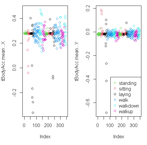
You can see from the plots that walking shown in the two blue shades, are more active specially in the horizontal (x-axis) direction than let’s say the passive activities (black, red, and green)
Distance matrix
The plot above focuses on the first 2 dimensions, let’s create a matrix, mdist of the first 3 columns of sub1 (the subset dataset).
mdist <- dist(sub1[,1:3])Clustering variable
Now create the variable hclustering by calling the R command hclust and passing it mdist as an argument. This will use the Euclidean distance as its default metric.
hclustering <- hclust(mdist)Pretty plotting
Now call the pretty plotting function (which we’ve already sourced) myplclust with 2 arguments. The first is hclustering, and the second is the argument lab.col set equal to unclass(sub1$activity).
myplclust(hclustering, lab.col = unclass(sub1$activity))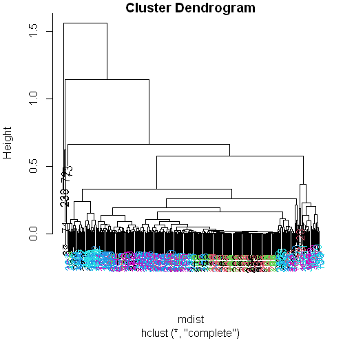
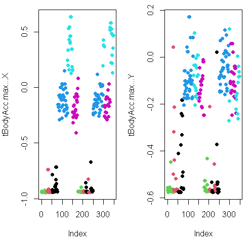
Well that dendrogram doesn’t look too helpful, does it? There’s no clear grouping of colors, except that active colors (blues and | magenta) are near each other as are the passive (black, red, and green). So average acceleration doesn’t tell us much. How about | maximum acceleration? Let’s look at that for the first subject (in our array sub1) for the X and Y dimensions. These are in column 10 and 11.
Here they are below plotted side by side, X dimension on the left, and Y on the right. The x-axis show the 300+ observations, and the y-axis the maximum acceleration.
Subset
Let’s focus then on the 3 dimensions of maximum acceleration, stored in columns 10 through 12 of sub1. Create a new distance matrix, mdist, of these 3 columns of sub1, by using the R command dist. Again, use the x[,10:12] notation to catch the columns.
mdist <- dist(sub1[,10:12])Clustering variable
hclustering <- hclust(mdist)Pretty plotting
myplclust(hclustering, lab.col = unclass(sub1$activity))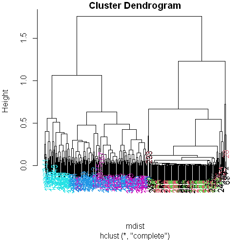
SVD
Create the variable svd1 by assigning to it the output of a call to the R command svd. The argument to svd should be scale(sub1[,-c(562,563)]). This will remove the last 2 columns from sub1 and scale the data. Recall that the last 2 columns contain activity and subject information which we won’t need.
To see the LEFT singular vectors of sub1, we’d look at svd1$u
svd1 <- svd(scale(sub1[,-c(562,563)]))Matrix
Let’s see the size of the matrix by using dim()
dim(svd1$u)[1] 347 347The matrix is 347 by 347, each row corresponding to a row in the matrix and each row has an activity associated with it.
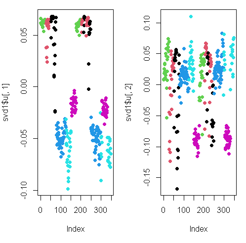
Here we’re looking at the 2 left singular vectors of svd1 (the first 2 columns of svd1$u).
Each entry of the columns belongs to a particular row with one of the 6 activities assigned to it.
We see the activities distinguished by color. Moving from left to right, the first section of rows are green (standing), the second red (sitting), the third black (laying), etc.
The first column of u shows separation of the nonmoving (black, red, and green) from the walking activities.
The second column is harder to interpret. However, the magenta cluster, which represents walking up, seems separate from the others. We’ll try to figure out why that is.
To do that we’ll have to find which of the 500+ measurements (represented by the columns of sub1) contributes to the variation of that component. Since we’re interested in sub1 columns, we’ll look at the RIGHT singular vectors (the columns of v) and in particular, the second one since the separation of the magenta cluster stood out in thesecond column of svd1$u.
Here’s a plot of the second column of v.
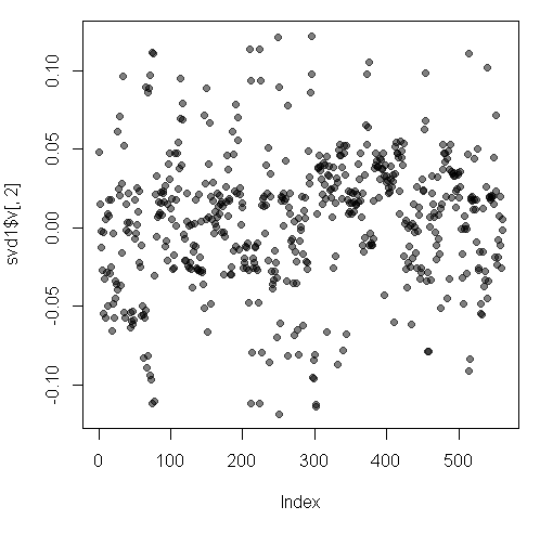
We used transparency in our plotting but nothing clearly stands out here. Let’s use clustering to find the feature (out of the 500+) which contributes the most to the variation of this second column of svd1$v.
Clustering
Create the variable maxCon by assigning to it the output of the R command which.max using the second column of svd1$v as an argument.
maxCon <- which.max(svd1$v[,2])Distance matrix
Now create a distance matrix mdist by assigning to it the output of the R command dist using 4 columns of sub1 as the arguments. These 4 columns are 10 through 12 (10:12) and maxCon. Recall that you’ll have to concatenate these 2 column expressions when specifying them.
mdist <- dist(sub1[,c(10:12,maxCon)])hclustering
Now create hclustering, the output of the R command hclust using mdist as the argument, and
Call the myplclust with 2 arguments, hclustering and lab.col=
hclustering <- hclust(mdist)
myplclust(hclustering, lab.col = unclass(sub1$activity))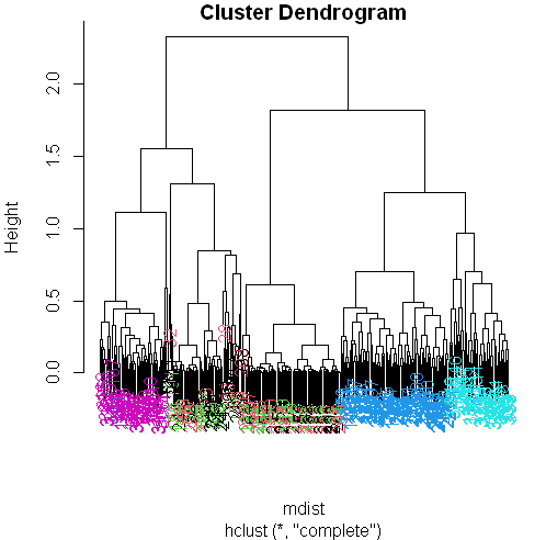
Now we see some real separation.
Magenta (walking up) is on the far left, and the two other walking activities, the two blues, are on the far right, but in separate clusters from one another.
The nonmoving activities still are jumbled together.
Maximum contributor
Run the R command names with the argument sub1[maxCon] to see what measurement is associated with this maximum contributor.
names(sub1[maxCon])[1] "fBodyAcc.meanFreq...Z"So the mean body acceleration in the frequency domain in the Z direction is the main contributor to this clustering phenomenon we’re seeing.
Let’s move on to k-means clustering to see if this technique can distinguish between the activities.
K-means
Create the variable kClust by assigning to it the output of the R command kmeans with 2 arguments.
- The first is sub1 with the last 2 columns removed. (Recall these don’t have pertinent information for clustering analysis.)
- The second argument to kmeans is centers set equal to 6, the number of activities we know we have.
kClust <- kmeans(sub1[,-c(562,563)], centers=6)Recall that without specifying coordinates for the cluster centroids (as we did), kmeans will generate starting points randomly.
Here we did only 1 random start (the default). To see the output, run the R command table with 2 arguments.
- The first is kClust$cluster (part of the output from kmeans), and
- The second is sub1$activity.
table(kClust$cluster, sub1$activity) laying sitting standing walk walkdown walkup
1 17 12 6 0 0 0
2 0 0 0 0 0 22
3 0 0 0 95 49 0
4 0 0 0 0 0 31
5 9 2 0 0 0 0
6 24 33 47 0 0 0Your exact output will depend on the state of your random number generator. We notice that - When we just run with 1 random start, the clusters tend to group the nonmoving activities together in one cluster.
K-means with 3 args
- The walking activities seem to cluster individually by themselves.
- You could run the call to kmeans with one random start again and you’ll probably get a slightly different result, but instead
- call kmeans with 3 arguments, the last of which will tell it to try more random starts and return the best one.
- The first 2 arguments should be the same as before (sub1 with the last 2 columns removed and centers set equal to 6).
- The third is nstart set equal to 100.
- Put the result in kClust again.
kClust <- kmeans(sub1[,-c(562,563)], centers=6, nstart = 100)Table
Again, run the R command table with 2 arguments.
- The first is part of the output from kmeans kClust$cluster, and
- The second is sub1$activity.
table(kClust$cluster, sub1$activity) laying sitting standing walk walkdown walkup
1 0 37 51 0 0 0
2 0 0 0 0 49 0
3 3 0 0 0 0 53
4 0 0 0 95 0 0
5 29 0 0 0 0 0
6 18 10 2 0 0 0We see that even with 100 random starts, the passive activities tend to cluster together. One of the clusters contains only laying, but in another cluster, standing and sitting group together.
Dimension
Find the dimensions of kClust$centers with
dim(kClust$centers)[1] 6 561So the centers are a 6 by 561 array. Sometimes it’s a good idea to look at the features of these centers to see if any dominate.
Create the variable laying and assign to it the output of the call to the R command which with the argument $size==29.
laying <- which(kClust$size==29)Now call plot with 3 arguments.
The first is center[laying,1:12], and
The second is pch set to 19
The third is ylab set equal to “Laying Cluster”
plot(kClust$centers[laying,1:12], pch=19,ylab="Laying Cluster")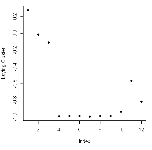
We see the first 3 columns dominate this cluster center. Run names with the first 3 columns of sub1 as the argument to remind yourself of what these columns contain.
names(sub1[1:3])[1] "tBodyAcc.mean...X" "tBodyAcc.mean...Y" "tBodyAcc.mean...Z"So the 3 directions of mean body acceleration seem to have the biggest effect on laying.
Which
Create the variable walkdown and assign to it the output of the call to the R command which with the argument $size==49.
walkdown <- which(kClust$size==49)Plot
Now call plot with 3 arguments. The first is $centers[walkdown,1:12], and the second is pch set to 19. The third is ylab set equal to “Walkdown Cluster”
plot(kClust$centers[walkdown,1:12], pch=19,ylab="Walkdown Cluster")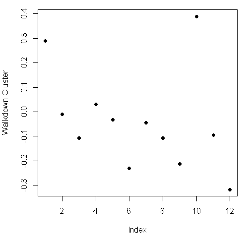
We see an interesting pattern here: From left to right, looking at the 12 acceleration measurements in groups of 3, the points decrease in value The X direction dominates, followed by Y then Z. This might tell us something more about the walking down activity.
We saw here that the sensor measurements were pretty good at discriminating between the 3 walking activities, but the passive activities were harder to distinguish from one another. These might require more analysis or an entirely different set of sensory measurements.