library(tidyverse)ggplot - Sample 1
Let’s look at what we created in the previous page with qplot() and we’ll strive to create the same visualizatioin but using ggplot().
Here is the complete code we used with qplot() where we plotted the hwy in relation to displ, from the mpg dataset, and plot it using point with a smoothing effect and split the plots according to the type of drv (4,f,r)
Reference:
qplot(displ, hwy, data=mpg, geom=c("point","smooth"), facets=.~drv)Warning: `qplot()` was deprecated in ggplot2 3.4.0.`geom_smooth()` using method = 'loess' and formula = 'y ~ x'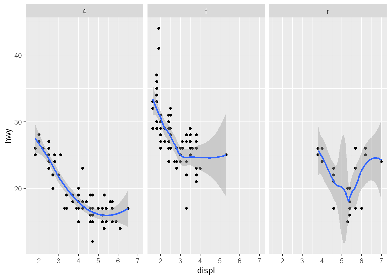
Scenario 1
Data
We’ll be using the built-in mpg dataset
Packages
library(tidyverse)Now let’s see how it’s done with ggplot().
Mapping - aes
First we’ll create a variable g by assigning to it the output of a call to ggplot with 2 arguments.
The first is mpg (our dataset) and
The second will tell ggplot what we want to plot, in this case, displ and hwy. These are what we want our aesthetics to represent so we enclose these as two arguments to the function aes.
g <- ggplot(data=mpg,mapping = aes(displ, hwy))
# could be coded this way
#g <- ggplot(mpg, aes(x=displ, y=hwy))
If you with to see what the graphical object contains, run and see that it contains:
The mpg data with all its named components in a 234 by 11 matrix.
And a mapping, x (displ) and y (hwy) which you specified, and no faceting.
Don’t try to print it ggplot wouldn’t know what to print because
We haven’t told it how to display the data, all we’ve done is tell it what we want to plot eventually but we didn’t tell it what we want to see: the geom
summary(g)data: manufacturer, model, displ, year, cyl, trans, drv, cty, hwy, fl,
class [234x11]
mapping: x = ~displ, y = ~hwy
faceting: <ggproto object: Class FacetNull, Facet, gg>
compute_layout: function
draw_back: function
draw_front: function
draw_labels: function
draw_panels: function
finish_data: function
init_scales: function
map_data: function
params: list
setup_data: function
setup_params: function
shrink: TRUE
train_scales: function
vars: function
super: <ggproto object: Class FacetNull, Facet, gg>geom
geom_point
Now let’s tell it how we want to see it by adding the geom(). So we basically add a layer. And since g contained all the data and aesthetics of the plot we didn’t need any arguments to geom_point()
g + geom_point()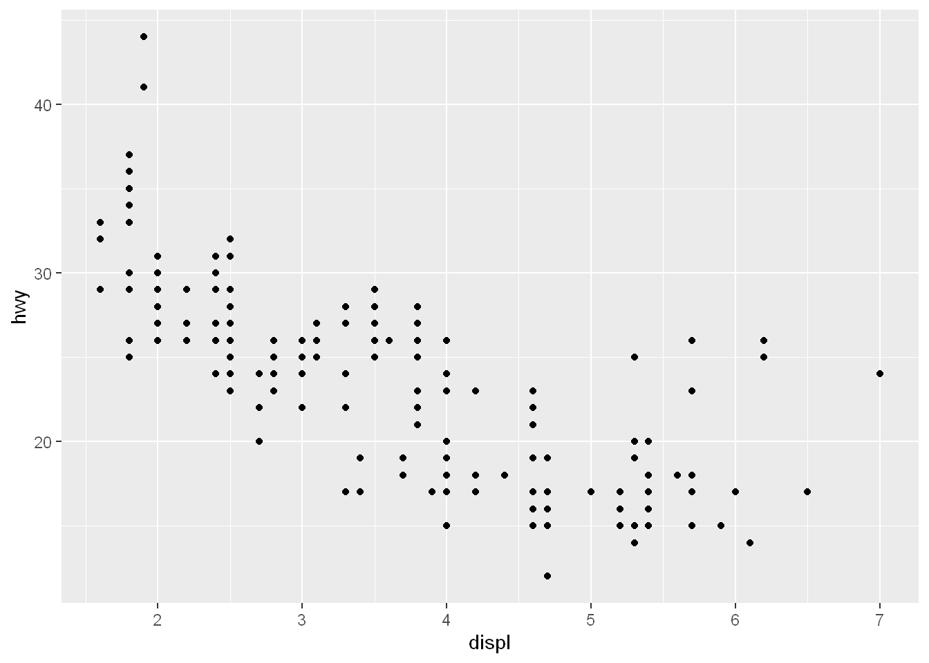
aes
color
size
alpha
Let’s adjust the aesthetics of the geom now, by setting the color to pink, size to 4, and alpha to 0.5.
Note: all arguments are set to constants.
g + geom_point(color="pink", size=4, alpha=0.5)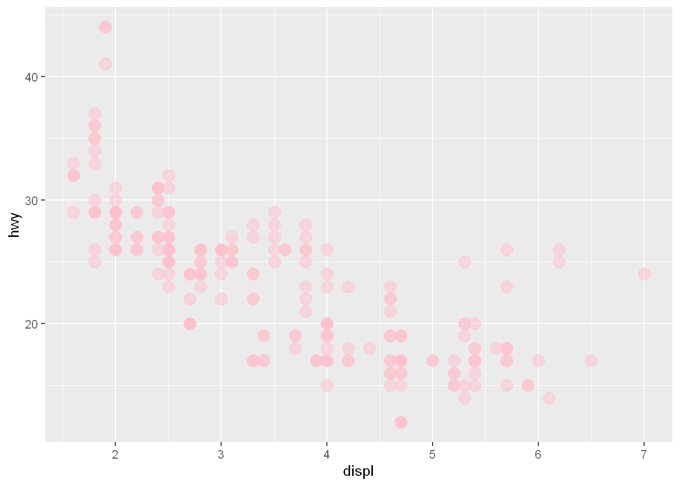
variable color
Let’s adjust our color to correspond to the type of drv we plot. Just above we set the color to “pink” a constant. Now we see how to set it to adjust to the value of the variable “drv”.
You must use the function aes() since the color of the geom is data dependent not a constant like it was above
g + geom_point(aes(color = drv), size=4, alpha=0.5)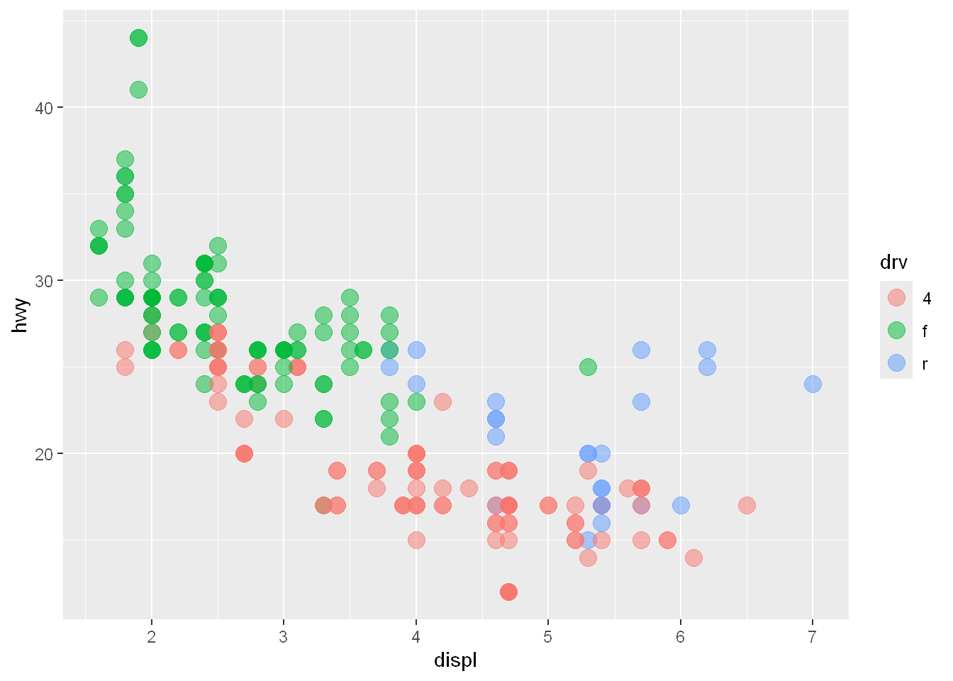
Layer
geom_smooth
Now let’s add a smooth line to it by adding another layer geom_smooth() - R uses method = ‘loess’ by default
g + geom_point() + geom_smooth()`geom_smooth()` using method = 'loess' and formula = 'y ~ x'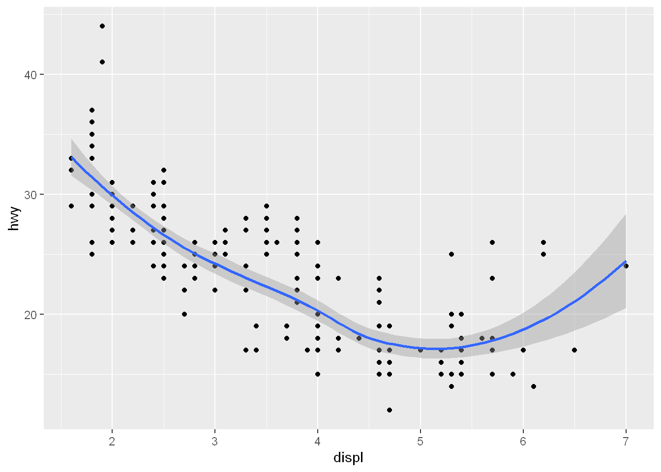
linetype
size
se
Let’s modify the geom_smooth call. Add the following:
“lm” is for linear regression
linetype is for dashed
size=4 made the line dashes bigger and set them apart from the plot points
se = FALSE turns the gray shadow displaying the standard errors (confidence intervals) off
g + geom_point(aes(color=drv), size = 2, alpha = 1/2) +
        geom_smooth(size=4, linetype=3, method = "lm", se=FALSE)
Warning: Using `size` aesthetic for lines was deprecated in ggplot2 3.4.0.
ℹ Please use `linewidth` instead.`geom_smooth()` using formula = 'y ~ x'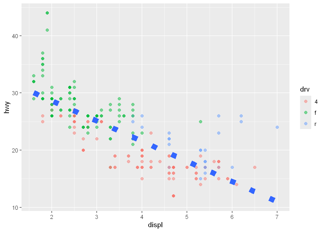
method = lm
Let’s adjust the smoothing effect and use lm (linear) instead of ‘loess’
g + geom_point() + geom_smooth(method="lm")`geom_smooth()` using formula = 'y ~ x'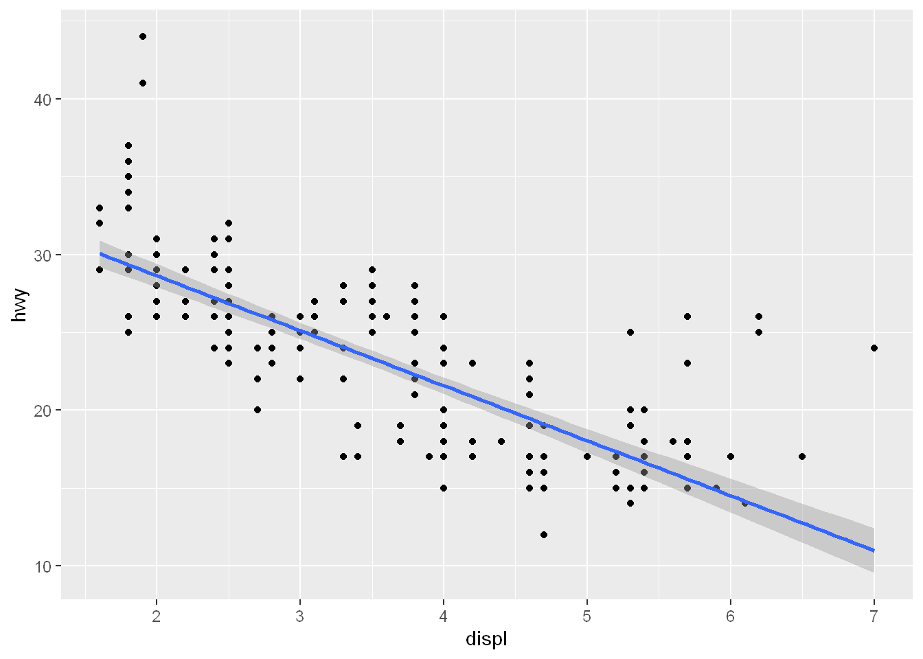
Facets
facet_grid
Now let’s break it up into panels by the variable drv and we only want one row and 3 columns (since drv has 3 factors). Note: this is the same formula we used in qplot()
g + geom_point() + geom_smooth(method='lm') + facet_grid(.~drv)`geom_smooth()` using formula = 'y ~ x'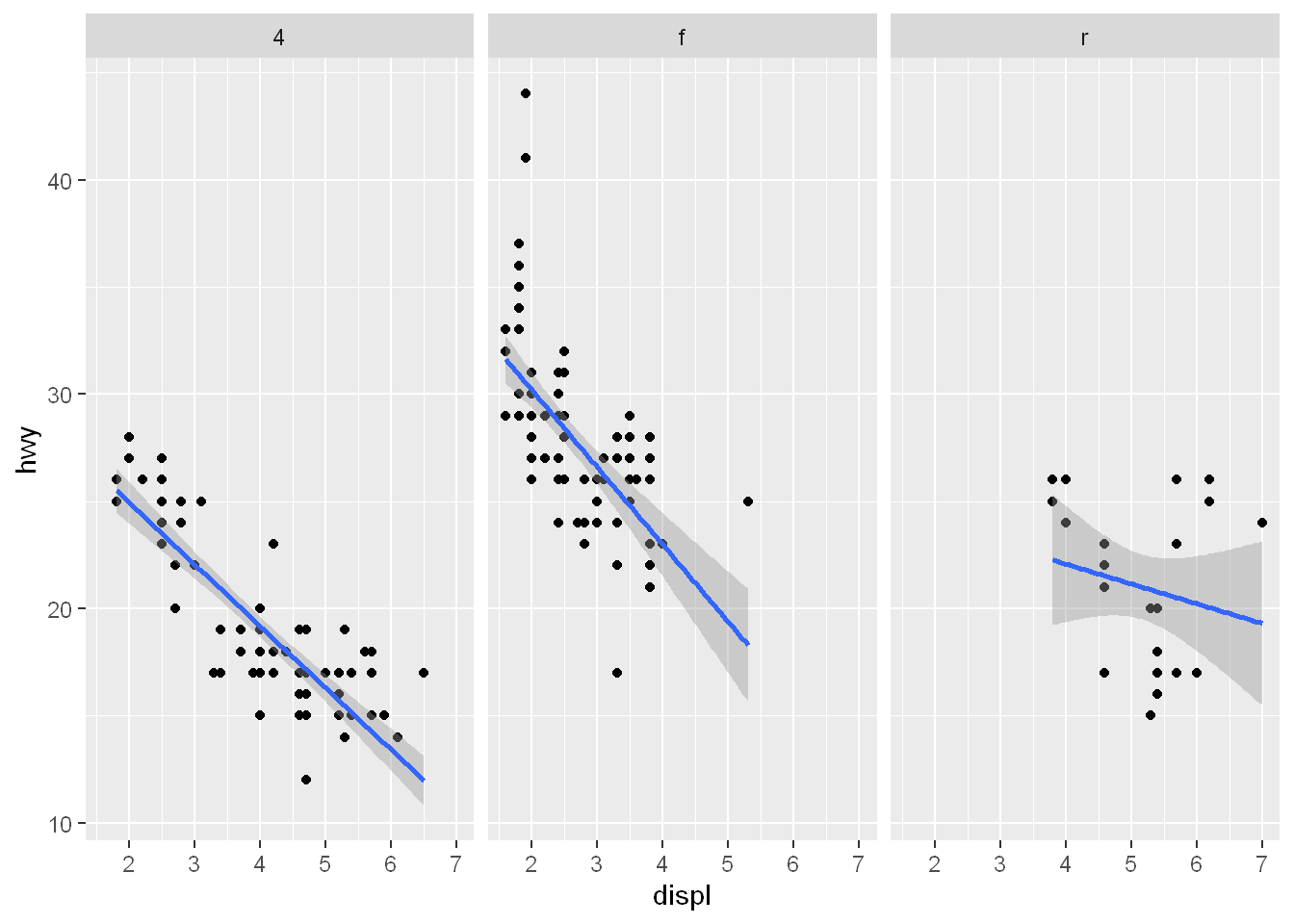
Theme
ggtitle
Let’s add a title by adding another layer using ggtitle()
g + geom_point() +
        geom_smooth(method='lm') +
        facet_grid(.~drv) +
        ggtitle("Swirl Rules!")
`geom_smooth()` using formula = 'y ~ x'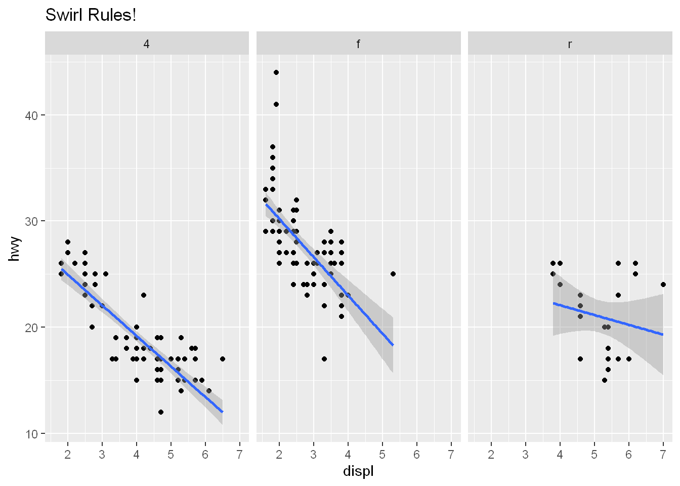
Labels
labs
Let’s label the axes and the main plot all at once, we could combine the labs calls together, but did it this way for explanation purposes
g + geom_point( aes(color=drv)) +
        labs(title = "Swirl Rules!") +
        labs( x= "Displacement", y="Hwy Mileage")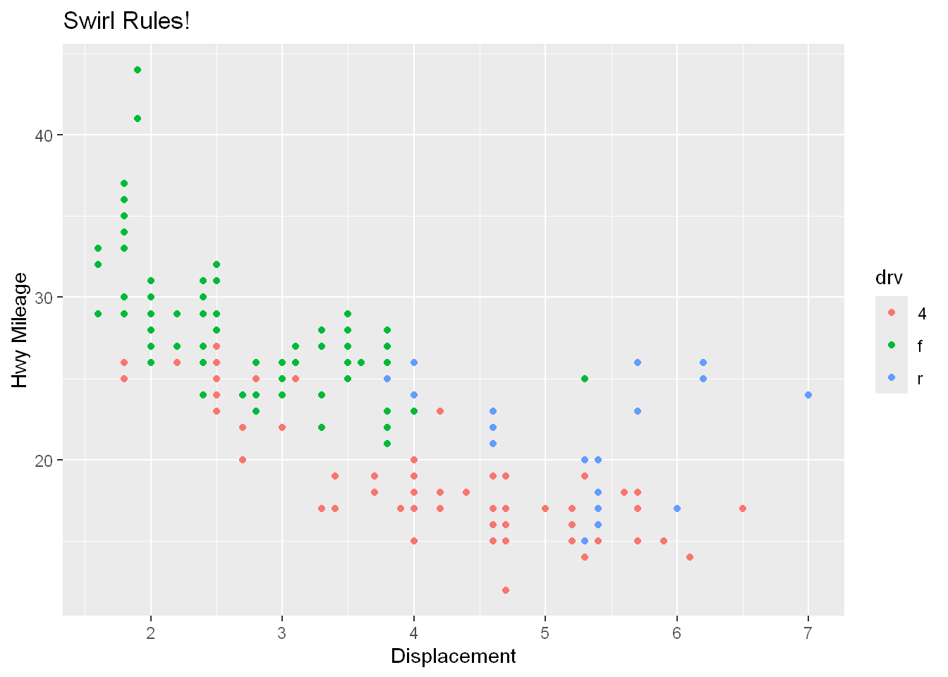
theme_bw
Font
The default theme is the grey you’ve seen above, how about we change it to black and white and change the font to “Times”
g + geom_point(aes(color=drv)) +
        theme_bw(base_family = "Times")
Warning in grid.Call(C_stringMetric, as.graphicsAnnot(x$label)): font family
not found in Windows font database
Warning in grid.Call(C_stringMetric, as.graphicsAnnot(x$label)): font family
not found in Windows font databaseWarning in grid.Call(C_textBounds, as.graphicsAnnot(x$label), x$x, x$y, : font
family not found in Windows font database
Warning in grid.Call(C_textBounds, as.graphicsAnnot(x$label), x$x, x$y, : font
family not found in Windows font databaseWarning in grid.Call.graphics(C_text, as.graphicsAnnot(x$label), x$x, x$y, :
font family not found in Windows font database
Warning in grid.Call.graphics(C_text, as.graphicsAnnot(x$label), x$x, x$y, :
font family not found in Windows font database
Warning in grid.Call.graphics(C_text, as.graphicsAnnot(x$label), x$x, x$y, :
font family not found in Windows font database
Warning in grid.Call.graphics(C_text, as.graphicsAnnot(x$label), x$x, x$y, :
font family not found in Windows font database
Warning in grid.Call.graphics(C_text, as.graphicsAnnot(x$label), x$x, x$y, :
font family not found in Windows font database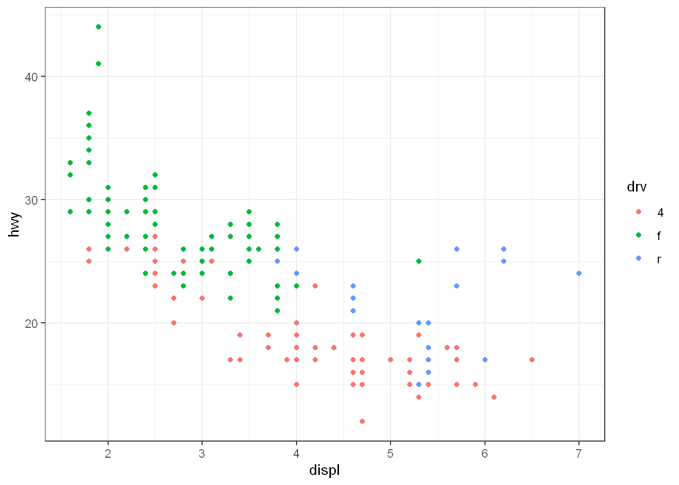
Scenario 2
Data
Random data to display outlier values
Outliers
We’ve created some random x and y data called myx and myy in a dataframe called testdat.
100 random normal points, except
Halfway one of the points was made an outlier, it was set with a y-value way out of range of the other points
Let’s use the base plot() to plot the x=myx, y=myy
User a line plot and set the y limits between -3 and 3 where all except one value reside
You’ll see the outlier at 50,100 is not shown in the plot
Base plot
plot
Let’s plot the data using the base plot() function
plot(myx, myy, type="l")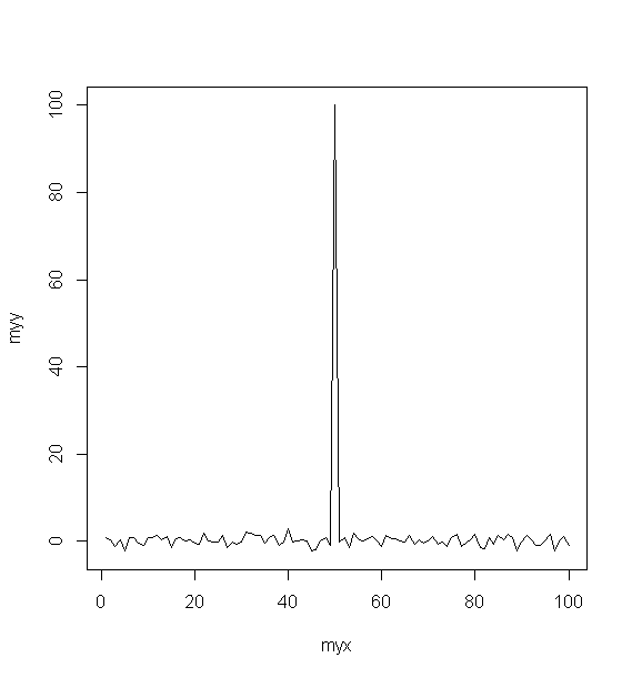
ylim
Now let’s limit the y axis:
plot(myx, myy, type="l", ylim=c(-3,3))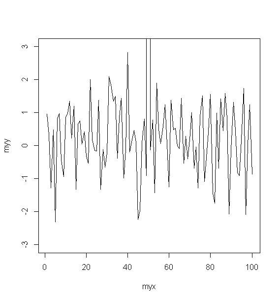
ggplot
Now let’s plot it using ggplot and see if anything differs. So first set up the graphical object g with a call to ggplot() then add the geom_line
# or this way
# g <- ggplot(data=testdat, mapping=aes(myx, myy))
g <- ggplot(testdat, aes(x=myx, y=myy))
geom_line
Notice how ggplot did display the outlier. Granted when we used plot we also used ylim which limited what the chart displays.
g + geom_line()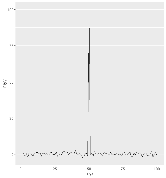
Let’s replicate what we did with the base plot() and limit the y axis
ylim
Similar to the base plot, but ylim() is used as a function that’s added as a layer. What’s important is look at x=50 and you’ll see a break in the line. ggplot() ignored the outlier value altogether.
g + geom_line() + ylim(-3,3)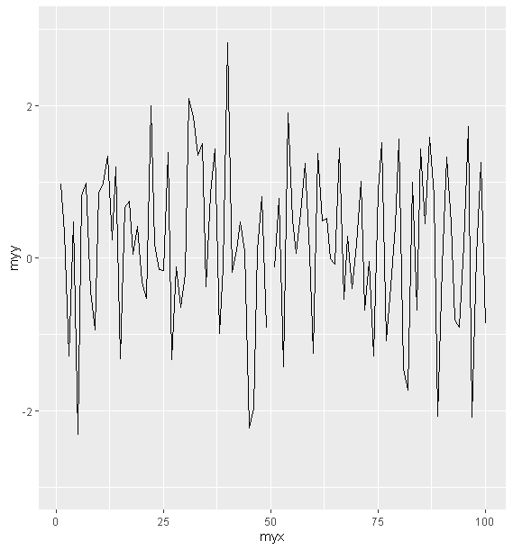
Just as with base plot() it ignored the value at 50. We can adjust the coordinate system as we mentioned at the beginning in definitions, that ggplot has 7 components one of which is coordinate systems.
Coordinate Systems
Instead of using ylim() let’s add a call to the coord_cartesian() instead and see what we have
g + geom_line() +
        coord_cartesian(ylim=c(-3,3))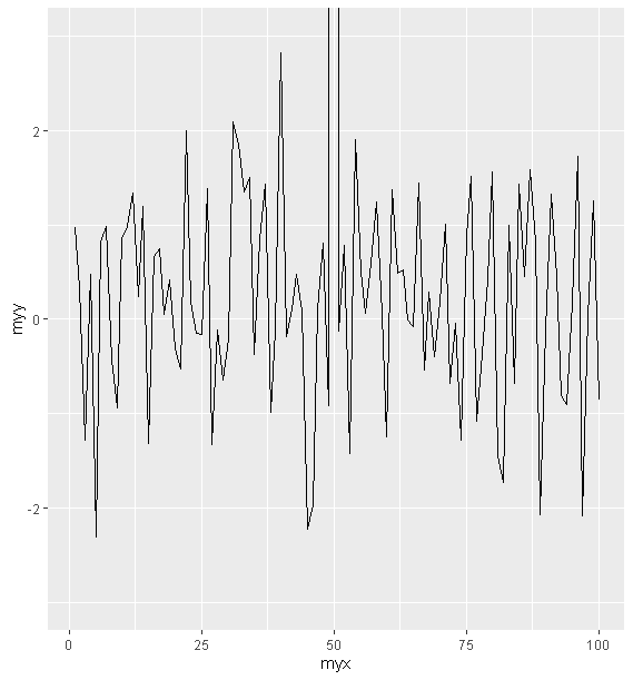
Now you see how close this is to the base plot(ylim) plot. It is much more noticeable than when we use ylim with ggplot because it tries to draw the line up as opposed to ignoring the value.
All together
Now let’s go back to the mpg dataset and create a graphical object g.
g <- ggplot(mpg, aes(x=displ, y=hwy, color= factor(year)))geom_point
Let’s plot it using geom_point
g + geom_point()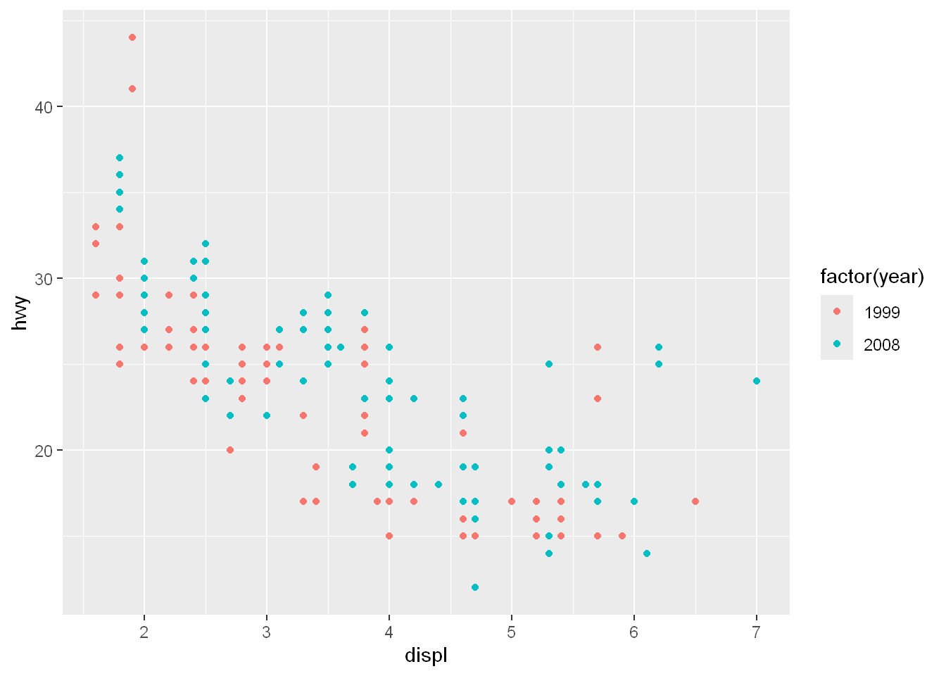
facet_grid
margins
Allows us to display the marginal totals for each row and column
We already know how to plot multiple panels (facets) with one variable over one row or one column, now we’ll do it across 2 variables.
If you remember facet_grid takes a formula as its argument
The formula is usually two variables separated by a ~
The left side of the ~ is for the rows,
The right side is for the columns
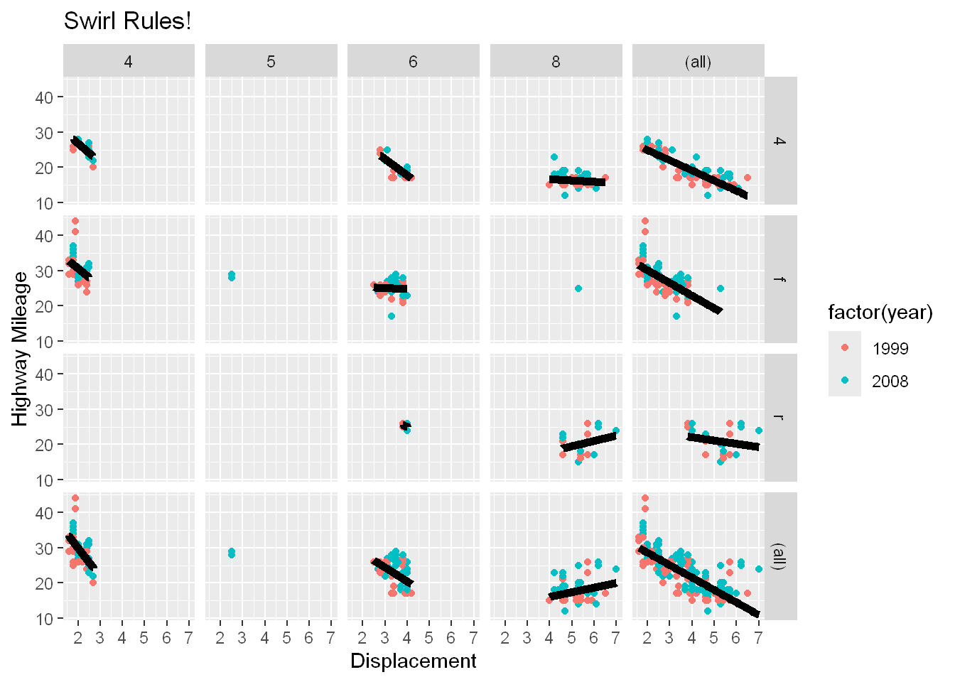
So use facet_grid(drv ~ cyl) so we want to plot the hwy mileage per drive for each cylinder configuration
Of course we already had the color separated by year when we created the graphical object g
The margin setting tells ggplot to display the marginal totals over each row and column
The margin totals column at the far right are the tiny version of the entire dataset across that row, So the far top right column is the total for all the 4 wheel drive across all cylinder configuration, and of course the lower far right plot is the total for all data
The margin total lower row is the entire dataset across that column, so the bottom row shows the total for all 4 cylinder vehicles…
g+geom_point() + facet_grid(drv~cyl, margins=TRUE)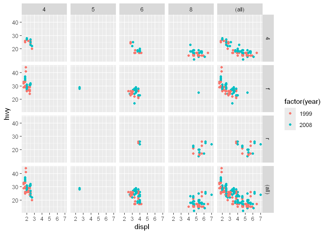
geom_smooth
lm
se
size
color
Let’s add a linear trendline, turn the grey displacement off with se, and set size to 2
g+geom_point() +
        facet_grid(drv~cyl, margins=TRUE) +
        geom_smooth(method="lm", se=FALSE, size=2, color="black")
`geom_smooth()` using formula = 'y ~ x'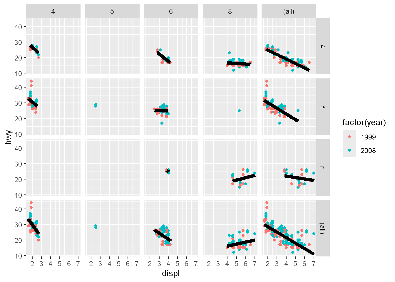
labs
Let’s add labels to x, y, and main
g+geom_point() +
        facet_grid(drv~cyl, margins=TRUE) +
        geom_smooth(method="lm", se=FALSE, size=2, color="black") +
        labs(x="Displacement", y="Highway Mileage", title="Swirl Rules!")
`geom_smooth()` using formula = 'y ~ x'