library(tidyverse)
library(palmerpenguins)
library(ggthemes)
library(cowplot)
library(ggridges)ggplot - Defined
ggplot2 a part of the tidyverse package is an R package for producing visualizations of data. It uses a conceptual framework based on the grammar of graphics which allows you to built a graph from composable elements. ggplot2.tidyverse provides complete documentation of what’s about to follow.
ggplot2 provides more than 40 geoms but these don’t cover all possible plots one could make. If you need a different geom, we recommend looking into extension packages first to see if someone else has already implemented it (see https://exts.ggplot2.tidyverse.org/gallery/ for a sampling). For example, the ggridges package (https://wilkelab.org/ggridges) is useful for making ridgeline plots, which can be useful for visualizing the density of a numerical variable for different levels of a categorical variable.
ggplot2 combines the best of base and lattice.
- Its default mode makes many choices for you (but you can customize!)
- Like lattice it allows for multipanels but more easily and intuitively
- Automatically deals with spacings, text, titles but also allows you to annotate
- It looks for data in a dataframe or the parent environment
- The workhorse is
qplot()which plots (scatter, histograms, box & whiskers) - The more advanced workhorse is
ggplot()which is more flexible and can do thingsqplot()cannot do, we’ll start withqplot()
Packages
In addition to tidyverse, we will also use the palmerpenguins package, which includes the penguins dataset containing body measurements for penguins on three islands in the Palmer Archipelago, and the ggthemes package, which offers a colorblind safe color palette. Cowplot gives us the ability to manipulate multiple plots on the same screen (like the side by side I have on this page), comparable to the par(mfrow=c(1,2)) in base plot. ggridges is for the use of the geom geom_density_ridges() to plot the ridges shown in the Numerical & Categorical/Ridges section.
The seven composable parts are
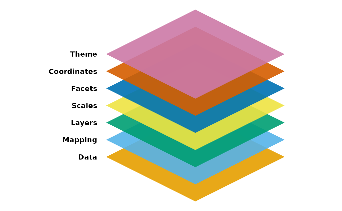
Out of these components, it needs at least the following three to produce a chart:
- Data
- Mapping
- Layer
Definitions
Data
It prefers in a tidy format, ( a rectangular data frame structure where rows are observations and columns are variables). We’ll be using the built-in diamonds and penguins and mpg datasets
ggplot(data = mpg)Mapping
Is a set of instructions on how parts of the data are mapped onto aesthetic attributes of geometric objects. A mapping can be made by using the aes() function. If we want cty and hwy (from pmg) to map to x and y we can use
ggplot(mpg, mapping = aes(x=cty, y=hwy))
# it could be done this way but let's stick with the full code for now
ggplot(mpg, aes(cty, hwy))
Aesthetic
In ggplot2 an aesthetic is a visual property of an object in your plot.
The AESTHETIC MAPPINGS determine how data are mapped to color, size, etc.
For example, in a scatter plot aesthetics include things like the size, shape or color of your data points. Think of an aesthetic as a connection or mapping between a visual feature in your plot and a variable in your data. In ggplot2, an aesthetic is defined as a visual property of an object in your plot.There are three aesthetic attributes in ggplot2:
- Color: this allows you to change the color of all of the points on your plot, or the color of each data group. Alpha can also be mapped.
- Size: this allows you to change the size of the points on your plot by data group
- Shape: this allows you to change the shape of the points on your plot by data group
Layers
This is the heart of the package. They take the mapped data and display it in something humans can visualize. Each layer consists of 3 important parts:
- The geometry that determines how the data is displayed: points, lines, rectangles…
- Statistical transformation which computes new variables from the data and affect what’s being displayed
- Position adjustment which determines where the data is being displayed A layer could be constructed using
geom_*()andstat_*()functions, these determine one of the 3 parts of a layer
Here is an example
ggplot(mpg, aes(cty,hwy)) +
        geom_point() +
        geom_smooth(formula = y ~ x, method = "lm")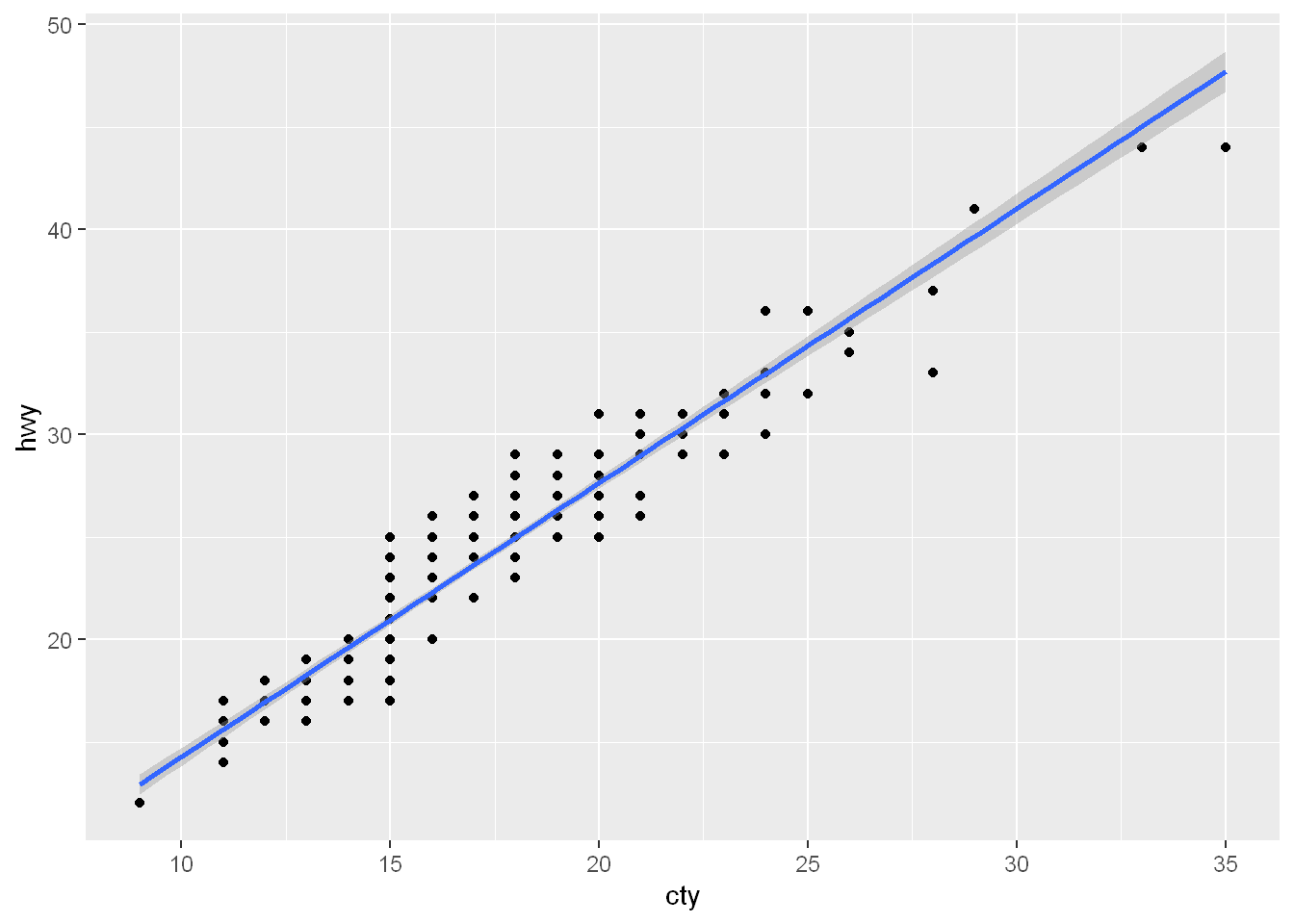
Geoms
A geom refers to the geometric object used to represent your data. The GEOMS (geometric objects) are what you see in the plot (points, lines, shapes)
For example, you can use
- Points to create a scatter plot - Points show the relationship between two quantitative variables.
- Bars to create a bar chart - Bars show one quantitative variable varies across different categories.
- Lines to create a line diagram. You can choose a geom to fit the type of data you have.
Another example
ggplot( data = penguins,
  mapping = aes(x = flipper_length_mm, y = body_mass_g, color = species)) +
  geom_point() +
  geom_smooth(method = "lm")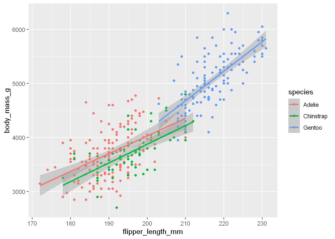
Global level geom
Every geom function in ggplot2 takes a
mappingargument, either defined locally in the geom layer or globally in theggplot()layer.Not every aesthetic works with every geom. You could set the shape of a point, but you couldn’t set the “shape” of a line. If you try, ggplot2 will silently ignore that aesthetic mapping as shown in plot on the left
On the other hand, you could set the linetype of a line.
geom_smooth()will draw a different line, with a different linetype, for each unique value of the variable that you map to linetype, as shown below on the right.
p1 <- ggplot(mpg, aes(x = displ, y = hwy, shape = drv)) +  geom_smooth()
p2 <- ggplot(mpg, aes(x = displ, y = hwy, linetype = drv)) +  geom_smooth()
plot_grid(p1, p2)
`geom_smooth()` using method = 'loess' and formula = 'y ~ x'
`geom_smooth()` using method = 'loess' and formula = 'y ~ x'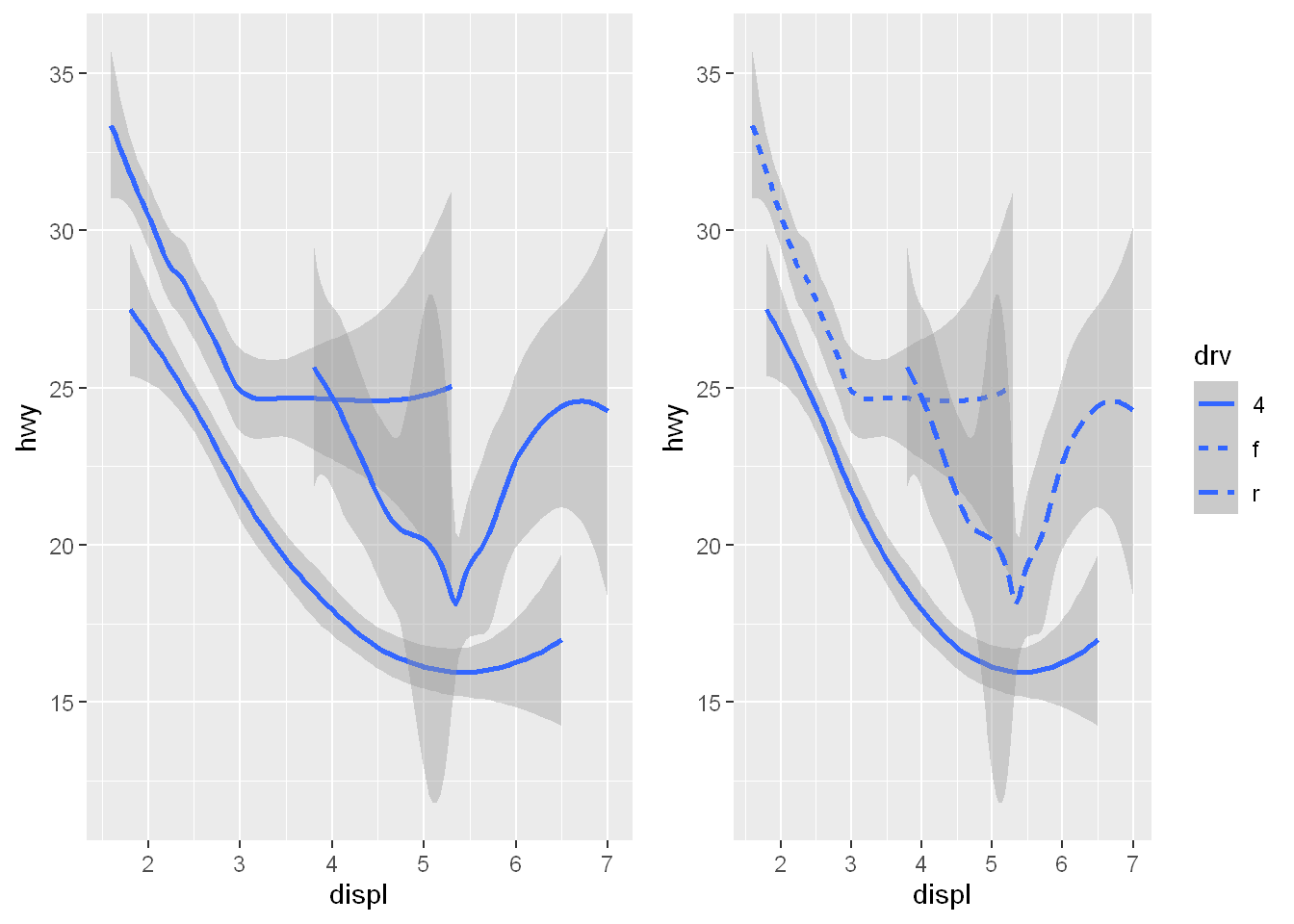
Local level geom
As you see each category has its own line. When aesthetic mappings are defined in ggplot(), at the global level, they’re passed down to each of the subsequent geom layers of the plot. However, each geom function in ggplot2 can also take a mapping argument, which allows for aesthetic mappings at the local level that are added to those inherited from the global level. Since we want points to be colored based on species but don’t want the lines to be separated out for them, we should specify color = species for geom_point() only.
ggplot(penguins, aes(x = flipper_length_mm, y = body_mass_g)) +
geom_point(aes(color = species)) +
geom_smooth(method = "lm")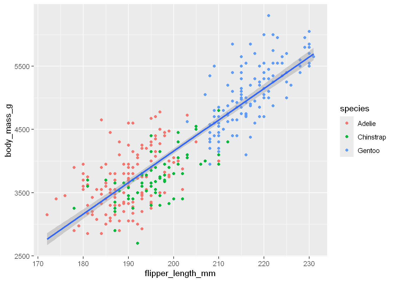
So remember: if you place a mapping in a geom function, ggplot2 will treat them as local mappings for the layer. It will use these mappings to extend or overwrite the global mappings for that layer ONLY. This makes it possible to display different aesthetics in different layers.
ggplot(mpg, aes(x = displ, y = hwy)) +
geom_point(aes(color = class)) +
geom_smooth()`geom_smooth()` using method = 'loess' and formula = 'y ~ x'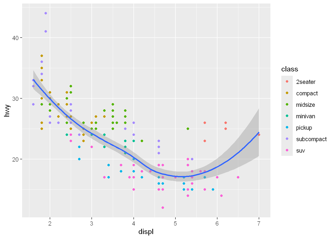
Multiple geoms
To clarify the point further, let’s break it down layer by layer and stack multiple geoms on top of another.
First we create the plot: data, aes(x, y, and color set to drv), which gives us the three different colors per drive globally
Then we layer the geom_point() for the scatterplot (which appears in drv colors
Then we layer the geom_smooth line and we map the linetype = drv locally. So now the lines will be different for each drv because of the local mapping, and the lines will be different colors because of the global color mapping.
ggplot(mpg, aes(x = displ, y = hwy, color = drv)) +
geom_point() +
geom_smooth(aes(linetype = drv))`geom_smooth()` using method = 'loess' and formula = 'y ~ x'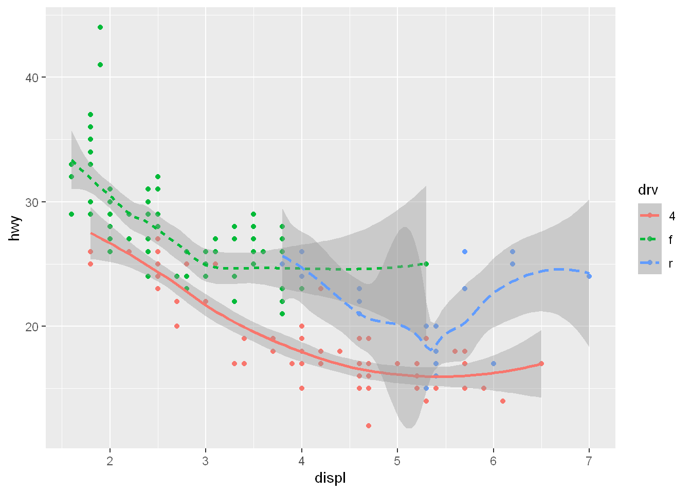
Group
Many geoms, like geom_smooth(), use a single geometric object to display multiple rows of data.
For these geoms, you can set the
groupaesthetic to a categorical variable to draw multiple objects. ggplot2 will draw a separate object for each unique value of the grouping variable.
In practice, ggplot2 will automatically group the data for these geoms whenever you map an aesthetic to a discrete variable (as in the linetype example). It is convenient to rely on this feature because the group aesthetic by itself does not add a legend or distinguishing features to the geoms.
Here are two chunks of code, showing the effect of group, which is identical to mapping to color = drv except that all group plots will be the same color with group.
g1 <- ggplot(mpg, aes(x = displ, y = hwy)) +
geom_smooth()
g2 <- ggplot(mpg, aes(x = displ, y = hwy)) +
geom_smooth(aes(group = drv))
g3 <- ggplot(mpg, aes(x = displ, y = hwy)) +
geom_smooth(aes(color = drv), show.legend = FALSE)
plot_grid(g1, g2, g3)`geom_smooth()` using method = 'loess' and formula = 'y ~ x'
`geom_smooth()` using method = 'loess' and formula = 'y ~ x'
`geom_smooth()` using method = 'loess' and formula = 'y ~ x'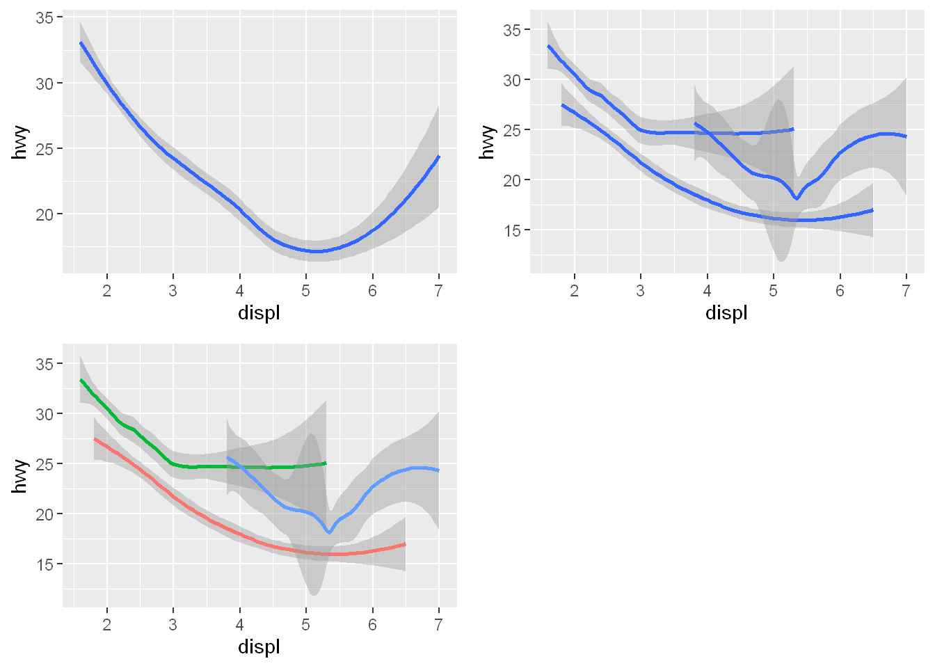
Shape
Most people think of these shapes
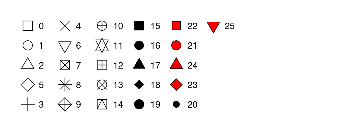
when they map shape, but sometimes shapes are hard to distinguish in a buzy plot and it might be better to distinguish the shape as a variable (species in this case). So let’s map the shape=species as well.
ggplot(
  data = penguins,
  mapping = aes(x = flipper_length_mm, y = body_mass_g)) +
  geom_point(mapping = aes(color = species, shape = species)) +
  geom_smooth(method = "lm")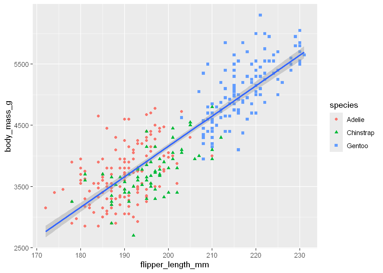
Stats
STATS are statistical transformations such as
Binning
Quantiles
Smoothing
Smoothing
Smoothing helps data professionals reveal trends. When scatterplots alone lack clarity, smoothing adds a trend line, making underlying patterns in the data easier to spot for casual observers. ggplot2 offers two smoothing methods:
Loess is best for plots with fewer than 1,000 points, it creates a flexible, local smoother.
Gam is ideal for larger datasets because it uses a more robust model for general trends.
Smoothing enhances data communication, adding a visual cue to highlight trends so data visualizations become clearer and more impactful for audiences.
| Type of smoothing | Description | Example code |
|---|---|---|
| Loess smoothing | The loess smoothing process is best for smoothing plots with less than 1000 points. | ggplot(data, aes(x=, y=))+ geom_point() + geom_smooth(method=“loess”) |
| Gam smoothing | Gam smoothing, or generalized additive model smoothing, is useful for smoothing plots with a large number of points. | ggplot(data, aes(x=, y=)) + geom_point() + geom_smooth(method=“gam”, formula = y ~s(x)) |
The smoothing functionality in ggplot2 helps make data plots more readable, so you are better able to
Scales
Scales translate what’s shown on the graph back to an understanding of the data
Scales show what coding an aesthetic map uses; for example: male = red, female = blue
ggplot(mpg, aes(cty, hwy, colour = class)) +
        geom_point() +
        scale_colour_viridis_d()
Scaling
A lengthier explanation is: when a categorical variable is mapped to an aesthetic, ggplot2 will automatically assign a unique value of the aesthetic (here a unique color) to each unique level of the variable (each of the three species), a process known as scaling. ggplot2 will also add a legend that explains which values correspond to which levels.
ihz #| warning: false # Using the penguins dataset ggplot(data = penguins, mapping = aes(x = flipper_length_mm, y = body_mass_g, color = species)) + geom_point()}
Facets
Facets let you display smaller groups or subsets of your data. Facets are the panels used in conditional plots.
With facets, you can create separate plots for all the variables in your dataset.
Facet_wrap
To facet your plot by a single variable, use facet underscore wrap. Let’s say we wanted to focus on the data for each species of penguin.
Take our plot that shows the relationship between body mass and flipper length in each penguin species. The facet underscore wrap function lets us create a separate plot for each species.
ggplot(penguins, aes(x = flipper_length_mm, y = body_mass_g)) +
  geom_point(aes(color = species, shape = species)) +
  facet_wrap(~island)
Warning: Removed 2 rows containing missing values or values outside the scale range
(`geom_point()`).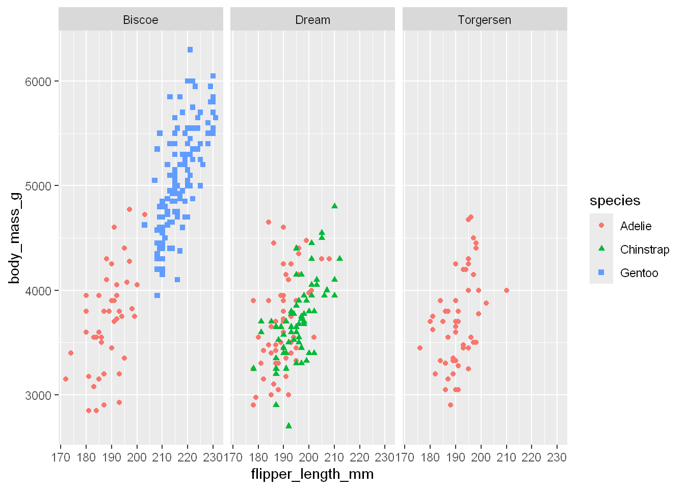
~
Tilde operator is used to define the relationship between dependent variable and independent variables in a statistical model formula.
The variable on the left-hand side of tilde operator is the dependent variable and the variable(s) on the right-hand side of tilde operator is/are called the independent variable(s). So with a tidy dataset, the rows will be on the left side as they are observations, and columns would be on the right side as they are the variables
So, tilde operator helps to define that dependent variable on the left depends on the independent variable(s) on the right-hand side of tilde operator.
In the case of this example, the independent variable at the end of the syntax line would be species, and the dependent variable in this case is facet_wrap. The facet_wrap is actually a function that is being called to separate and distribute the independent data within the plot.
Facet_grid
To facet your plot with two variables, use the facet underscore grid function. Facet underscore_grid will split the plot into facets vertically by the values of the first variable and horizontally by the values of the second variable.
ggplot(mpg, aes(cty, hwy)) +
        geom_point() +
        facet_grid(year ~ drv)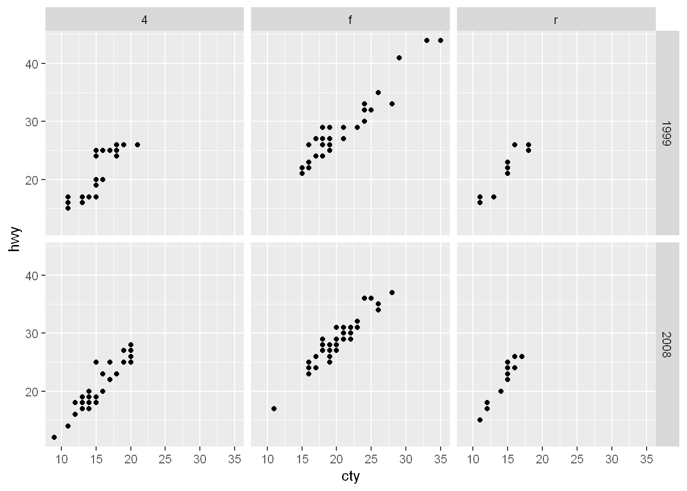
Coordinate System
Qplot takes care of that automatically. ggplot is another story we’ll discuss later.
Theme
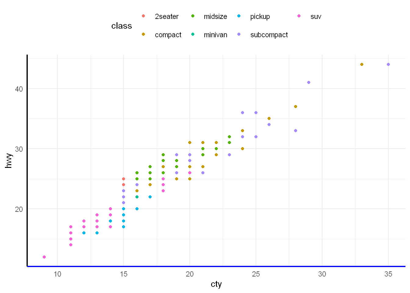
The theme system controls almost any visuals of the plot that are not controlled by the data and is therefore important for the look and feel of the plot. You can use the theme for customizations ranging from changing the location of the legends to setting the background color of the plot. Many elements in the theme are hierarchical in that setting the look of the general axis line affects those of the x and y axes simultaneously.
To tweak the look of the plot, one can use many of the built-in theme_*() functions and/or detail specific aspects with the theme() function. The element_*() functions control the graphical attributes of theme components.
ggplot(mpg, aes(cty, hwy, colour = class)) +
  geom_point() +
  theme_minimal() +
  theme(
    legend.position = "top",
    axis.line = element_line(linewidth = 0.75),
    axis.line.x.bottom = element_line(colour = "blue")
  )
Annotations
The label and annotate functions let you customize your plot. You can add text like titles, subtitles and captions to communicate the purpose of your plot or highlight important data.
- Create an annotation layer: This guide explains how to add an annotation layer with ggplot2. It includes sample code and data visualizations with annotations created in ggplot2.
- How to annotate a plot in ggplot2: This resource includes explanations about how to add different kinds of annotations to your ggplot2 plots, and is a great reference if you need to quickly look up a specific kind of annotation.
- Annotations: Chapter eight of the online ggplot2 textbook is focused entirely on annotations. It provides in-depth explanations of the different types of annotations, how they are used, and detailed examples.
- How to annotate a plot: This R-Bloggers article includes explanations about how to annotate plots in ggplot2. It starts with basic concepts and covers more complicated information the further on you read.
- Text Annotations: This resource focuses specifically on adding text annotations and labels to ggplot2 visualizations.
Next we’ll dive into some examples of using ggplot2. First off we’ll start with qplot (quick plot) even though it has been deprecated, some might still use it.
Labels
Labs
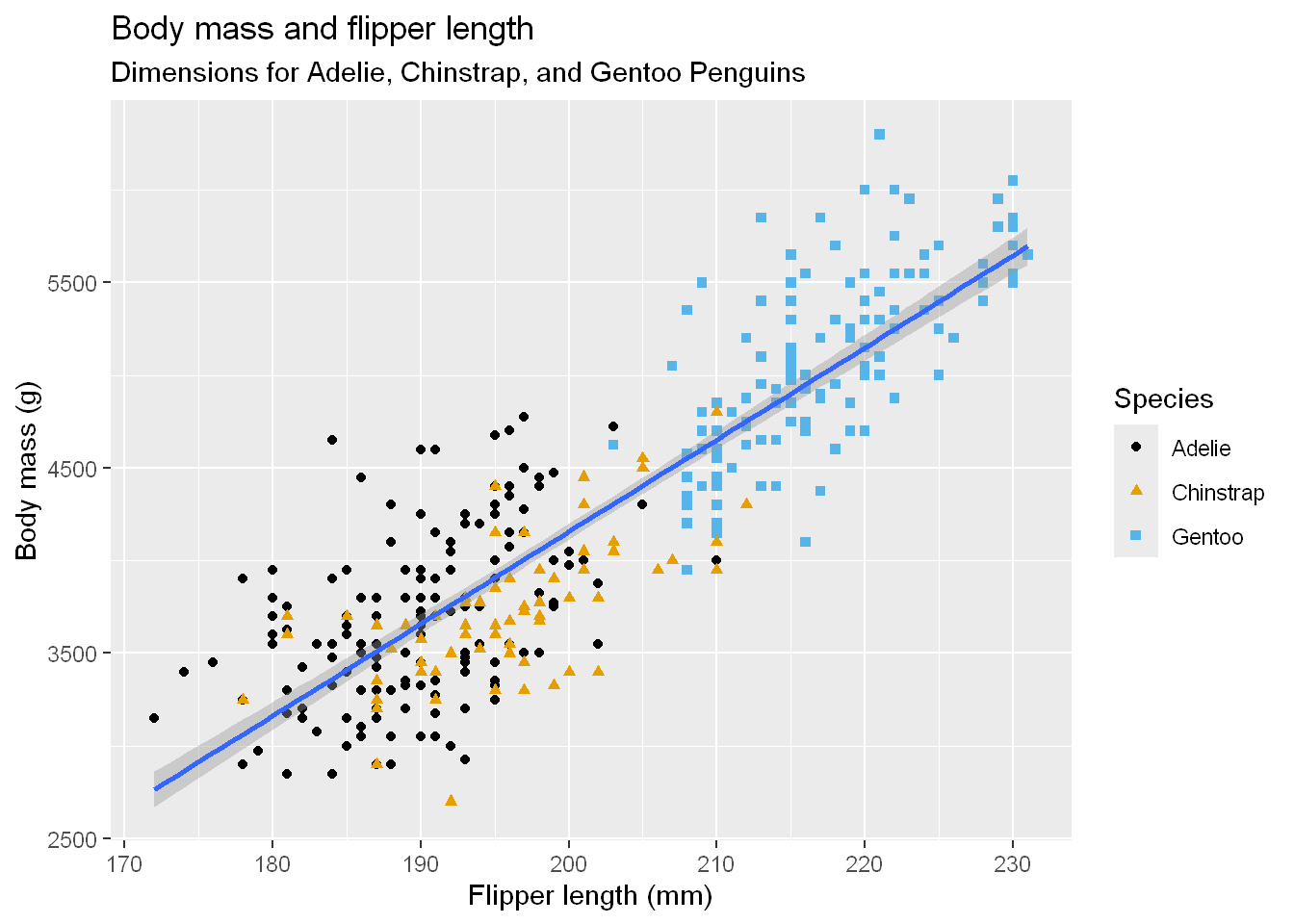
We can improve the appearance of the plot by adding a labs layer to address the axes and title and ….
ggplot(
  data = penguins,
  mapping = aes(x = flipper_length_mm, y = body_mass_g)) +
  geom_point(aes(color = species, shape = species)) +
  geom_smooth(method = "lm") +
  labs(
    title = "Body mass and flipper length",
    subtitle = "Dimensions for Adelie, Chinstrap, and Gentoo Penguins",
    x = "Flipper length (mm)", y = "Body mass (g)",
    color = "Species", shape = "Species")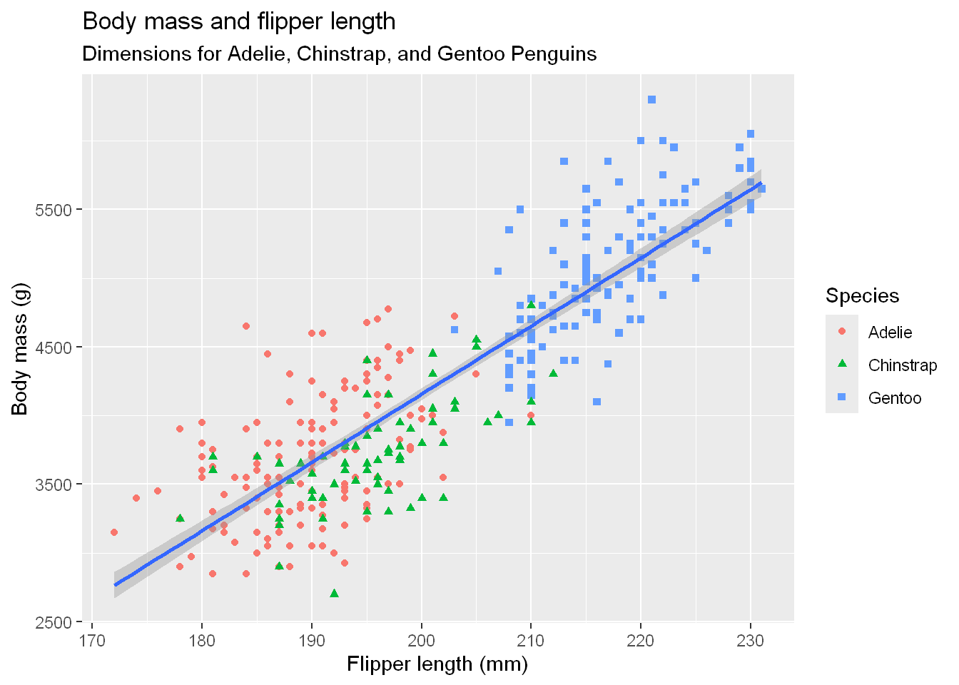
Colorblind theme
If we wish to ensure the plot is accommodating to the color blind we can add the last line to the code
ggplot(
  data = penguins,
  mapping = aes(x = flipper_length_mm, y = body_mass_g)) +
  geom_point(aes(color = species, shape = species)) +
  geom_smooth(method = "lm") +
  labs(
    title = "Body mass and flipper length",
    subtitle = "Dimensions for Adelie, Chinstrap, and Gentoo Penguins",
    x = "Flipper length (mm)", y = "Body mass (g)",
    color = "Species", shape = "Species") +
  scale_color_colorblind()