library(tidyverse)ggplot - Sample 2
Data
We’ll be working with diamonds a built-in dataset.
Packages
Histogram
hist(diamonds$price)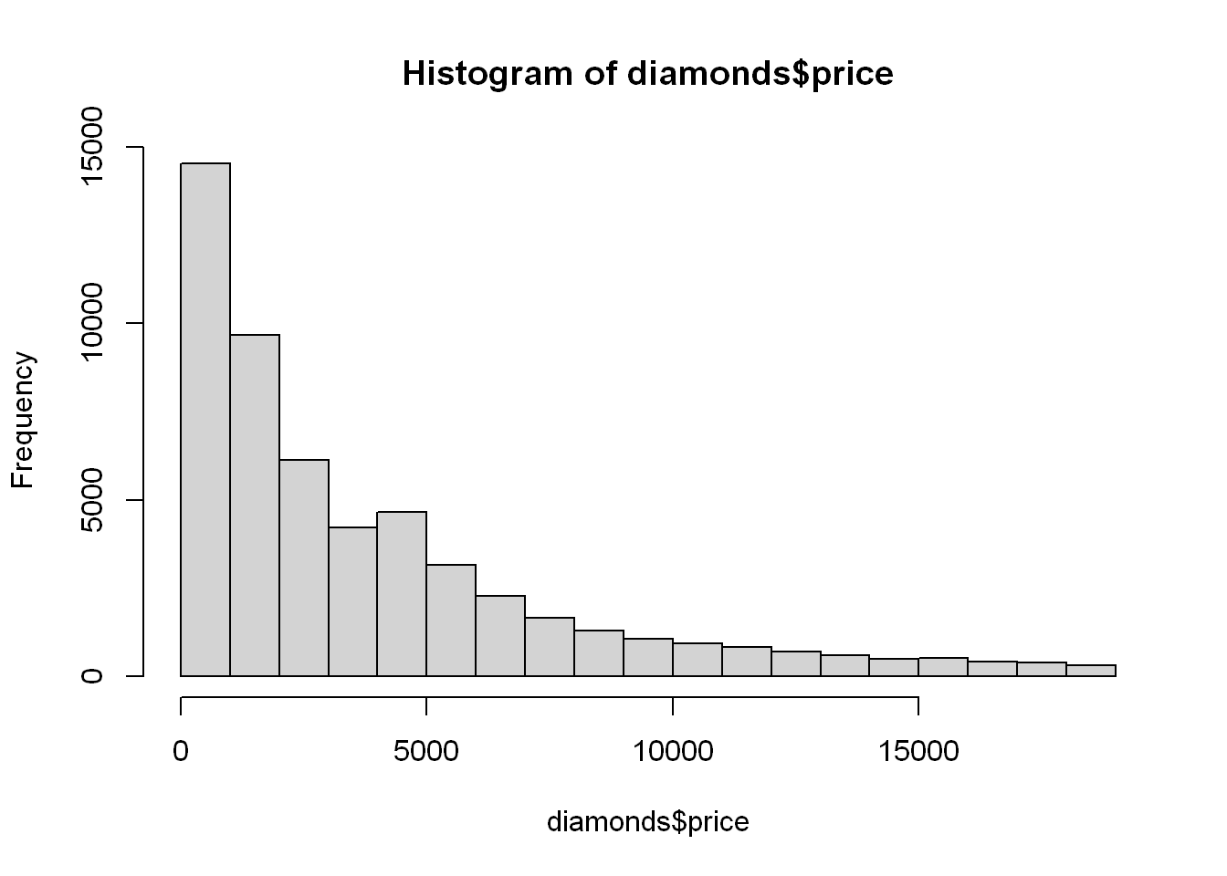
Start with
g <- ggplot(diamonds, aes(depth, price))Scatterplot
g + geom_point(alpha=1/3)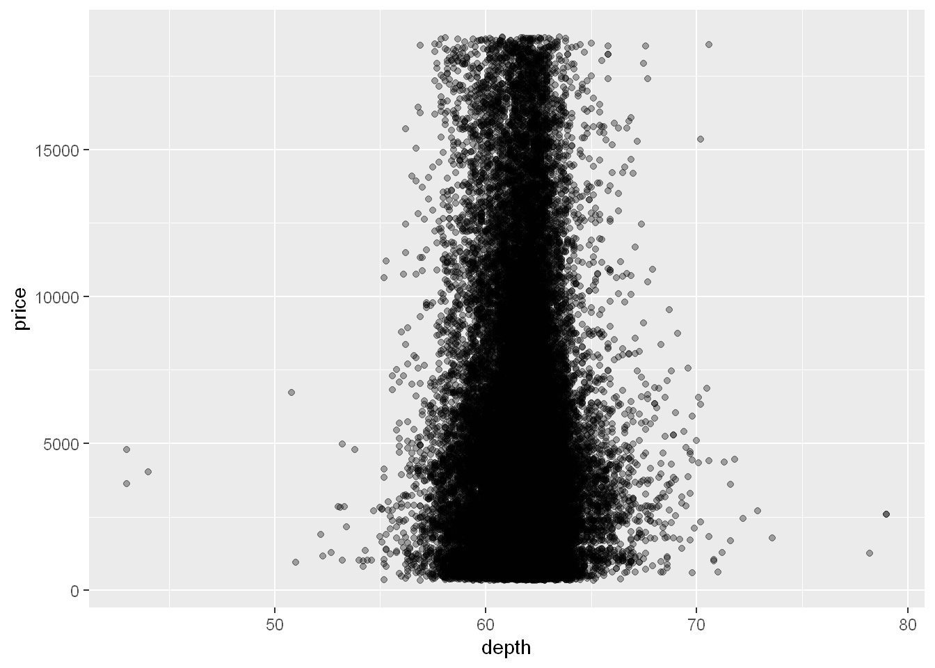
The densest distribution is around 60-65.
Let’s see if this relationship between density and price is affected by cut or carat.
Cut is a factor with 5 levels
Carat is a numeric and not a discrete factor, so how do we do this?
We can use cut
Cut
Cut() essentially divides the data into sets and labels each entry as to the one set it belongs to, in effect creating a new factor for us. All we have to do is decide where to cut the data using the carat variable!
Let’s divide the data into 3 pockets, so 1/3 of the data falls into each.
We’ll use the R command quantile to do this.
Create the variable cutpoints and assign to it the output of a call to the function quantile with 3 arguments.
The first is the data to cut, namely diamonds$carat
The second is a call to the R function seq. This is also called with 3 arguments, (0, 1, and length set equal to 4).
The third argument to the call to quantile is the boolean na.rm set equal to TRUE.
Quantile
cutpoints <- quantile(diamonds$carat, seq(0,1,length=4), na.rm=TRUE)
cutpoints
0% 33.33333% 66.66667% 100%
0.20 0.50 1.00 5.01 We get a 4 long vector, length=4 divided into 3 equal bins/cut into 3.
It tells us the smallest carat is 0.2 and the largest is 5.01
33.3% or 1/3 of the carats are between 0.2 and 0.5
NOTE: this indicate values above 0.2 to 0.5 so any values equal to or below are not included. We won’t have any below 0.2 because that’s the lowest but we will have some equal to 0.2 which will show up as NA later.
Another third is between 0.5 and 1
Another third is between 1 and 5.01
Now we can label each data point as to which one of the 3 factors it belongs to.
Cut
Now let’s cut the data at the points we created with the quantile function and assign it to a new column in the dataset
diamonds$car2 <- cut(diamonds$carat, cutpoints)Reset g since we added a new column car2. This is the same command as before but now the dataset is larger.
g <- ggplot(diamonds, aes(depth, price))facet_grid
So as we said before, we needed to plot carat in relation to cut but we needed to cut carat first, and since cut is already a factor, now that we did that let’s write our command.
We already know cut has 5 levels, and we just set carat to 3 factors. We should have a 5 row and 3 column panel, but we end up with 4 columns?!
g + geom_point(alpha=1/3) + facet_grid(cut ~ car2)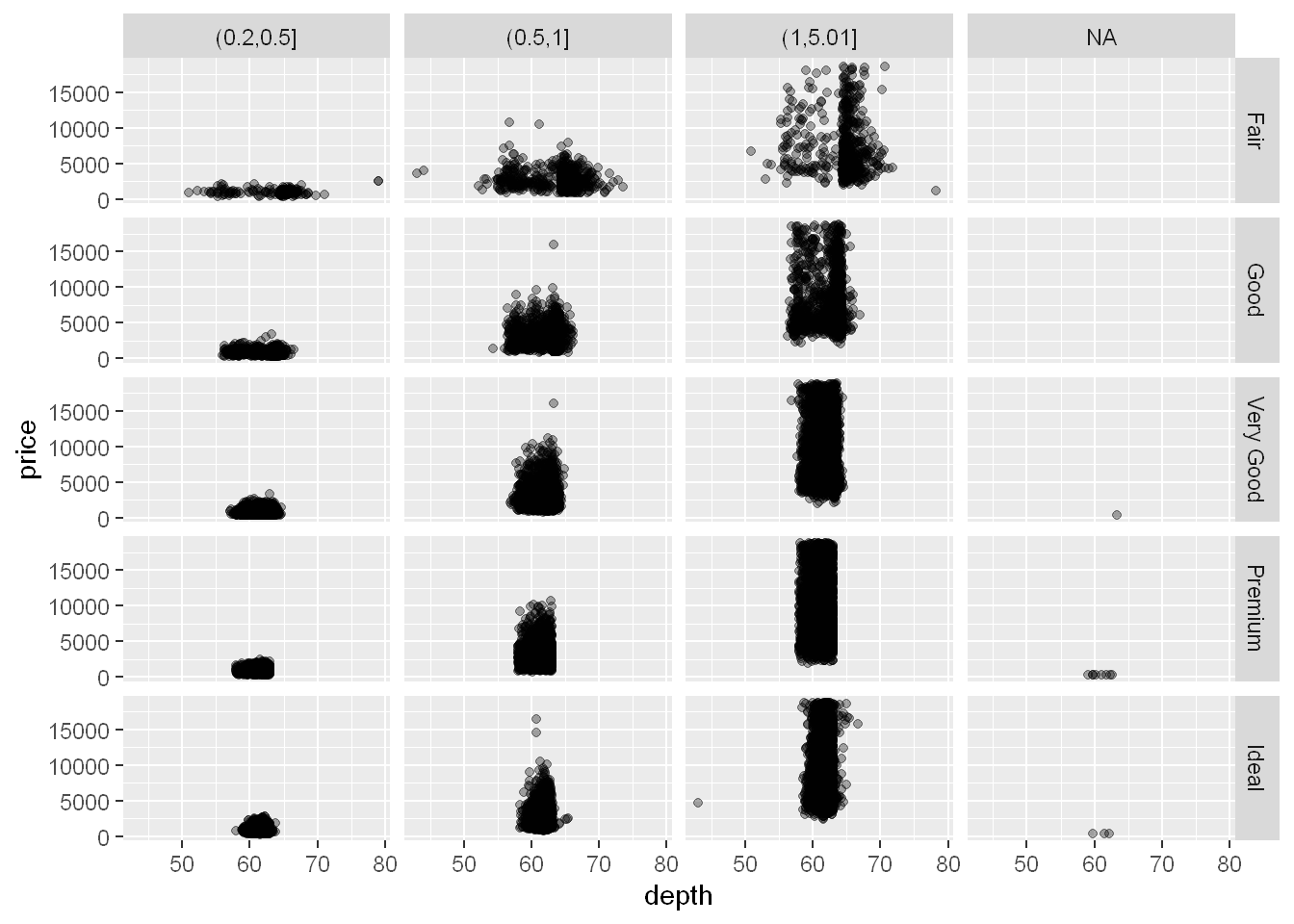
The fourth column is labeled NA and it shows the points with missing data occurred. Those occurred in very good, premium and ideal cuts.
geom_smooth
Let’s plot the smooth linear line
g + geom_point(alpha=1/3) +
        facet_grid(cut ~ car2) +
        geom_smooth(method="lm", size=3, color="pink")
Warning: Using `size` aesthetic for lines was deprecated in ggplot2 3.4.0.
ℹ Please use `linewidth` instead.`geom_smooth()` using formula = 'y ~ x'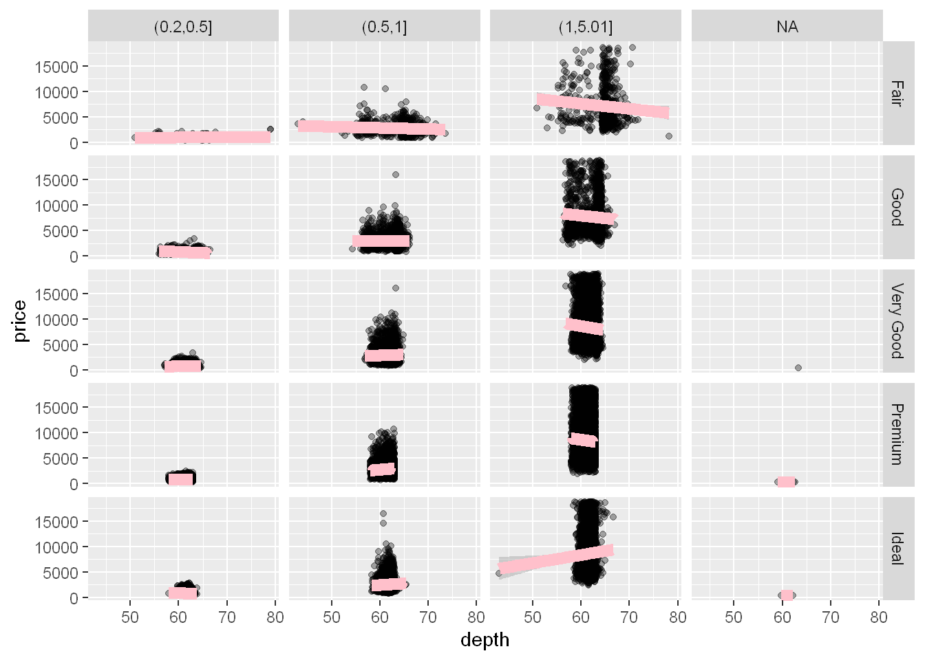
Boxplot
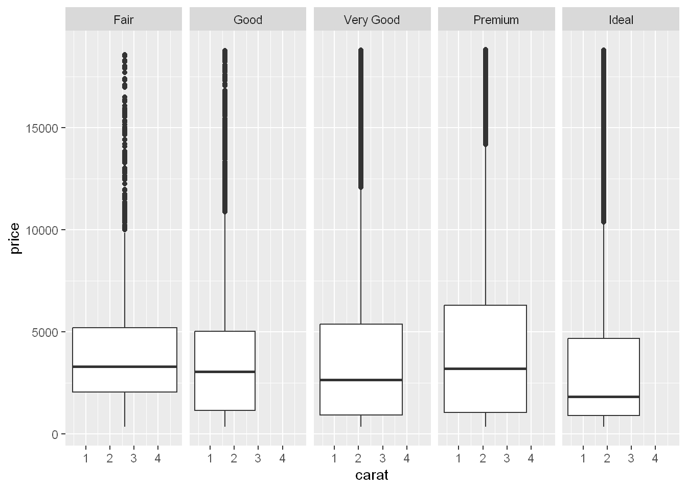
By now it’s self explanatory:
Data is diamonds
Axes are x=carat, y=price
geom
Facet with one row and 5 cut columns for 5 levels of cut
ggplot(diamonds, aes(carat, price)) + geom_boxplot() + facet_grid(. ~ cut)Warning: Continuous x aesthetic
ℹ did you forget `aes(group = ...)`?